Modern
I’ve seen a few people say that the Computer Modern font is ugly. It started me thinking about why this might be, and I browsed the internet for a while to find out. This post is a collection of some bits and pieces of information about various fonts that I gathered on the way.[1]
Types of ugly
There might be a number of possible sources of font ugliness, and I’m guessing at a few:
the shapes of the individual characters aren’t pleasing
short titles in the font don’t look good
paragraphs of text set in the font don’t look good
the contexts and associations of the font trigger unhappy thoughts
A bit of Computer Modern:
The Julia code that made this figure:
using Luxor
Drawing(1200, 200, joinpath(@OUTPUT, "_d1.svg"))
origin()
background("#ededed")
@layer begin
    fontface("CMUSerif-Roman")
    fontsize(17)
    textfit("I am ugly. Am I?", BoundingBox())
end
finish()
tidysvg(joinpath(@OUTPUT, "_d1.svg"), joinpath(@OUTPUT, "d1.svg"))
The first thought I have is that the changes from thick to thin strokes are quite abrupt. In that “m”, for example, one minute it’s a big thick and heavy down stroke, and the feet are chunky and solid, but the next minute it’s getting thin and almost breakable at the top. There’s a heavy-ish vertical up/down stress everywhere, like iron railings. It switches from straight to curved a lot, and quite quickly, rather than gradually changing from one to other. If my glasses were anything like that “g”, they would have broken on the first day I wore them...
But aren’t all fonts a bit like this? Is this attractive or ugly? Let’s go back in time to get some historical context.
Blinding the nation
In 1758, the printer and industrialist John Baskerville wrote:
Having been an early admirer of the beauty of letters, I became insensibly desirous of contributing to the perfection of them. I formed to myself ideas of greater accuracy than had yet appeared. [2]
Baskerville did everything he could to make his printed books look as good as he could: he improved the recipe for making ink (which involved letting it stand for months to thicken), rebuilt his wooden machines in metal, made much better paper, and created precise metal type that he used just once, so as to avoid wearing out the delicate shapes.
His efforts provoked some controversy at the time. There were some negative comments suggesting that the sharp, crisp text would have the effect of “blinding the nation”.
Here’s an impression of the standard fonts of the time compared with Baskerville’s output:
A letter from Benjamin Franklin to John Baskerville; Caslon (left) Baskerville (right):
The Julia code that made this figure:
tempfile = joinpath(@OUTPUT, "_d2.svg")
Drawing(1200, 800, tempfile)
origin()
background("#ededed")
panes = Tiler(1200, 800, 1, 2)

t = "“Soon after I returned, discoursing with a gentleman concerning the artists of Birmingham, he said you would be a means of blinding all the readers in the nation; for the strokes of your letters, being too thin and narrow, hurt the eye, and he could never read a line of them without pain. ‘I thought,’ said I,‘you were going to complain of the gloss of the paper, which some object to.’ ‘No, no,’ said he, ‘I have heard that mentioned, but it is not that; it is in the form and cut of the letters themselves; they have not that height and thickness of the stroke, which make the common printing so much the more comfortable to the eye.’ ... Yesterday he called to visit me, when, mischievously bent to try his judgement, I stepped into my closet, tore off the top of Mr. Caslon’s specimen, and produced it to him as yours, brought with me from Birmingham; saying, I had been examining it, since he spoke to me, and could not for my life perceive the disproportion he mentioned, desiring him to point it out to me. He readily undertook it, and went over the several founts, showing me everywhere what he thought instances of that disproportion; and declared that he could not then read the specimen, without feeling very strongly the pain he had mentioned to me. I spared him that time the confusion of being told, that these were the types he had been reading all his life, with so much ease to his eyes; the types his adored Newton is printed with, on which he has pored not a little; nay, the very types his own book is printed with (for he is himself an author,) and yet never discovered this painful disproportion in them, till he thought they were yours.”
[Benjamin Franklin writing to John Baskerville]"

@layer begin
    fontface("ACaslon-Regular")
    fontsize(20)
    bbx = BoundingBox(box(panes, 1)) * 0.86
    textwrap(t, boxwidth(bbx), boxtopleft(bbx), leading=24)
end

@layer begin
    fontface("Baskerville")
    fontsize(20)
    bbx = BoundingBox(box(panes, 2)) * 0.86
    textwrap(t, boxwidth(bbx), boxtopleft(bbx), leading=24)
end
finish()
tidysvg(joinpath(@OUTPUT, "_d2.svg"), joinpath(@OUTPUT, "d2.svg"))
The Baskerville letters are generally a bit “sharper”, but I wouldn’t describe this as painful to read. That mischievous anecdote in the sample above suggests that critics were just exaggerating their complaints as a way of channelling their envy. The Baskerville sample has a bit more contrast between the thick and thin strokes, and is a bit more upright and symmetrical – the “old-stye” Caslon on the left (looking at the “d” for example) retains a hint of its calligraphic origins.
Caslon (left) Baskerville (right):
The Julia code that made this figure:
tempfile = joinpath(@OUTPUT, "_d3.svg")
Drawing(1200, 200, tempfile)
origin()
background("#ededed")
panes = Tiler(1200, 200, 1, 2)

t = "sharp doubt"

@layer begin
    fontsize(110)
    fontface("ACaslon-Regular")
    bbx = BoundingBox(box(panes, 1)) #* 0.8
    textbox(t, boxtopleft(bbx))
end

@layer begin
    fontsize(120)
    fontface("Baskerville")
    bbx = BoundingBox(box(panes, 2)) #* 0.8
    textbox(t, boxtopleft(bbx))
end

finish()
tidysvg(joinpath(@OUTPUT, "_d3.svg"), joinpath(@OUTPUT, "d3.svg"))
Ancient and Modern
Baskerville’s efforts weren’t hugely popular in his lifetime, but he influenced many others, particular the type designers Firmin Didot and Giambattista Bodoni around 1800. This led to the development of very sharp, high-contrast fonts that ended up being called “Modern” in order to distinguish them from fonts like Caslon (which were consequently called “oldstyle”). Baskerville’s fonts were eventually assigned to a category called “transitional”, with the idea that his work could be seen as a stage on the journey from the old to the modern.
In a Didot font, the strokes change from very thick to very thin, sometimes abruptly. The flat straight serifs are crisp, razor-sharp. Curves are fat at the sides and dwindle to positively skinny at the tops and bottoms. The overall effect is bright and aggressive (the technical term is “dazzling”), and reading a whole book like this could be optically tiring. However, the mechanical printing process of ink spreading into paper would have softened the edges a bit, and these SVG images are possibly showing the font more accurately than it was seen at the time.
Baskerville (left), Didot (right):
The Julia code that made this figure:
tempfile = joinpath(@OUTPUT, "_d4.svg")
Drawing(1200, 600, tempfile)
origin()
background("#ededed")
panes = Tiler(1200, 600, 1, 2)

t = "“Soon after I returned, discoursing with a gentleman concerning the artists of Birmingham, he said you would be a means of blinding all the readers in the nation; for the strokes of your letters, being too thin and narrow, hurt the eye, and he could never read a line of them without pain.”"

@layer begin
    fontface("Baskerville")
    fontsize(36)
    bbx = BoundingBox(box(panes, 1)) * 0.9
    textwrap(t, boxwidth(bbx), boxtopleft(bbx), leading=45)
end

@layer begin
    fontface("Didot")
    fontsize(35)
    bbx = BoundingBox(box(panes, 2)) * 0.9
    textwrap(t, boxwidth(bbx), boxtopleft(bbx), leading=45)
end
finish()
tidysvg(joinpath(@OUTPUT, "_d4.svg"), joinpath(@OUTPUT, "d4.svg"))
Typographic terminology likes to confound. The word “modern” in a typeface context means designed about 1780 to 1820. (And “Gothic” means “sans serif”...)
An alternative term for modern is “neoclassical.” This places the style in the context of the classical revival in 18th century European art, and it avoids confusion with the 20th century avant-garde styles that are also called modern. [3]
Baskerville (left) Didot (right):
The Julia code that made this figure:
tempfile = joinpath(@OUTPUT, "_d5.svg")
Drawing(1200, 200, tempfile)
origin()
background("#ededed")
translate(0, 20)
panes = Tiler(1200, 200, 1, 2)

t = "sharp doubt"

fontsize(100)
@layer begin
    fontface("Baskerville")
    bbx = BoundingBox(box(panes, 1))
    text(t, boxmiddlecenter(bbx), halign=:center)
end

@layer begin
    fontface("Didot")
    bbx = BoundingBox(box(panes, 2))
    text(t, boxmiddlecenter(bbx), halign=:center)
end

finish()
tidysvg(joinpath(@OUTPUT, "_d5.svg"), joinpath(@OUTPUT, "d5.svg"))
The small serifs are supposed to be guiding the eye along the line. But you could cut your eye on them if you’re not careful.
Caslon (left) Didot (right):
The Julia code that made this figure:
tempfile = joinpath(@OUTPUT, "_d6.svg")
Drawing(800, 300, tempfile)
origin()
background("#ededed")
translate(0, 50)
panes = Tiler(700, 300, 1, 3)
t = "honey"

fontsize(125)
@layer begin
    fontface("ACaslon-Regular")
    bbx = BoundingBox(box(panes, 1)) * 0.9
    text(t, boxmiddlecenter(bbx), halign=:center)
end

@layer begin
    fontface("Didot")
    bbx = BoundingBox(box(panes, 3)) * 0.9
    text(t, boxmiddlecenter(bbx), halign=:center)
end
finish()
tidysvg(joinpath(@OUTPUT, "_d6.svg"), joinpath(@OUTPUT, "d6.svg"))
These “modern” fonts became very popular in the 19th century, and they, and their more practical descendants known as “Scotch Romans” and “Clarendons”, became the standard typefaces for many Victorian-era printers, at least until everything changed in the 20th century.
Here’s a fairly typical look, from James Clerk Maxwell’s “Elementary Treatise on Electricity” printed in 1881:
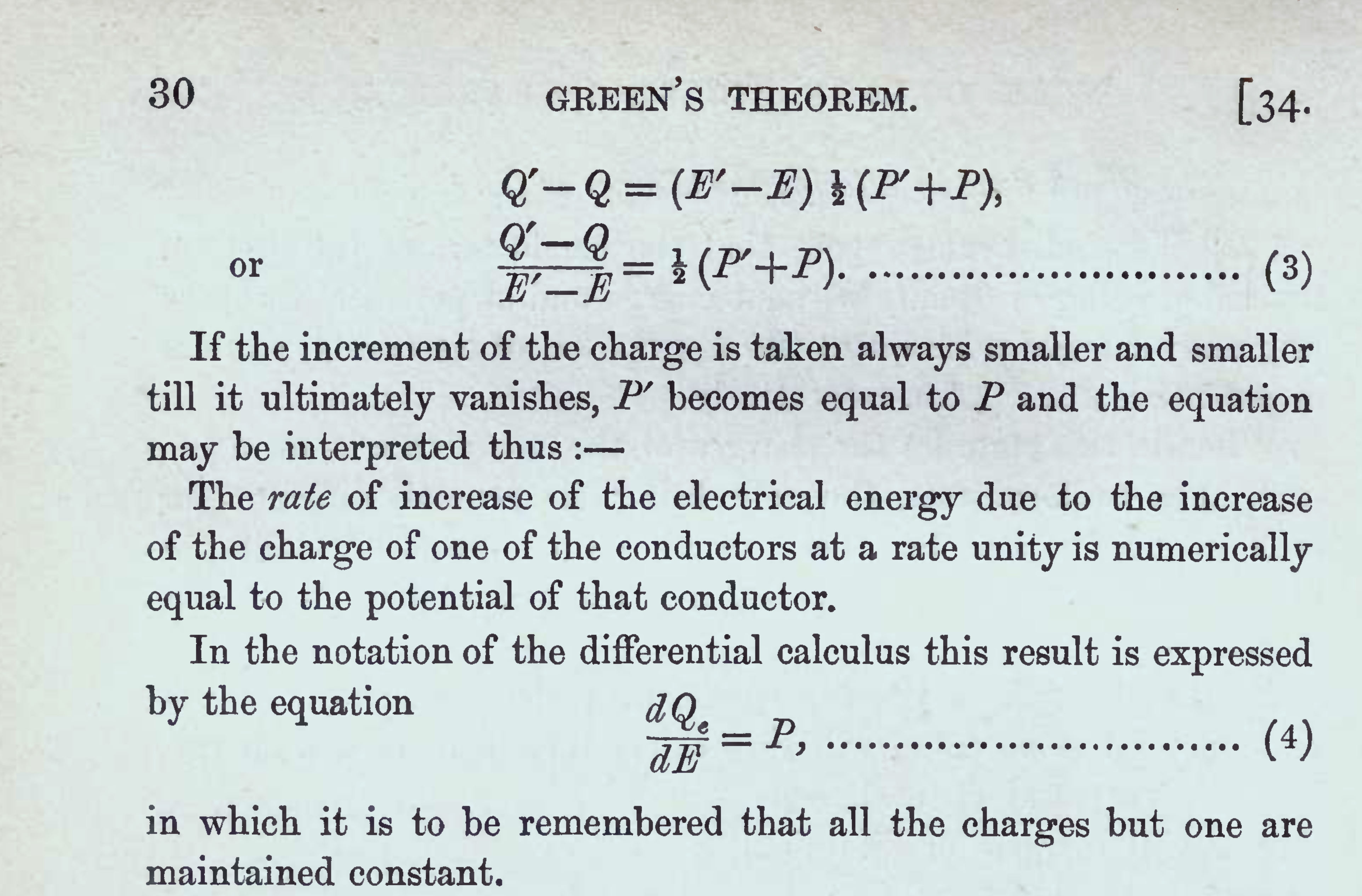
The contrasts are still there, of course, softened by the spreading ink. The serifs have been given brackets where they join the stems, so that they’re less likely to snap off during the printing process.
A more contemporary version of the same text looks like this:
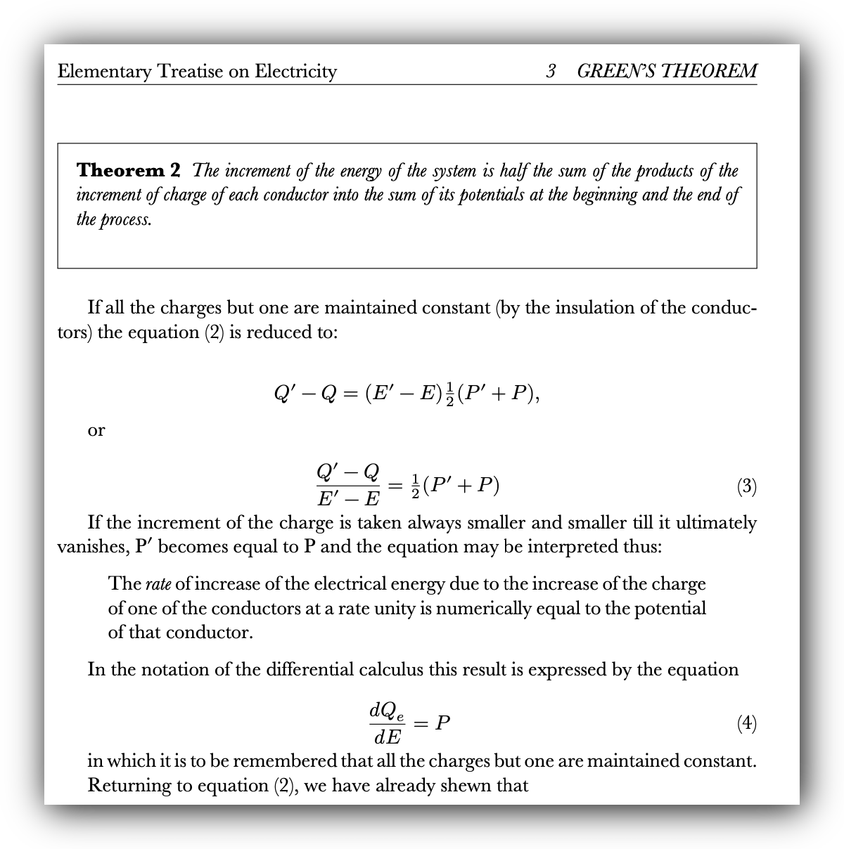
Which of these two do you prefer?
Type historians start to comment on the ugliness of the so-called “modern” fonts that appeared during the 19th century after the initial designs of Didot and Bodoni:
“the first modern faces designed around 1800 and 1810 are charming; neat, rational and witty. But from that time onwards nineteenth-century book types grow more and more depressing; the serifs grow longer, the ascenders and descenders grow longer, the letters crowd together; the normal mid nineteenth-century book is typographically dreary. The Victorians lost the idea of good type to read.” [5]
“the most lifeless, regular types ever seen”. [6]
“the types cut between 1810 and 1850 represent the worst that have ever been.” [7]
“ ... due to the contrast relation of heavy stems and thin hair-lines, the style [of Didot typefaces] results in low legibility”. [8]
During the 19th and 20th centuries, many books were typeset using “modern” (or “modern”-derived fonts such as Scotch Roman and Clarendon), but it was becoming out of fashion by the end of the century:
But typographic taste changes, and there have been significant reactions against modern. The Arts & Crafts printers of the turn of the century thought it degenerate, preferring to revive Medieval and Renaissance styles. Also rejecting modern as decadent, the proponents of the “new typography” championed sans-serif types in the 1920s and 1930s. [3]
In the 1930s, you could expect your mathematics text books to look like this:
Again, the printing process has reduced the contrast between the thin and thick strokes. The text is a bit cramped for modern tastes – but remember, printers have to save space to keep their costs down and profits up!
Donald Knuth
Donald Knuth, the creator of \(\TeX\) and Computer Modern, takes up the story:
My first book, Volume 1 of The Art of Computer Programming, came out in 1968, and Volume 2 was ready a year later.[9]
The first editions had been typeset using one of these “modern” fonts (US Monotype Modern 8A, or UK Monotype Modern no. 7) on a Monotype hot-metal compositing machine which stored the characters on:
a paper tape something like a player-piano roll; the paper tape was then used to control a special casting machine that produced individual pieces of type from hot molten lead. [9]
However, when it was time to print another volume, Knuth discovered to his dismay that the old machines had been sold (and that Eric, one of the few skilled math compositors in the world, had had to find a new job):
New machines based on photography began to replace hot-lead machines like the Monotype in the 1960s. The new machines created pages by exposing a photographic plate, one letter at a time, using an ingenious combination of rotating disks and lenses to put each character in its proper position. [9]
There were a number of competing systems being developed by the printing industry. All proprietary, of course, and fonts were encrypted to protect copyright.
Shortly after Volume 3 of The Art of Computer Programming came out in 1973, my publisher sold its Monotype machines and Eric had to find another job. New printings of Volume 1 and Volume 3 were published in 1975, correcting errors that readers had found in the earlier printings; these corrections were typeset in Europe, where Monotype technology still survived. [9]
The results of the new technology were disappointing:
My publishers found that it was too expensive in 1976 to produce a book the way it had been done in 1969. Moreover, the style of type that had been used in the original books was not available on photo-optical typesetting machines. [9]
But then:
in February 1977 I saw for the first time the output of a high-quality digital typesetter, which had more than 1000 dots per inch ... and it looked perfect, every bit as good as the best metal typography I had ever seen. Suddenly I saw that dots of ink will form smooth looking curves if the dots are small enough, by the laws of physics. [9]
Thus was born \(\TeX\), his computer-based typesetting system, and \(\mathsf{METAFONT}\), his font creation software.
Knuth based his first new font on the typeface his publishers had used for the first edition – Monotype Modern – and so he called his version Computer Modern. He tried projecting photographs of the book onto the wall, tracing over them in order to obtain the outlines for the glyphs. [10] Copying the outlines from printed specimens would introduce problems due to the fact that the ink-spread impressions could make letter shapes appear larger than the original lead type. He used his \(\mathsf{METAFONT}\) program to generate the fonts.
Here’s a comparison between a Monotype Modern (probably quite similar to the one used for the hot metal-printed version of Knuth’s books) and his Computer Modern. (This is probably a refined version of his first version, because he worked continuously on the font for years, and had assistance from type designers such as Herman Zapf and Matthew Carter. [11])
These are sharp SVG images – I would imagine that most early print-outs would have been inky-blurred:
Monotype Modern (left) ComputerModern (right):
The Julia code that made this figure:
tempfile = joinpath(@OUTPUT, "_d7.svg")
Drawing(2400, 1100, tempfile)
origin()
background("#ededed")
panes = Tiler(2400, 1100, 1, 2)

t = "“
Of course it is necessary that the mathematically-defined letters be beautiful according to traditional notions of aesthetics. Given a sequence of points in the plane, what is the most pleasing curve that connects them? This question leads to interesting mathematics, and one solution based on a novel family of spline curves has produced excellent [SIC] fonts of type in the author’s preliminary experiments.
” [Donald Knuth]"

@layer begin
    fontface("ModernMTStd-Extended")
    fontsize(40)
    bbx = BoundingBox(box(panes, 1)) * 0.9
    textwrap(t, boxwidth(bbx), boxtopleft(bbx), leading=66)
end

@layer begin
    fontsize(40)
    fontface("CMUSerif-Roman")
    bbx = BoundingBox(box(panes, 2)) * 0.9
    textwrap(t, boxwidth(bbx), boxtopleft(bbx), leading = 66)
end
finish()
tidysvg(joinpath(@OUTPUT, "_d7.svg"), joinpath(@OUTPUT, "d7.svg"))
Let’s output the same image in PNG, to see how it might look with the edges of the characters smoothed somewhat in the way that ink might spread on paper, or in the way that a lower-resolution device might show it.
Monotype Modern (left) ComputerModern (right) in PNG format:
The Julia code that made this figure:
tempfile = joinpath(@OUTPUT, "d8.png")
Drawing(2400, 1450, tempfile)
origin()
background("#ededed")
panes = Tiler(2400, 1450, 1, 2)

t = "“
Of course it is necessary that the mathematically-defined letters be beautiful according to traditional notions of aesthetics. Given a sequence of points in the plane, what is the most pleasing curve that connects them? This question leads to interesting mathematics, and one solution based on a novel family of spline curves has produced excellent [SIC] fonts of type in the author’s preliminary experiments.
” [Donald Knuth]"

@layer begin
     fontface("ModernMTStd-Extended")
    fontsize(70)
    bbx = BoundingBox(box(panes, 1)) * 0.9
    textwrap(t, boxwidth(bbx), boxtopleft(bbx), leading=86)
end

@layer begin
    fontface("CMUSerif-Roman")
    fontsize(70)
    bbx = BoundingBox(box(panes, 2)) * 0.9
    textwrap(t, boxwidth(bbx), boxtopleft(bbx), leading = 86)
end
finish()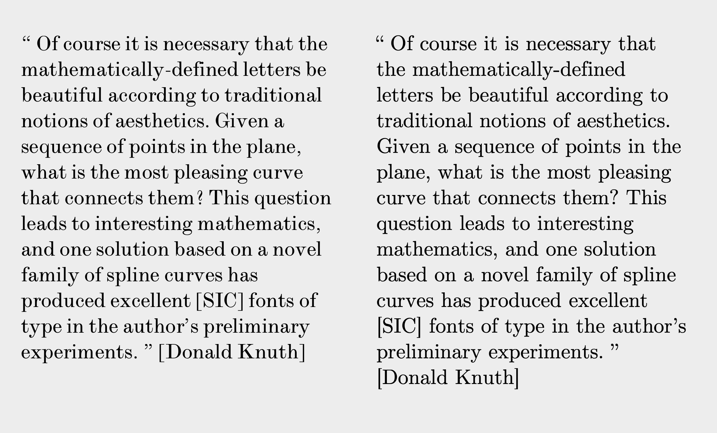
The Monotype Modern font my computer provides looks very crisp – but Computer Modern isn’t too different.
Monotype Modern (left) Computer Modern (right):
The Julia code that made this figure:
tempfile = joinpath(@OUTPUT, "_d9.svg")
Drawing(800, 300, tempfile)
origin()
background("#ededed")
translate(0, 50)
panes = Tiler(800, 300, 1, 5)
t = "Rome"

fontsize(110)
@layer begin
    fontface("ModernMTStd-Extended")
    bbx = BoundingBox(box(panes, 2))
    text(t, boxmiddlecenter(bbx), halign=:center)
end

@layer begin
    fontface("CMUSerif-Roman")
    bbx = BoundingBox(box(panes, 4))
    text(t, boxmiddlecenter(bbx), halign=:center)
end
finish()
tidysvg(joinpath(@OUTPUT, "_d9.svg"), joinpath(@OUTPUT, "d9.svg"))
In response to the criticisms that Computer Modern isn’t dark or heavy enough, it’s worth pointing out that the amount of “darkness” in a \(\mathsf{METAFONT}\) font could be parameterized, and different modes and settings could produce heavier, blacker fonts suitable for different printers. So, for example, if you knew that you were printing to an ACME 8000 printer on a certain type of paper, you could create a new font just for this task, adjusting the font’s weight settings for the best outcome. Something you can’t really do easily today, although OpenType technology has recently introduced features such as variable fonts and optical sizing.
Baskerville (left) Monotype Modern (right):
The Julia code that made this figure:
tempfile = joinpath(@OUTPUT, "_d10.svg")
Drawing(1200, 550, tempfile)
origin()
background("#ededed")
panes = Tiler(1200, 550, 1, 2)

t = "“
Given a sequence of points in the plane, what is the most pleasing curve that connects them? This question leads to interesting mathematics, and one solution based on a novel family of spline curves has produced excellent [SIC] fonts of type in the author’s preliminary experiments.
” [Donald Knuth]"

@layer begin
    fontface("Baskerville")
    fontsize(40)
    bbx = BoundingBox(box(panes, 1)) * 0.9
    textwrap(t, boxwidth(bbx), boxtopleft(bbx), leading=45)
end

@layer begin
    fontface("ModernMTStd-Extended")
    fontsize(40)
    bbx = BoundingBox(box(panes, 2)) * 0.9
    textwrap(t, boxwidth(bbx), boxtopleft(bbx), leading = 45)
end
finish()
tidysvg(joinpath(@OUTPUT, "_d10.svg"), joinpath(@OUTPUT, "d10.svg"))
Pros and cons
Academics and professionals are often generous and helpful to amateurs, and to people coming from other disciplines, but they can also be a bit snippy. And Knuth was proposing a maths-based, code-driven alternative (\(\mathsf{METAFONT}\)) to traditional methods of type design. So it’s not surprising that he encountered a bit of snark from the type design professionals.
Here are a few comments about the Computer Modern font from the denizens of typedrawers.com:
The only thing I personally would blend with Computer Modern is sulfuric acid, in order to dissolve it into oblivion.
terribly washed out and spindly. As I get older, I find it a real drag to wade through 20 pages set tightly in that font.
I went and read his piece, on ‘mathematical typography’. As I scroll down, I watched in horror how he seduced himself down the garden path of his empty formalism. I actually study some of his gobbledygook as part of my job, so I saw what he was getting at. It’s all wrong-headed. Why impose the axiom of invariance under rotations on a font shape? It’s not rigid-body mechanics, it’s type meant to be read at the same angle, horizontally, unrotated. Same goes for Axiom 4, Locality. Only someone who hasn’t designed a font himself would ignore that glyphs must work as a whole too – as a family– not just at small neighborhoods around a point. Axiom 6 is a dogmatic imposition ("circles are always best!"), not based in any evidence from the history of type. They’re all the same, these math-minded types – easily seduced by their own BS appearance of rigor, as if their little axioms could ever match empirical good sense, the wisdom of the masters, and the consensus of proven experts. If that “Consider a spherical cow” joke was ever a propos, it’s in this instance.
If you try telling the \(\TeX\) community that Computer Modern doesn’t really look very nice, or that the \(\TeX\) leading algorithm is bananas, or that DVI really wasn’t a good idea, you may not get a fair hearing.
If [Monotype] 8A was the face he was looking to imitate, then the less said about his attempt, the better. His spidery little font looks nothing like the alleged inspiration. Not a good look for Knuth.
Knuth – being a CS mind – needed to formalize letterforms, and was [mis]led by Zapf down the false path of expanded skeletons... even though Zapf’s own type tellingly doesn’t actually fall for that trap. With two huge names involved, it’s hard for most people to admit that the result is horrible.
the basic principles of \(\mathsf{METAFONT}\) are built around imitating the motion and behavior of the pen. And it doesn’t seem to do that quite well enough for one thing, and for another that’s not the kind of tool you want for every typeface.
Spindles and spiders
As for \(\TeX\) and \(\LaTeX\) users, some have very similar thoughts about Computer Modern. Here are a few comments from the tex.stackexchange.com.
CM has a very distinctive look that immediately marks a document as “created with TeX”. This is not good – a typeface should not draw attention to itself, but facilitate people reading the document.
I very much like the design of the Computer Modern fonts, except that the strokes (mostly the hairlines) are too thin and “spindly”, so not well suited to low-resolution devices like computer screens.
take a look at the New Computer Modern fonts for a modern OTF font, with full Unicode support, which come in a thicker “Book” weight.
Observe that Computer Modern almost looks “spindly” and thin next to the darker, less contrasty Times Roman
Times Roman (left) Computer Modern (right):
The Julia code that made this figure:
tempfile = joinpath(@OUTPUT, "_d11.svg")
Drawing(1200, 450, tempfile)
origin()
background("#ededed")
panes = Tiler(1200, 450, 1, 2)

t = "“
Of course it is necessary that the mathematically-defined letters be beautiful according to traditional notions of aesthetics. Given a sequence of points in the plane, what is the most pleasing curve that connects them? This question leads to interesting mathematics, and one solution based on a novel family of spline curves has produced excellent [SIC] fonts of type in the author’s preliminary experiments.
” [Donald Knuth]"

@layer begin
    fontface("Times-Roman")
    fontsize(28)
    bbx = BoundingBox(box(panes, 1)) * 0.9
    textwrap(t, boxwidth(bbx), boxtopleft(bbx), leading=33)
end

@layer begin
    fontface("CMUSerif-Roman")
    fontsize(28)
    bbx = BoundingBox(box(panes, 2)) * 0.9
    textwrap(t, boxwidth(bbx), boxtopleft(bbx), leading = 33)
end
finish()
tidysvg(joinpath(@OUTPUT, "_d11.svg"), joinpath(@OUTPUT, "d11.svg"))
In [La]TeX documents printed in the early 1980s, fonts look noticeably thicker than they do today. Something about the advent of modern laser printers and the disappearance of older printing technologies seems to have made the fonts appear thinner. Whatever the reason for the change, I prefer the thicker look in the old books and would like to recreate it in my own documents.
use
luatexand OpenType NewComputerModern or LatinModern and then experiment with thefakeboldparameter infontspec
The MLModern package was designed to address precisely this problem...
Use Latin Modern (
\usepackage{lmodern}), the updated version of Computer Modern. It looks a bit less spindly on screen and print than the original, in my opinion.
Latin Modern ... Very much like Computer Modern, but with many more glyphs
And so on... There are (this being the world of open source) a plethora of variants and versions of the Computer Modern font idea, some made with \(\mathsf{METAFONT}\), others made with standard interactive font design software.
Computer Modern (left) Latin Modern (right):
The Julia code that made this figure:
tempfile = joinpath(@OUTPUT, "_d12.svg")
Drawing(1200, 450, tempfile)
origin()
background("#ededed")
panes = Tiler(1200, 450, 1, 2)

t = "“
If the Computer Modern typefaces have any merit, the credit should go to Zapf, Carter, Southall, Billawala, Bigelow, Holmes, and the anonymous original designer of Monotype 8A. I have tried to translate some of their wisdom into precise mathematical expressions. On the other hand, if these typefaces have deficiencies, the blame should be directed at me, because I did not always do what I was told.
” [Donald Knuth]"

@layer begin
    fontface("CMUSerif-Roman")
    fontsize(28)
    bbx = BoundingBox(box(panes, 1)) * 0.9
    textwrap(t, boxwidth(bbx), boxtopleft(bbx), leading=33)
end

@layer begin
    fontface("LMRoman12-Regular")
    fontsize(28)
    bbx = BoundingBox(box(panes, 2)) * 0.9
    textwrap(t, boxwidth(bbx), boxtopleft(bbx), leading = 33)
end
finish()
tidysvg(joinpath(@OUTPUT, "_d12.svg"), joinpath(@OUTPUT, "d12.svg"))
There have also been criticisms of individual glyphs, too – another mark of the open-source community, who are passionate about details and achieving perfection. Knuth himself continuously tuned and adjusted the glyphs, and occasionally criticized them himself:
Four years ago I redesigned the Greek lowercase delta and I made the arrowheads darker. I didn’t change anything in the way \(\TeX\) operates — all the dimensions and the characters’ heights and widths stayed exactly the same. But I did tune up a lot of the characters. Still I see lots of math journals are still using the old ones from four years ago, and I get letters and preprints from people with the old-style delta. I changed it because I just couldn’t stand the old versions. [...] there’s a reference saying, “Important notice for all users of TeX” ; and that page says “Look at the lowercase delta and if you have the wrong one, you die!” [9]
The arithmetic operators (multiplication sign U+00D7, minus sign U+2212, division sign U+00F7) look a bit skinny to me:
Computer Modern:
The Julia code that made this figure:
tempfile = joinpath(@OUTPUT, "_d13.svg")
Drawing(800, 200, tempfile)
origin()
background("#ededed")
translate(0, 40)
panes = Tiler(800, 200, 1, 1)
t = "1 × −2 == −4 ÷ 2"

fontsize(80)

@layer begin
    fontface("CMUSerif-Roman")
    bbx = BoundingBox(box(panes, 1))
    text(t, boxmiddlecenter(bbx), halign=:center)
end
finish()
tidysvg(joinpath(@OUTPUT, "_d13.svg"), joinpath(@OUTPUT, "d13.svg"))
That minus sign looks like it’s waiting for some digits to arrive so that it can have a fraction party. Times Roman looks better here. But I’m no mathematician...
Times Roman:
The Julia code that made this figure:
tempfile = joinpath(@OUTPUT, "_d14.svg")
Drawing(800, 200, tempfile)
origin()
background("#ededed")
translate(0, 40)
panes = Tiler(800, 200, 1, 1)
t = "1 × −2 == −4 ÷ 2"

fontsize(80)

@layer begin
    fontface("Times-Roman")
    bbx = BoundingBox(box(panes, 1))
    text(t, boxmiddlecenter(bbx), halign=:center)
end
finish()
tidysvg(joinpath(@OUTPUT, "_d14.svg"), joinpath(@OUTPUT, "d14.svg"))
But Computer Modern will overtake the others when you start writing real maths. Computer Modern was for many years the only \(\LaTeX\) font family that had full math support, and obviously you’ll choose symbol support over font quality...
Titles
Using ComputerModern in headings and titles is quite common in many \(\LaTeX\) documents. There are various ways of indicating the hierarchy of a document (eg titles : headings : subheadings : paragraphs), and, while varying the font size is an obvious approach, I think graphic designers these days are quite fond of varying the font and weight as well or instead. (Is it possible that LaTeX users don’t find it as easy to change fonts as users of more mainstream graphic design software do?)
Titles: ComputerModern (left), Avenir and Baskerville (right)
The Julia code that made this figure:
tempfile = joinpath(@OUTPUT, "_d15.svg")

Drawing(1200, 650, tempfile)
origin()
background("#ededed")
panes = Tiler(1200, 650, 1, 2)

title = "This is a heading"
para = "But typographic taste changes, and there have been significant reactions against modern. The Arts & Crafts printers of the turn of the century thought it degenerate, preferring to revive Medieval and Renaissance styles. Also rejecting modern as decadent, the proponents of the \"new typography\" championed sans-serif types in the 1920s and 30s.
Despite periodic reactions against it, the modern style has a stern beauty that continues to attract the attention of typographers even in our computer era. Revivals of the cuts of Bodoni, Didot, and Walbaum are available on most digital typesetting systems. and type designers have explored the idiom with fresh vision. Adrian Frutiger’s Iridium is a lively evocation of the potentials of modern for photocomposition: Herman Zapf’s Marconi is an elegant modern designed for digital composition: and Donald Knuth’s Computer Modern, the subject of this book. is a reinterpretation of Monotype Modern No. 8A.
In letterpress printing, modern fonts were technically troublesome because their delicate hairlines and serifs were particularly susceptible to damage; the broken letters produced a degraded text image. In digital typesetting with sufficient resolution. the delicate forms of modern can be rendered precisely. "

@layer begin
    fontface("CMUSerif-Roman")
    fontsize(40)
    pt = text(title, boxtopleft(BoundingBox(box(panes, 1)) * 0.8), halign=:left)
    fontsize(18)
    textwrap(para, panes.tilewidth, pt + (0, 40), rightgutter=100, leading=22)
end

@layer begin
    fontface("AvenirNext-Bold")
    fontsize(28)
    pt = text(title, boxtopleft(BoundingBox(box(panes, 2)) * 0.8), halign=:left)
    fontsize(18)
    fontface("Baskerville")
    textwrap(para, panes.tilewidth, pt + (0, 30), rightgutter=100, leading=22)
end

finish()
tidysvg(joinpath(@OUTPUT, "_d15.svg"), joinpath(@OUTPUT, "d15.svg"))
To my eye, the one on the right looks better and more commonly used, but it’s personal taste, and there’s no single “correct” approach.
Deep learning
Almost as soon as we learn to walk, we start training the font analysis routines in our brain, and continue to do so for decades. Unless you’re a child prodigy and read mostly old maths books and \(\LaTeX\) papers as you were growing up, you trained your brain mostly on old-style and traditional fonts such as Times, Garamond, Baskerville, and similar, plus a good sprinkling of sans-serif fonts. (If you’re young enough, there were all those handouts in Comic Sans that your teachers gave you in school. And those massive Harry Potter books were probably set in old-style Garamond.) I’ll guess that the example shown at the left corresponds to what your brain thinks is “normal” and “typical” for a text paragraph. Your brain is so quick at recognizing fonts that you’ll immediately sense that something is wrong with the example on the right:
Baskerville and Baskerville, but there’s something wrong....
The Julia code that made this figure:
tempfile = joinpath(@OUTPUT, "_d16.svg")

Drawing(1200, 550, tempfile)
origin()
background("#ededed")

panes = Tiler(1200, 550, 1, 2)

t = "“
Of course it is necessary that the mathematically-defined letters be beautiful according to traditional notions of aesthetics. Given a sequence of points in the plane, what is the most pleasing curve that connects them? This question leads to interesting mathematics, and one solution based on a novel family of spline curves has produced excellent [SIC] fonts of type in the author’s preliminary experiments.
” [Donald Knuth]"

@layer begin
    fontface("LibreBaskerville-Regular")
    fontsize(24)
    bbx = BoundingBox(box(panes, 1)) * 0.9
    textwrap(t, boxwidth(bbx), boxtopleft(bbx), leading=40)
end

@layer begin
    # Baskerville font with the "e" replaced with the Comic Sans one
    fontface("BaskervilleComic")
    fontsize(24)
    bbx = BoundingBox(box(panes, 2)) * 0.9
    textwrap(t, boxwidth(bbx), boxtopleft(bbx), leading = 40)
end
finish()
tidysvg(joinpath(@OUTPUT, "_d16.svg"), joinpath(@OUTPUT, "d16.svg"))
I wonder whether most people would typically expect to see this type of text (the left example) when they open a book...
Output
The most common complaint about Computer Modern from both pros and users is that the font is too thin and has too much contrast – I think this is what those frequent repetitions of “spidery” and “spindly” are saying. Is this because the higher contrast of all the “modern” fonts makes the font less impactful on the page? Does it just suffer more than other fonts when printed or displayed at higher resolutions because of the higher contrast?
In digital typesetting with sufficient resolution. the delicate forms of modern can be rendered precisely. [3]
Knuth was working before the age of PostScript and high-resolution devices. His \(\mathsf{METAFONT}\) maths-based approach to type design didn’t become the standard way of designing fonts – you won’t find mathematicians and font designers sharing a workstation, passing equations to each other. His work pre-dates the main stream desktop-publishing revolution in the 1980s, with Adobe and Apple developing fonts based on PostScript and on-screen rasterizers, and he would have been pleased to output documents on a – by today’s standards – modestly capable Apple laser printer.
So while Computer Modern was initially designed with ink-on-paper in mind, today’s fonts have to work everywhere. Who knows whether the carefully-designed pages of your thesis are going to be viewed on a high-resolution iPad screen in a PDF, or printed out on the department’s old 300dpi laser printer, or despatched to a high-end imagesetter (with resolutions these days approaching 3000 dpi), or viewed on a cheap mobile phone, or churned out on 1000s of sheets of dead tree in cheap black ink by a large publishing house? How could a single choice of typeface work in all those different situations? It would be like packing clothes for a holiday without knowing your destination.
Obviously everyone who makes documents knows this:
Heavier weight makes the type more resilient to xeroxing and easier to read in a poorly lighted library, so these new typefaces may help solve some of the legibility problems we all know too well. [9]
Later I noticed that the infinity sign ‘∞’ of Computer Modern was too light to be a good match for the Euler alphabets, so I created a darker version. [9]
While “modern” fonts are still popular for display purposes and, especially, fashion brands, they’re not used much today for text that’s designed to be read. I browsed through a bunch of newly published books in the local book store and didn’t find a single one that was set in a “modern” font. And the only book I could find at home with high-contrast body text was an old copy of Fowler’s English Usage from 1926. For body text, most books printed in the last 50 years use oldstyle fonts such as Bembo and Garamond and others, based on typefaces designed in the 14th and 15th centuries, rather than the more recent “modern” ones.
Nostalgia ain’t what it used to be
We have a complicated relationship with the past. There’s “nostalgia” and “retro”, and “if it was OK for our grandparents it’s OK for us”. But there’s also “old-fashioned” and “out-dated”, “moribund”, and “OK Boomer!”.
Computer Modern, once a good compromise between nascent technology and the available printing machinery, now looks old-fashioned because it resembles old books rather than new ones, and it’s rarely used for typesetting text outside of the \(\LaTeX\) community. It works best when printed in ink onto reasonable (but not too high) quality paper stock, to smooth out the sharp edges. It’s less attractive when thrown onto high-resolution displays that are increasingly common.
It can sometimes be a bit of a dilemma – when you publish a written piece, you have a choice: format it in a way that satisfies your own taste and looks right to your eyes, or design it so that other people enjoy seeing it from their perspective. Or find some kind of compromise... Of course, you have no idea how others will view your writing. For example, unless you’re reading this post on a 2017 27" iMac in a Safari (v16.3) browser window with no modifications, I have no idea what it looks like to you.
Leaving aside the issues of math typesetting and symbol availability – if you want your text to absorb some of the authority of historical technical publications, and you're not as famous as Donald Knuth, using an old-school “modern” font might boost your chances. Otherwise, for online and printed use (assuming the display isn’t from the 1990s) you could either find a better and darker version of the classic Computer Modern font, Or use any of the better replacements which never look spindly or old-fashioned. Baskerville, Bembo, Palatino, Times, Garamond, Charter, and similar – they might not have “modern” in the name, but are far more widely used and read today, and will look great to all readers, not just old-school \(\LaTeX\) aficionados!
[2023-06-22]

| [1] | I’m focussing on English fonts and my personal reading experiences here. |
| [2] | John Baskerville, preface to Milton’s “Paradise Lost” (1758) |
| [3] | Charles Bigelow in Knuth, Donald, "Computers and Digital Typography", Volume E, |
| [4] | Elementary Treatise on Electricity, James Clerk Maxwell, 1881 https://archive.org/details/elementarytreati00maxw |
| [5] | Gray, Nicolete (1976). “Nineteenth-century Ornamented Typefaces.” |
| [6] | Ovink, G. Willem (1973). “Review: Jan van Krimpen, A Letter to Philip Hofer”. Quaerendo: 239–242. doi:10.1163/157006973X00237. |
| [7] | Morison, Stanley (1937). “Type Designs of the Past and Present” |
| [8] | Sofie Beier’s thesis on font legibility at https://researchonline.rca.ac.uk/957/1/Sofie_Beier_Typeface_Legibility_2009.pdf |
| [9] | Knuth, Donald, “Digital Typography”, 1999 |
| [10] | “Another piece of luck came my way in 1984, when I learned that the original bronze patterns used to make the molds of Monotype 8A were in San Francisco. For years I had been working with indirect and imprecise information about the fonts that had stimulated this work. First I had worked from photographic blowups of letterpress original pages from The Art of Computer Programming; then Richard Southall had prepared enlargements from original proofs he had located in England. At last I found the actual 80-vear-old patterns that had generated the metal type. The present owner of these patterns, Mr. Othmar Peters, kindly consented to let me borrow them while I was preparing the final draft of Computer Modern, and I learned much by measuring them with calipers. It never was my intention to make a slavish copy of any particular typeface, but the chance to work with these real artifacts made it possible to understand many of the intentions of the original designer.” Knuth, Donald, “Computers and Digital Typography”, Volume E, February 1986 |
| [11] | “If the Computer Modern typefaces have any merit, the credit should go to Zapf, Carter, Southall, Billawala, Bigelow, Holmes, and the anonymous original designer of Monotype 8A. I have tried to translate some of their wisdom into precise mathematical expressions. On the other hand, if these typefaces have deficiencies, the blame should be directed at me, because I did not always do what I was told.” Knuth, Donald, “Computers and Digital Typography”, Volume E, February 1986 |