Challenged to write about a single Unicode character, I chose the humble asterisk. In this post, Julia takes a back seat but it’s working hard behind the scenes. [1] The font used for the examples is JuliaMono.
Asterisk
The asterisk has a long history. The first appearance of this simple mark was probably on a cave wall somewhere, but we like to assign inventions to known individuals, so the inventor of the asterisk was: Aristarchus of Samothrace, in about 200 BCE.
I was disappointed that this wasn’t the other Aristarchus, Aristarchus of Samos, the famous mathematician with an interest in astronomy, because ἀστερίσκος means “little star”. The man from Samothrace however was a librarian, scholar, critic, and proofreader, who liked to make numerous marks (*) in the margin of texts and manuscripts, like notes, queries, and critical comments.

As well as writing little stars in the margin he also used other marks, such as the one we now call the reference mark (\u203b)*.

This use of the asterisk and related marks has continued right up to the present day. Medieval scribes and scholars used a range of symbols to indicate their marginal annotations, and these continued as the printing revolution superseded hand-written manuscripts. Marginal notes were often replaced by footnotes, and the asterisk and dagger were the primary two symbols used for indicating these.

Another name for the dagger was the obelisk, hence the comic book characters Asterix and Obelix (which are probably familiar to you if you grew up in Europe).
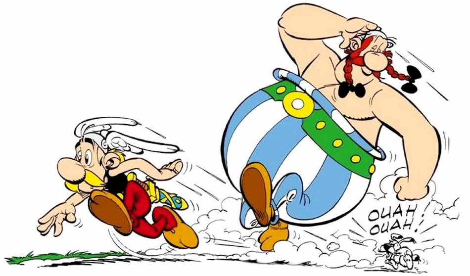
If you’re writing a book, you can re-use these two indicators on every page, but if you want more than two footnotes on the same page, you have to reach into some of the less rarely seen marks, such as the double dagger (a ‘diesis’); the triple dagger; the section sign; the pilcrow; the ‘parallel to’; and the asterism.

Medieval scribes, and readers who enjoy writing in the margins of books, can get carried away with the possibilities. The pointing hand or manicule* is also seen in the margins of manuscripts, and adds some human interest to the dullest of scriptural documents.
* also called the printers’ fist
If you run out of symbols, you might have to start doubling up on them. A heavily-footnoted page could work through the following:

But by now you’re probably using too many footnotes on a single page. It could be time to switch to numbered footnotes, numbered from 1 to n for the whole chapter rather than starting at 1 on each page. These days, we can leave it to the software (such as \( \LaTeX \) or, for this web page, Franklin [2]) to do that for us.
Aspersion
To this day, the word “asterisk” carries with it a few additional meanings derived from its history as a pointer to important additional content. It’s used in advertising, to indicate the presence of small print which you should probably read – but perhaps they hope you don’t. In American journalism, often dominated by sport and politics, the word “asterisk” has come to mean “no, you’d better read more about this before you decide what to think”. It was famously applied to George W Bush after his disputed “victory”* in the 2000 US presidential election, when the cartoon strip Doonesbury started featuring Bush as a literal asterisk.
* Bush got fewer votes than Al Gore in Florida, but still won there.
I originally thought this cartoon was written by a chap called Doonesbury, because the signature isn't very legible. But I've since learned he's called Trudeau.
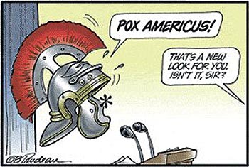
In baseball, there's always talk of asterisks set against players’ recorded achievements. According to the New York Times, the US Tennis Open this year (2020) should be called “The Asterisk Open”, because of the many players who couldn’t attend, and so the winner isn’t the best player.[3]
Another famous bearer of the insinuating asterisk is drug-peddler and bike-pedaller Lance Armstrong.

So the word itself has picked up a bit of a smell.
Asterisk assessment
So far, this is the history of the asterisk as told in books and web pages. Keith Houston’s excellent book Shady Characters [4] covers the history of most of the punctuation marks in great detail. But his chapter on the asterisk concentrates entirely on the asterisk’s use as a footnote indicator, and ends more or less here.
Today we're used to seeing it used for many more things than footnotes, such as multiplication. In mathematics, various symbols have been used for multiplication, although the default operation is multiplication: for mathematicians, if you place two symbols in intimate contact, they’ll naturally multiply without needing any help from a third symbol.
The Julia language allows for implicit multiplication between numbers and variables:
julia>

julia> x = 2
2

julia> 2x
4
although Python doesn’t:
% python
Python 3.8.1 (default, Mar  8 2020, 13:39:36)
[Clang 10.0.0 (clang-1000.11.45.5)] on darwin
Type "help", "copyright", "credits" or "license" for more information.
>>> x = 2
>>> 2x
File "<stdin>", line 1
2x
^
SyntaxError: invalid syntax
>>>
Most languages use * for multiplication. Mathematica* is more capable than most. Spaces denote multiplication, but you can also use a * for multiplication if you want to.
Let's go back in time again, to see how the asterisk started this journey.
Galileo Galileo
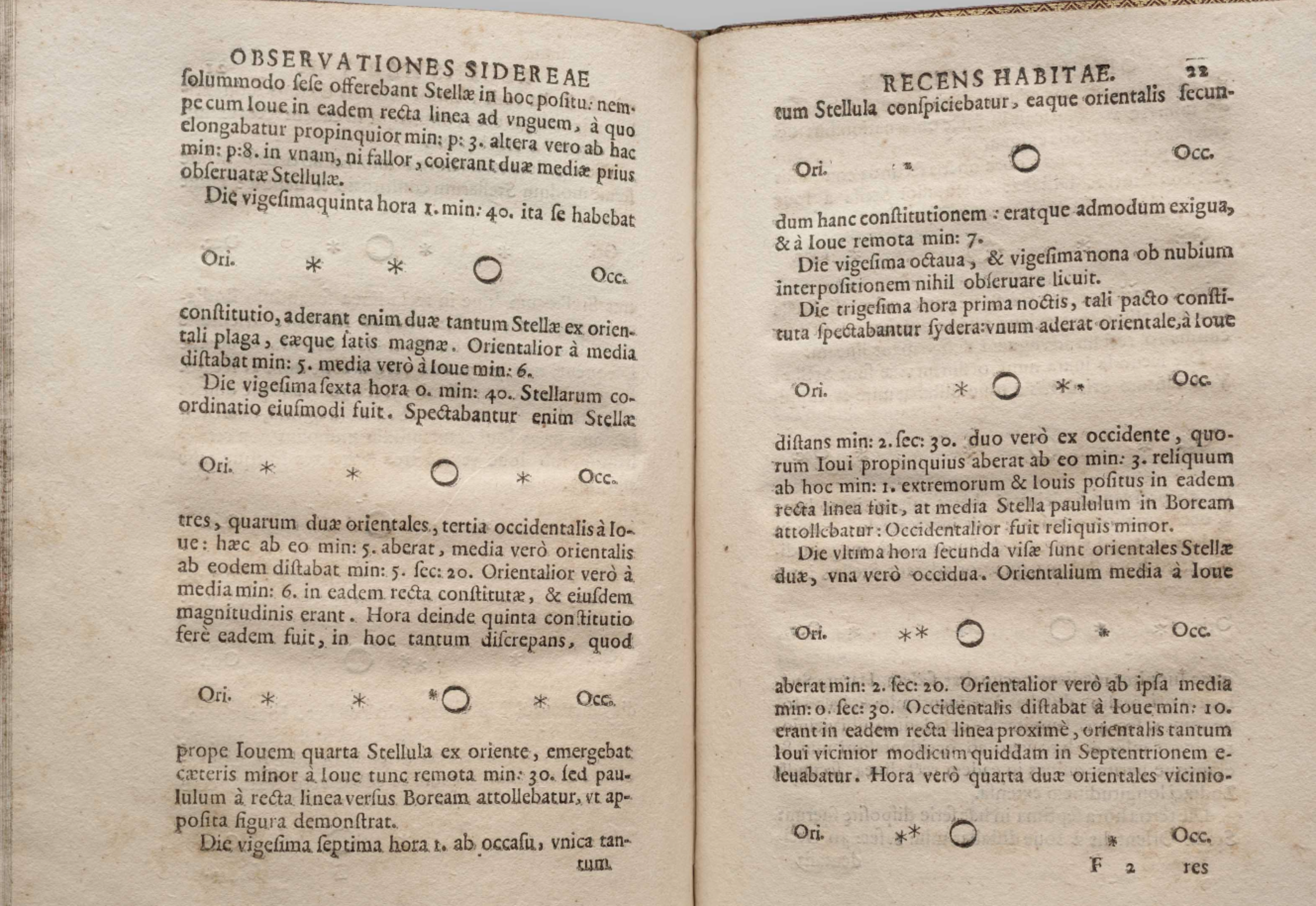
Up to the 1600s, the asterisk was used mainly for footnotes and decorative purposes in scientific books. For example, it finds its astronomical roots in the famous publication by Galileo, Sidereus Nuncius, the Sidereal (Starry) Message, printed in 1610.
These asterisks show what Galileo called the Medicean Stars, which we now call the Galilean Moons, orbiting Jupiter.*
Symbols
Science, and mathematics, the language of science, had gradually developed from medieval manuscripts written in elaborate Latin sentences to printed books embroidered with algebraic symbols. Mathematics moved away from the wordy descriptive approach to a more algebraic style.*
From the 1500s on, various authors enthusiastically promoted new syntax and probably hoped that their favourite symbols would take hold and become standard. No doubt the printers of mathematical books were happy to add the cost of designing, punch-cutting, and hot-lead-moulding all those extra new pieces of type to the final invoice.*
In 1668, the Swiss author Johan Heinrich Rahn was the first to introduce the asterisk to indicate multiplication, in his algebraic treatise Teutsche Algebra.
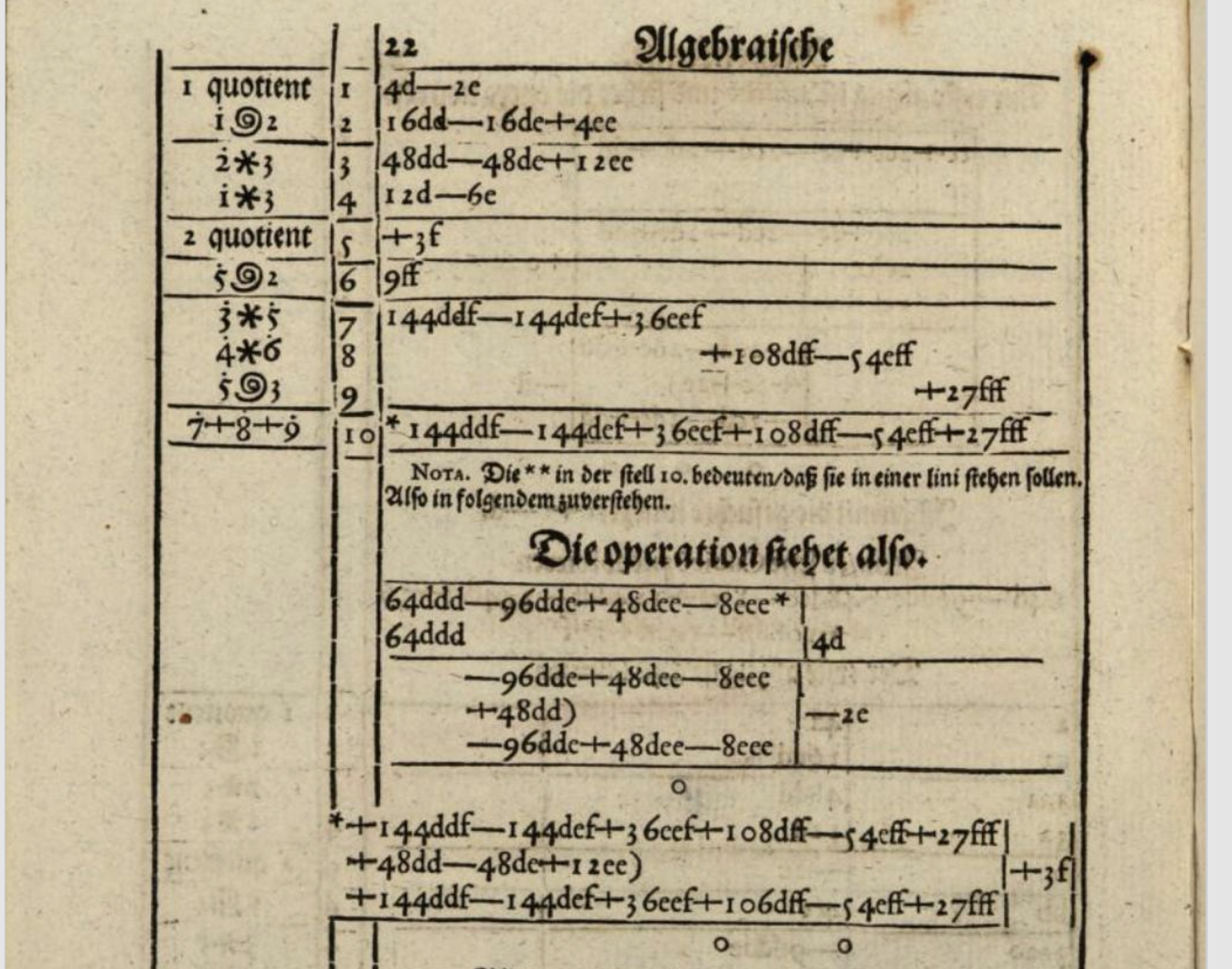
That spiral character denotes ‘involution’ (an old word for exponentiation). His book also contains, on another page, the first printed use of the division symbol ÷.
Until recently, Rahn’s score had been: won 1, lost 1. The multiplying asterisk didn’t catch on at all at the time, although his division sign did.
The saltire
Earlier, in 1631, William Oughtred[6]* had published the Clavis Mathematicae, The Key to Mathematics, and this famous textbook, with its profusion of new symbols, was very influential and studied by many, including the young Isaac Newton.
Oughtred’s book popularized the saltire, a rotated plus sign, for use as the visible multiplication symbol. Here’s the first time it appeared in print:
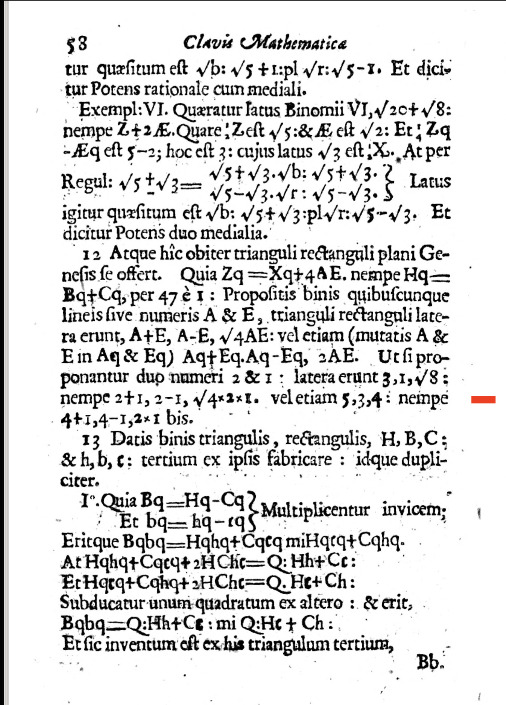
In the hands of this typesetter, it’s quite small compared with the other operators. It wouldn't easily be confused with the usually seriff-ed letter X.
Here's ×, the times sign (\u00d7), and the saltire:

Sadly, × doesn’t work as a multiplication sign in Julia, although it’s easy enough to make it work:
julia> const × = *
* (generic function with 385 methods)

julia> x = 3 × 4
12

julia> a = "hello" × "world" # ⁉
"helloworld"
I don't know if there are any unexpected side effects when doing this.
Leibniz
The influential mathematician and philosopher Gottfried Leibniz didn’t like Oughtred’s saltire symbol, and wrote to Bernoulli in 1698:
I do not like the
×symbol as a symbol for multiplication, since it is easily confounded withx; … often I simply relate two quantities by an interposed dot and indicate multiplication withZC ⋅ LM.
The saltire probably found more favour in England than Germany. Newton adopted it, doubtless after seeing a need for it. Here’s the first edition of his Principia Mathematica[7], published in 1687.
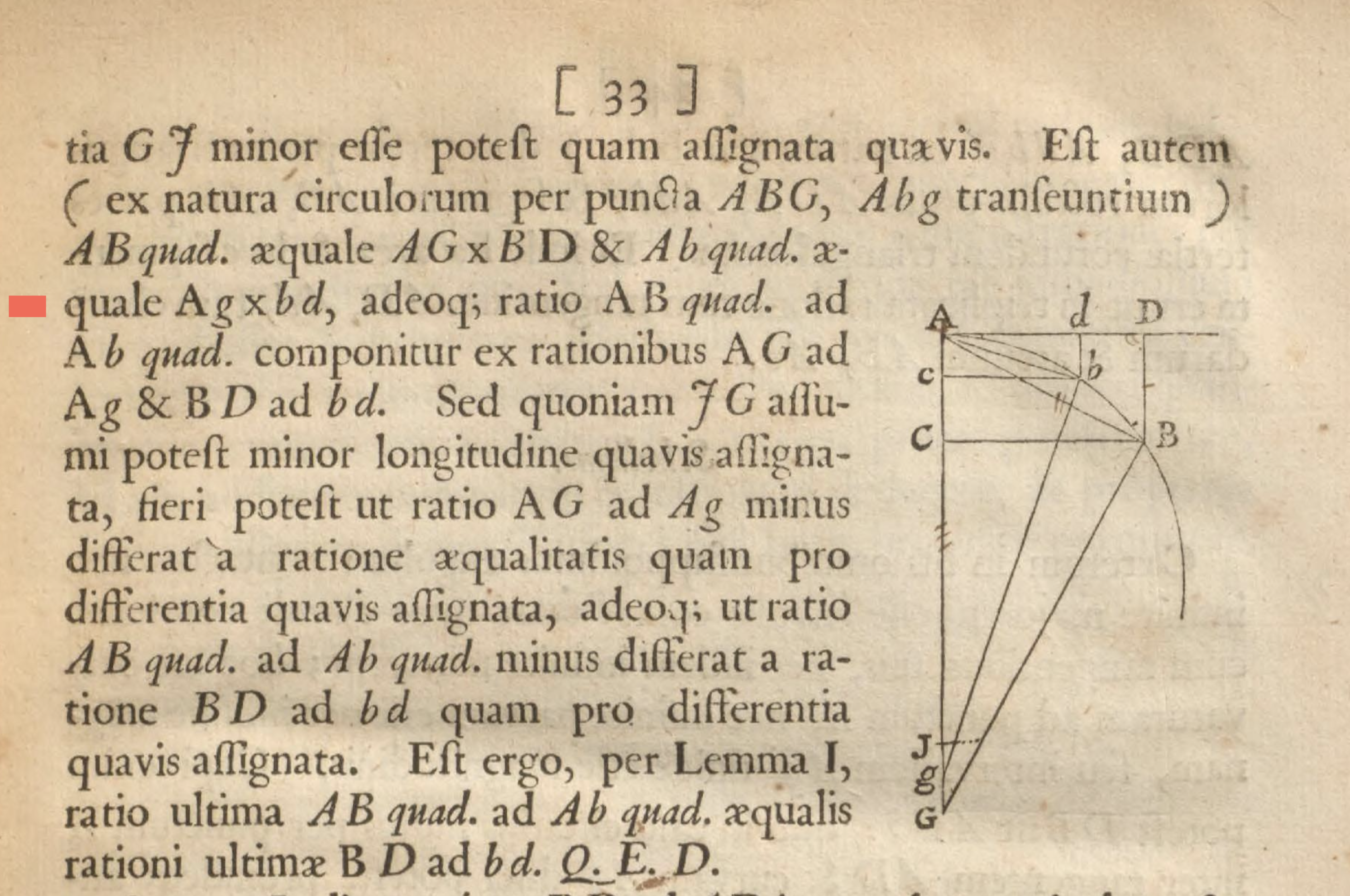
I’d say Leibniz definitely has a ‘point’ here, because Newton's used a lowercase x as a surrogate saltire, although to be fair he doesn't often use x as a variable. But in the revised 1723 edition, Newton improves most of his font choices*:
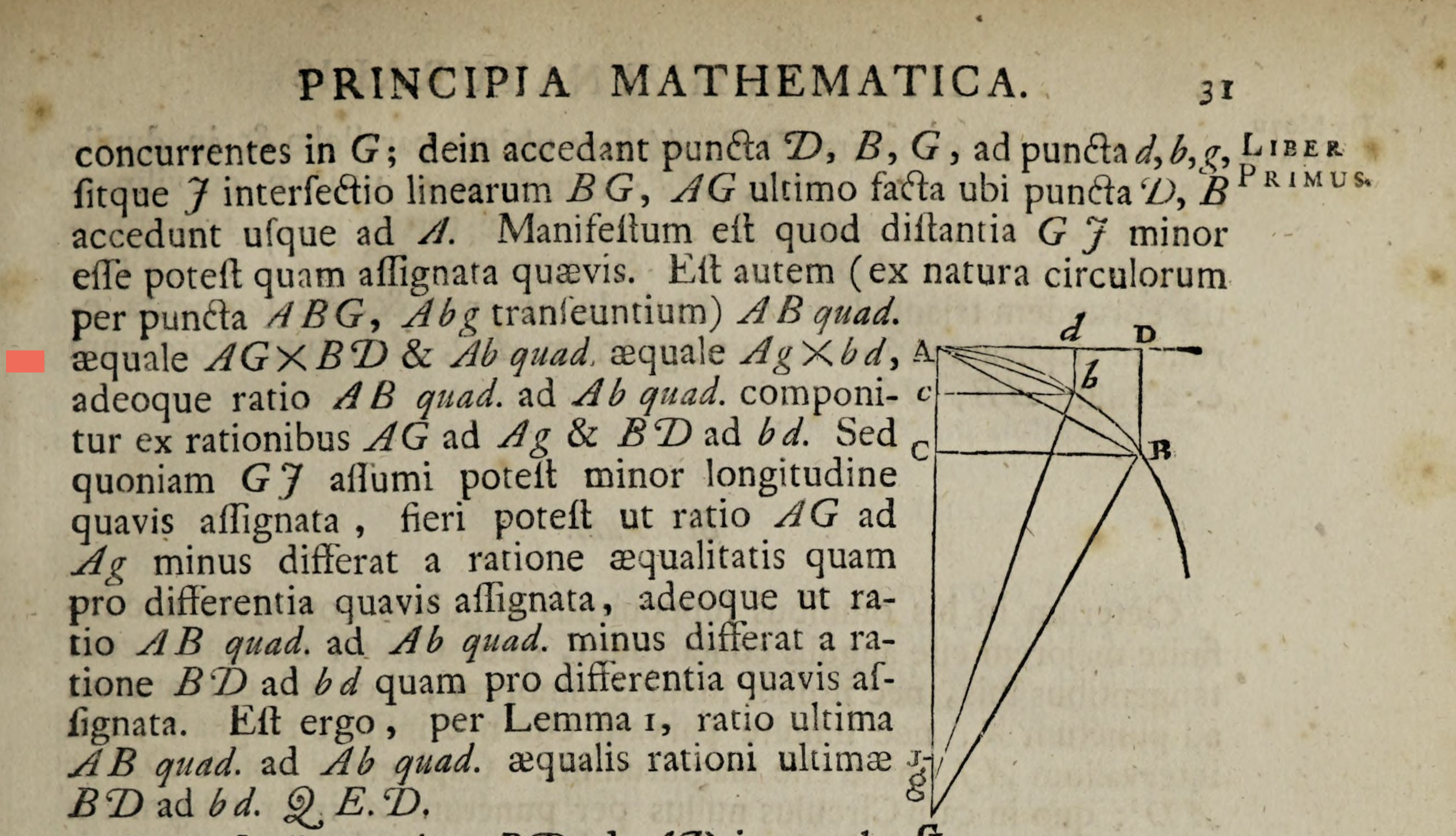
Now the saltire is much larger and, without the serifs used for most mathematical printing at the time, is less likely to be confused with an X of any size.
More so than Oughtred and Rahn, Leibniz was very influential: he popularized the dx/dy notation, the integration symbol, the multiplication dot, signs for congruence and similarity, and many more, and even used an asterisk for the occasional multiplication.
Too useful
In general, though, the multiplying asterisk wasn’t often used in most mathematics (as opposed to arithmetical) texts, and was more likely to be used to indicate footnotes or for other more specialized uses. If multiplication was required, Leibniz’ dot was considered sufficient. Mathematical symbols for common operations had largely been agreed upon.
The asterisk was too useful and recognizable a symbol to be left in the dusty corner of the upper case, kept just for occasional multiplication duties
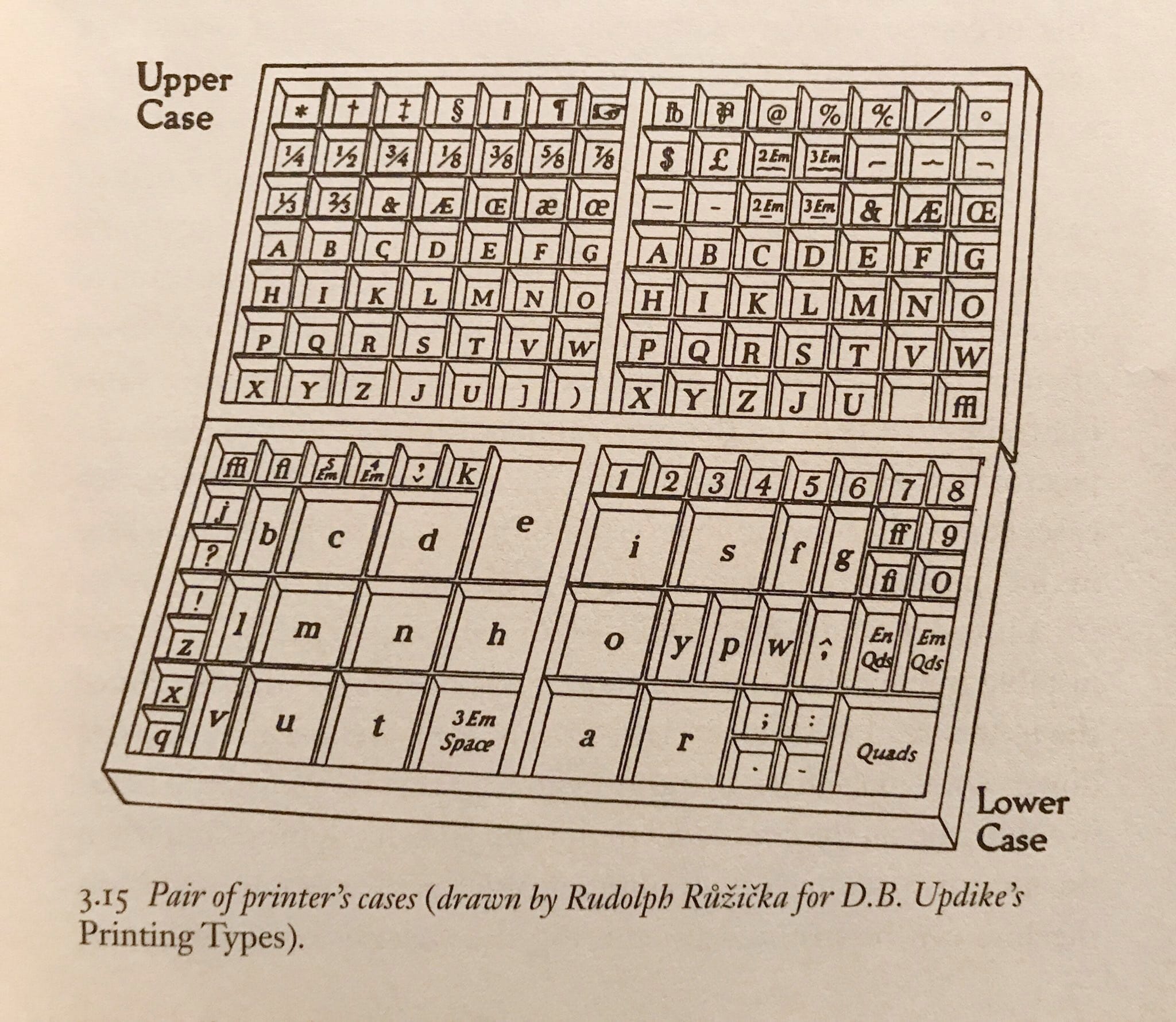
or for the occasional footnote. Mathematicians adopted it for all kinds of things. In 1774, one J B Basedow used an asterisk to indicate factorial: so 5* = 5.4.3.2.1. Later, it found many other more specialized uses:
A*is the conjugate transpose of AV*is the Dual space of vector space VR*is the Reflexive closure of relation Rz*is the Complex conjugate of zin the
A*algorithm, the*is a wildcard (there were algorithms called A1 and A2, soA*includes all possible versions)R*is the set of numbers without zeroQ*is the set of numbers without zeroC*is the set of complex numbers without zero*is (noncommutative) string concatenation in Julia
and so on.
That d**n **terisk
The asterisk also took over some of the jobs formerly done by the dash (—). Dashes were often used in 19th century fiction to indicate a pause, or an omission, and sometimes to imply that real names were being concealed to avoid legal problems (a clever way to add realism to a story). (The humble dash has of course been been extensively studied by scholars [8].)
The dash's task of indicating omission has gradually been taken over by the asterisk. In more modern times, it allow writers to use swear* words that the printers aren't brave enough to show in full, as this page from the New Zealand Sunday Star demonstrates.

Perhaps this is where the use of * as the wild-card character comes from. I find regular expressions can induce swearing, occasionally.
Typewriters and teleprinters
The rapid rise of the typewriter in the 1860s with its restricted character set meant a few symbols had to go, since the typewriter wasn’t able to inherit everything from the printer’s type cases.
The first machines had just uppercase letters. And models were often shipped that didn't have keys for 1 (just use an l), 0 (just use an O) or ! (just use a ' then type a backspace and then type a . underneath). But the technology progressed, and ingenious double-shift key machines such as the Corona 3[9] were able to produce most of the characters we would expect to see:
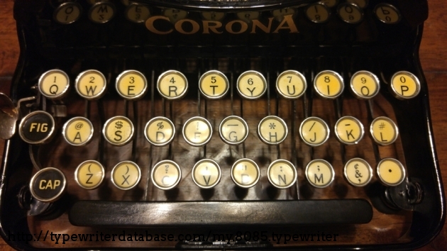
But very few machines carried a times (×) key, so you would have to use the letter “x” or the “*”. And some machines didn’t even have an asterisk – presumably you had to fake that by overtyping an x and | and -, or something similarly inventive.
Using typewriting technology to do mathematical typesetting requires some work. The book seen in the following image was published in 1978, coincidentally the same year that Donald Knuth introduced the \( \TeX \) software that would eventually make such efforts unnecessary. It puts the Courier typeface, a frequent presence on the IBM Selectric typewriter before it took up residence on the world’s laser printers, through its paces.
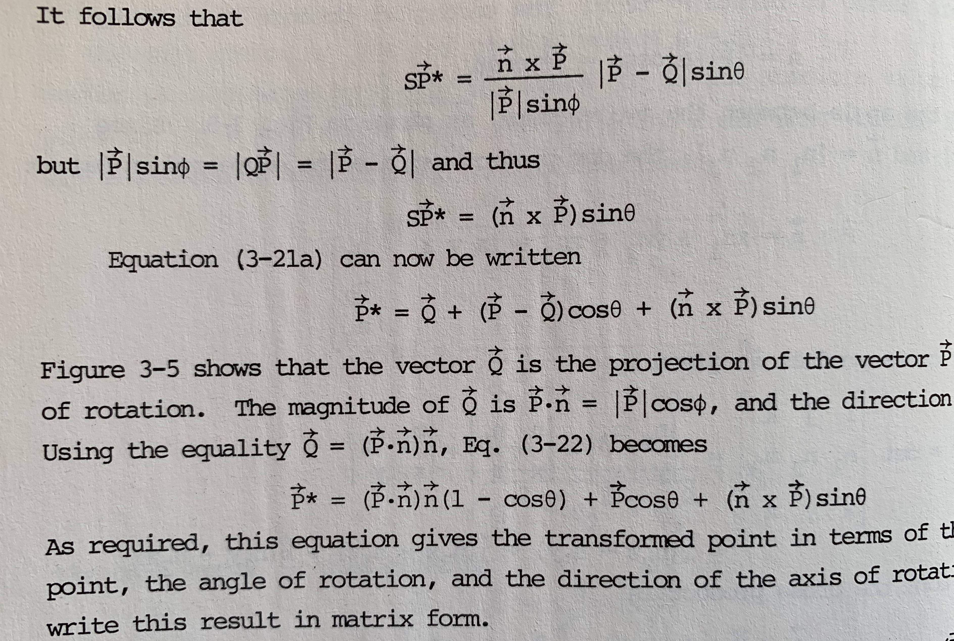
Here, the asterisk has found other jobs to do, and the occasional requirement for a multiplication sign was met by a sneaky lowercase x, unambiguous in context.
Typewriter technology evolved into the teleprinter and teletype machines of the mid-20th century. For example, a machine like the Friden Flexowriter was a fearsome beast containing a keyboard, printer, paper tape reader, card reader, and a programmable plug-board controlling dozens of electrical relays, and it weighed about 60kg. (Nostalgic video here.) It could communicate over a serial connection, so inevitably it had a major influence on the development of the early computer.
Formula translation
Mathematical texts can largely do without a multiplication sign, resorting to the old saltire when necessary.
So the design documents for the new proposed Fortran* programming language in 1954 show the 500-year old Oughtred multiplication symbol being used extensively, not a single asterisk in sight: [10]
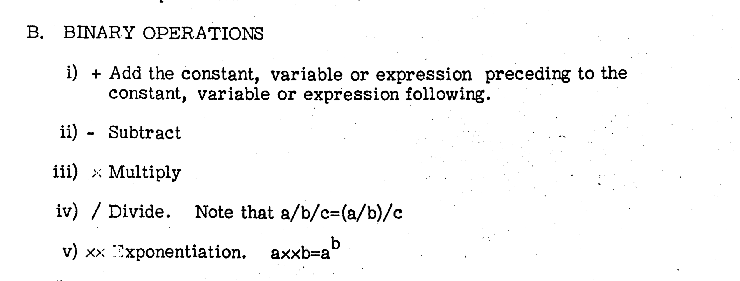
I can’t tell whether these have been inserted by hand, or whether the printer was physically modified so that it could generate this symbol (something which people could do, and did, apparently).
When the language was implemented, though, the saltire wasn’t available, because programs were initially loaded from punched cards, and only the characters that made it as far as the 1960s-era punch card machines survived into the computer era.
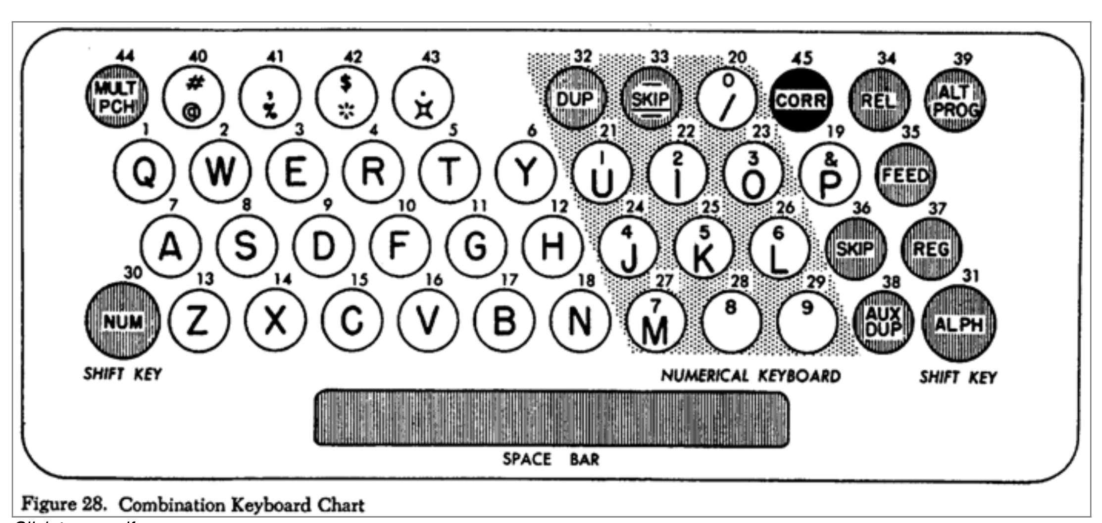
The asterisk was the obvious stand-in.
Much of this early computing machinery was designed primarily for commercial use, so the symbols available to early programmers were designed for accounting and statistics, rather than programming.
That character on the top (43) looks like the rare square lozenge:

which, like the other keys, was part of the IBM 1401 code, an early character encoding pre-dating ASCII. This symbol was commonly used in 1960s computerized banking systems to indicate second level totals.
Some programmers would have wanted keyboards like this, the APL keyboard:[11]

\u2336 to \u2376so that they could input all these APL symbols*:
⌰⌱⌲⌳⌴⌵⌶⌷⌸⌹⌺⌻⌼⌽⌾⌿⍀⍁⍂⍃⍄⍅⍆⍇⍈⍉⍊⍋
⍌⍍⍎⍏⍐⍑⍒⍓⍔⍕⍖⍗⍘⍙⍚⍛⍜⍝⍞⍟⍠⍡⍢⍣⍤⍥⍦⍧
⍨⍩⍪⍫⍬⍭⍮⍯⍰⍱⍲⍳⍴⍵⍶⍷⍸⍹⍺
The APL language was developed in the 1960s, and predicted the abundance of symbols that we take for granted in the Unicode era. I think there's still a bit of reluctance to use characters whose codes stray outside the ASCII page, but this is probably a natural desire to avoid compatibility issues. Most programmers have suffered Unicode and font display issues before. Also, not all programming environments provide an easy way to access thousands of symbols from a QWERTY keyboard (like Julia users can from the REPL).
How high is your asterisk?
The asterisk today (at Unicode \u002a) is a Jekyll-and-Hyde character. It's either a footnote indicator or a multiplication symbol. So typeface designers have a choice: position it discreetly at the top of the line, to line up with the dagger and other superscript characters, or place it on the same level as the other arithmetic operators such as + and -. A few fonts can't decide, and settle for a compromise, somewhere between the two.
This diagram shows how a few fonts position their asterisks at different heights above the baseline. An equals sign is shown in blue.
I originally expected this to show that the asterisk has been slowly getting lower over time. But, although most non-programming fonts keep their asterisks held high, footnote-style, not all programming fonts keep aligned with the math operators, which I think is the obvious place to put it.
One slight wrinkle here is that mathematicians have their very own asterisk, \u2217. In the words of Wikipedia:
This should be used in fine typography for a large asterisk that lines up with the other mathematical operators.
Here’s the non-‘fine’ footnote asterisk for multiplication, the one used in programming code:

And here’s the ‘fine’ mathematical one:

In some fonts there might be a height difference between the footnote-asterisk and the multiplication-asterisk, but in the font I’ve used here, they happen to be the more or less the same. Unfortunately, the ‘fine asterisk’, like the × symbol, doesn’t work as a multiplication symbol in Julia (or any other language, I expect). But it remains available in the Unicode glyph warehouse, awaiting incorporation by enthusiastic lovers of ‘fine’ typography.
It’s full of stars
The Unicode Consortium have an ‘inordinate fondness’[12] for arrows and stars, but they’re also quite keen on asterisks:


There's also a handful of saltires:


Perhaps there aren’t many people who take ages deliberating over which asterisk and saltire they want, but it’s good that they’re catered for.
Pointless
How many points should an asterisk have, 5 or 6? Designer Tony Seddon[13] says:
traditionally serif faces included a six-pointed asterisk, while sans serif asterisks had five, but in practice this is no longer an observed convention.
I made a poster of a few[14], and I don't think there's much of a pattern. Bodoni has five, Gotham has six, plenty of sans serif fonts sport six, and there are serif fonts with five and eight, and there's a couple of sevens, too.
Roll your own
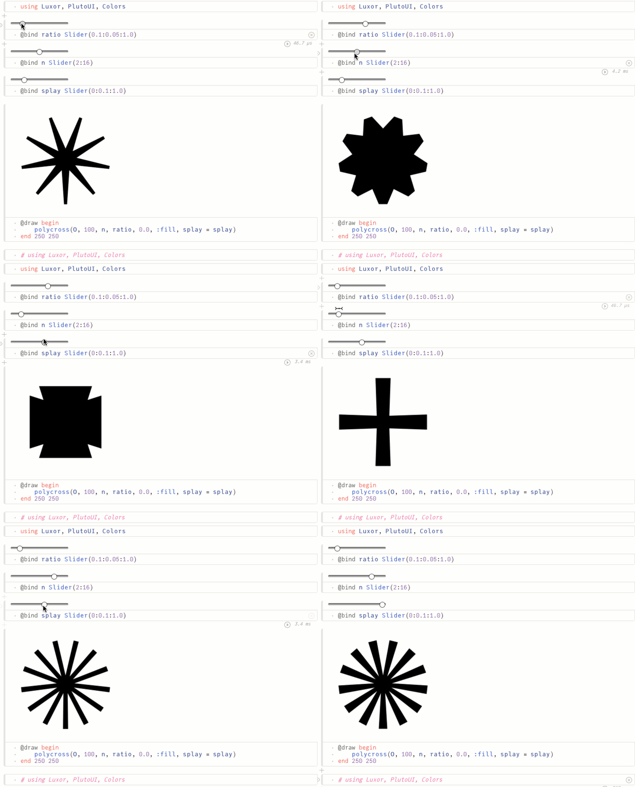
If you feel that none of these quite work for you, you could always whip up your own. Here's how you might use Julia in a Pluto notebook to start designing your own.
Conclusion
If you’ve read all the way to the end, thank you – you’re a ∗!
Notes at the foot
| [1] | Franklin.jl worked very hard, building the pages and creating the images of Unicode glyphs. |
| [2] | Franklin.jl's good for automatic numbering – although I couldn't persuade it to use footnote markers such as *, †, ‡, §, ||, #, **, ††, ‡‡, §§, ||||, ###, ***, †††, ‡‡‡ ... 😃. |
| [3] | NY Times, Aug 31 2020 |
| [4] | See the Shady Characters web site. |
| [5] | facsimile of A History Of Mathematical Notations by Cajori, Florian |
| [6] | facsimile of Oughtred’s Clavis Mathematicae |
| [7] | facsimile of Newton’s Principia Mathematica |
| [8] | See Kressie Kornis – My two-year study of Jane Austen's dashes |
| [9] | image from the Typewriter database |
| [10] | Fortran documentation |
| [11] | image of APL keyboard from wikipedia |
| [12] | “inordinate fondness” at quoteinvestigator.com |
| [13] | “Essential Type: An Illustrated Guide to Understanding and Using Fonts”, Yale University Press, 2016 |
| [14] | You can find similar posters for other letters here |


