World
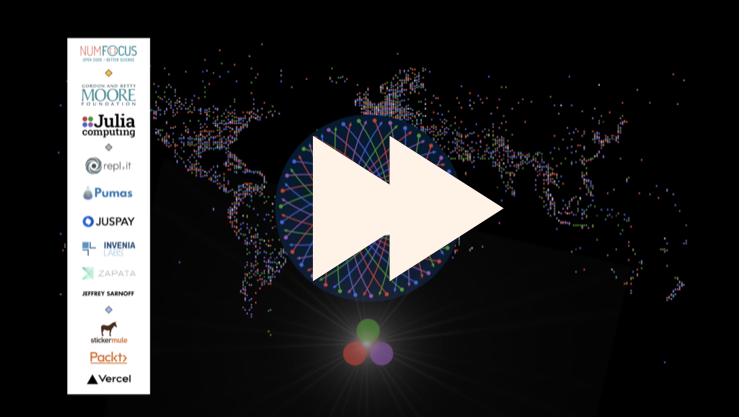
The videos from JuliaCon 2020 are on YouTube , over 150 of them, and I’ve been watching quite a few. Have you been tempted to start skipping the first 17 seconds of some of them? Well, here are a few paragraphs that might make sitting through the JuliaCon2020 “station ident” a litle bit more interesting — for a while, at least.
At first, I wanted to use the beautiful skyline illustration showing lots of world-famous buildings. This is another in the series of city skyline stock images that Avik (one of the JuliaCon organizing team) manages to find each year, whatever the location.
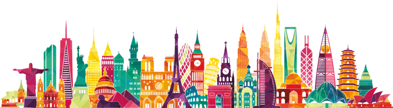
I was tempted to animate it somehow, but I couldn’t think of a good way to do it without it looking like a terrible cartoon. Besides, the SVG file was an unstructured collection of 6000 polygons. And it was already getting a lot of usage.
First attempt
It’s always a good idea to avoid graphical clichés, but it was difficult to resist using a world map or globe of some sort for a world-wide global event. I remembered I had some old shapefile-reading code, long since abandoned (because it was more complicated than I thought), so I loaded up Shapefile.jl and trusty old Luxor.jl, and threw some shapes onto the canvas.
using Shapefile, Luxor

include(joinpath(dirname(pathof(Luxor)), "readshapefiles.jl"))

countries = open(worldshapefile) do f
    read(f, Shapefile.Handle)
end

...
for shape in countries.shapes
    randomhue()
    pgons, bbox = convert(Array{Luxor.Point, 1}, shape)
    for pgon in pgons
        poly(pgon, :fill)
    end
end
...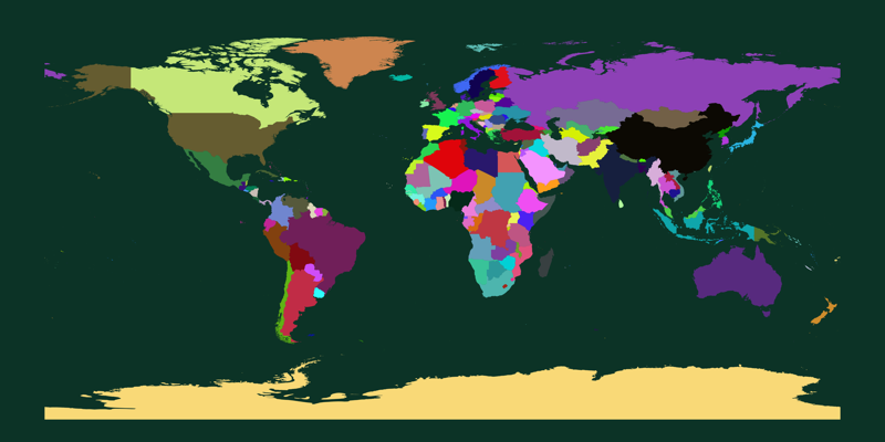
There are problems here. First, it's the old Mercator projection; it’s probably the most familiar view of the world, despite being a not-very accurate way to view it with any sense of proportion. And Antarctica just looks wrong, spread across the bottom like that...
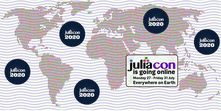
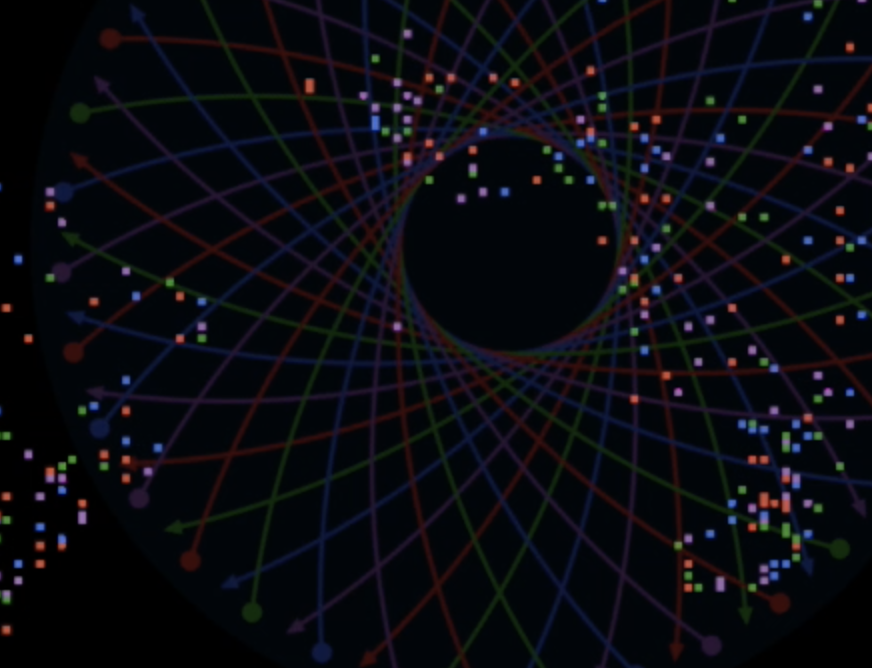
Second, it's a bit dull. I tried a few ways to make the map more interesting. To get the grid effect below I created a Tiler, then tested each cell to see whether it was inside a country polygon or not. And I added some wavy sine waves to avoid huge areas of empty ocean.
(The code for that circular logo itself is just:
...
cols = [Luxor.julia_green, Luxor.julia_red,Luxor.julia_purple, Luxor.julia_blue]
for (n, θ) in enumerate(range(0, stop=2π, length=36))
    sethue(cols[mod1(n, end)])
    arrow(O - polar(230, θ), O + polar(230, θ), [50, 50],
        decoration = 0.0,
        decorate = () -> circle(O, 5, :fill),
        linewidth = 2)
end
drawjuliaconlogo(O, 0.5)
...
)
But it didn't click.
Another try
However, a bigger problem for me is that the Mercator world map is a geographic, geocentric, ‘landmass-oriented’ view, with some political boundaries added. But a worldwide virtual online conference such as JuliaCon 2020 is about people; people reaching out and communicating with each other, forming communities and partnerships, and this doesn’t come across in a simple map view.
I thought about plotting Julia contributors on a map, inspired by this nice post “Where are the Julians?” by Dr Júlio Hoffimann. But the distribution is still, to be honest, a little sparse, and I wasn’t sure about targetting individuals so precisely.
Browsing through some folders led me to a CSV file of about 3000 world airports, with latitude/longitude coordinates, and I tried plotting those instead of the countries’ outlines.
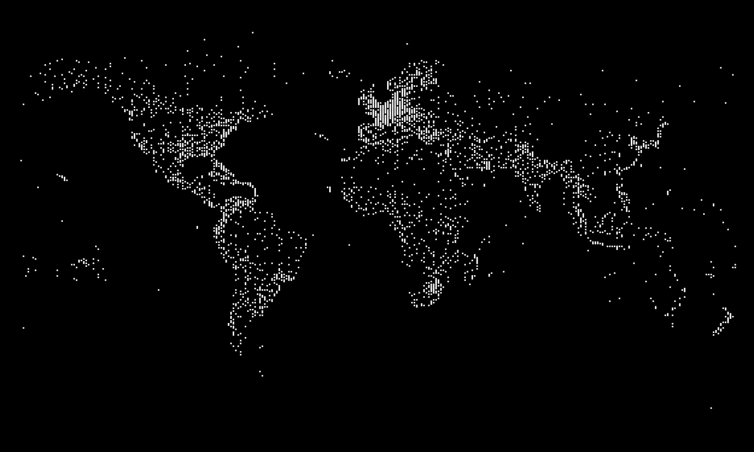
I thought this worked better (if not perfectly). The graphic was now a bit more about human beings, and where they lived, or at least where some of them and their supplies got on and off aircraft. The squares indicate the population centres better. The use of unscaled symbols emphasized the communication links of smaller islands and communities, which would be lost if I’d drawn shapes proportional to population numbers, say. For example, the small islands in the Pacific ocean are at least as visible as the densely packed squares in Europe and the coasts of the Americas.
There are still areas of emptiness — you can see the sparsely populated areas of Northern Africa, Russia, Namibia, the rain forests of South America, and the empty wilderness in the heart of Australia.
Sparse
I’d converted the latitude and longitude values into rows and columns of 1s in a sparse matrix. I was intending to explore the idea of initially rendering the world as a coarse grid of large squares and then gradually refining it by taking smaller and smaller views. I didn't get round to it. (Perhaps I'll use the upcoming Javis.jl to try this out one day.)
One nice feature about the forthcoming Julia 1.6 release is the improved display of sparse matrices in the REPL. Instead of this:
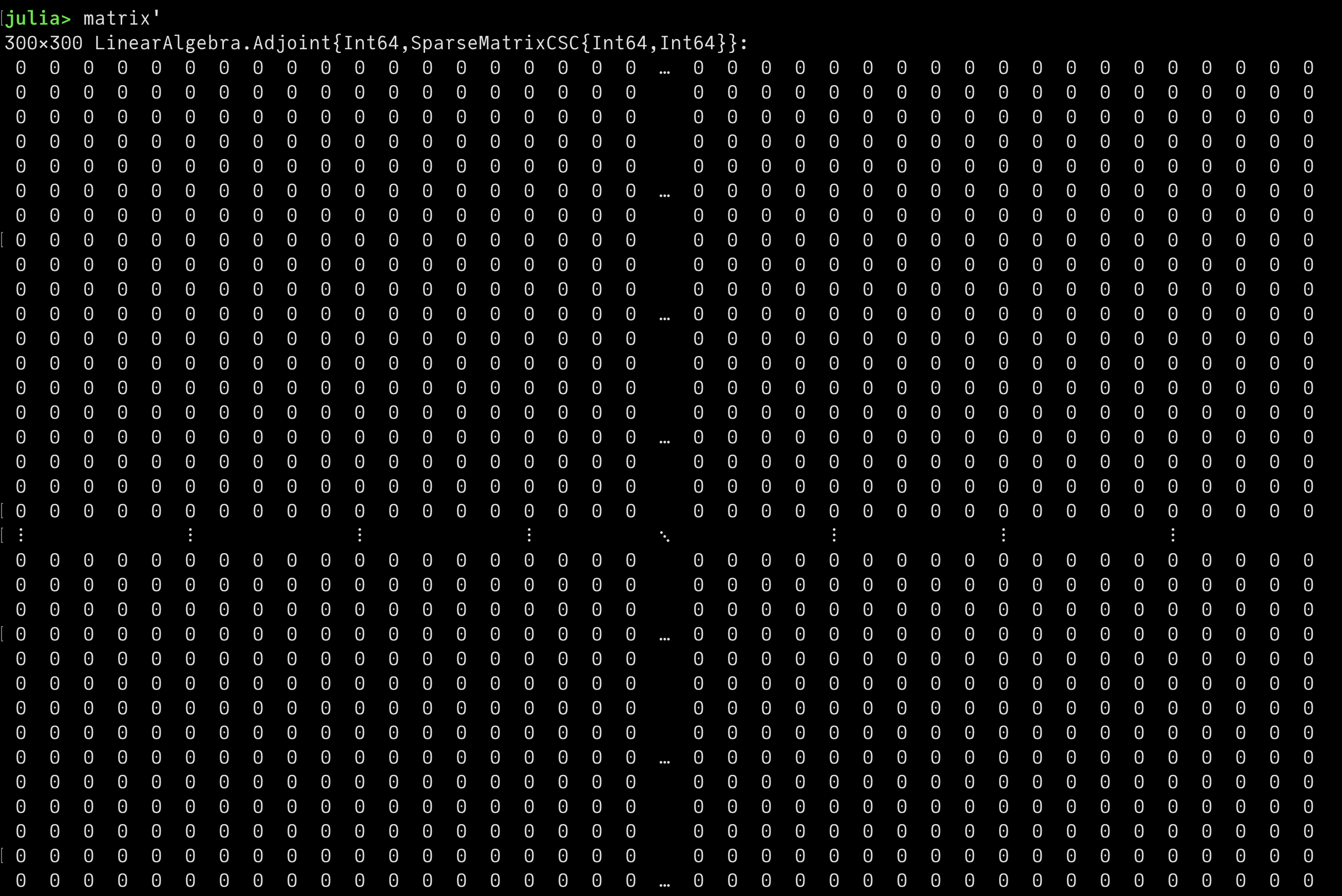
You’ll see this:
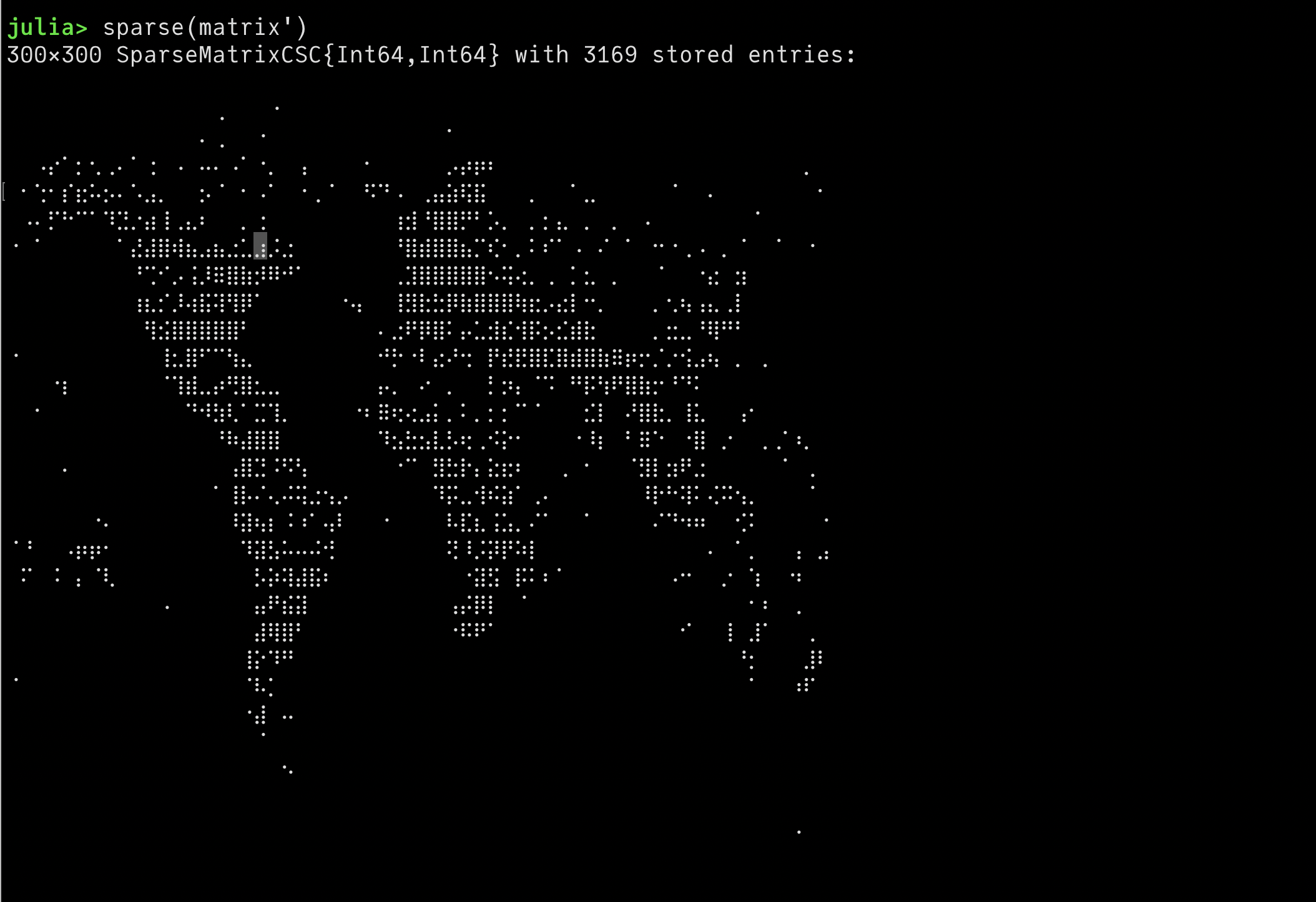
This uses characters with Unicode values \U2800 to \U28FF. Make sure you’re using a monospaced font that includes them. There are a few floating around.
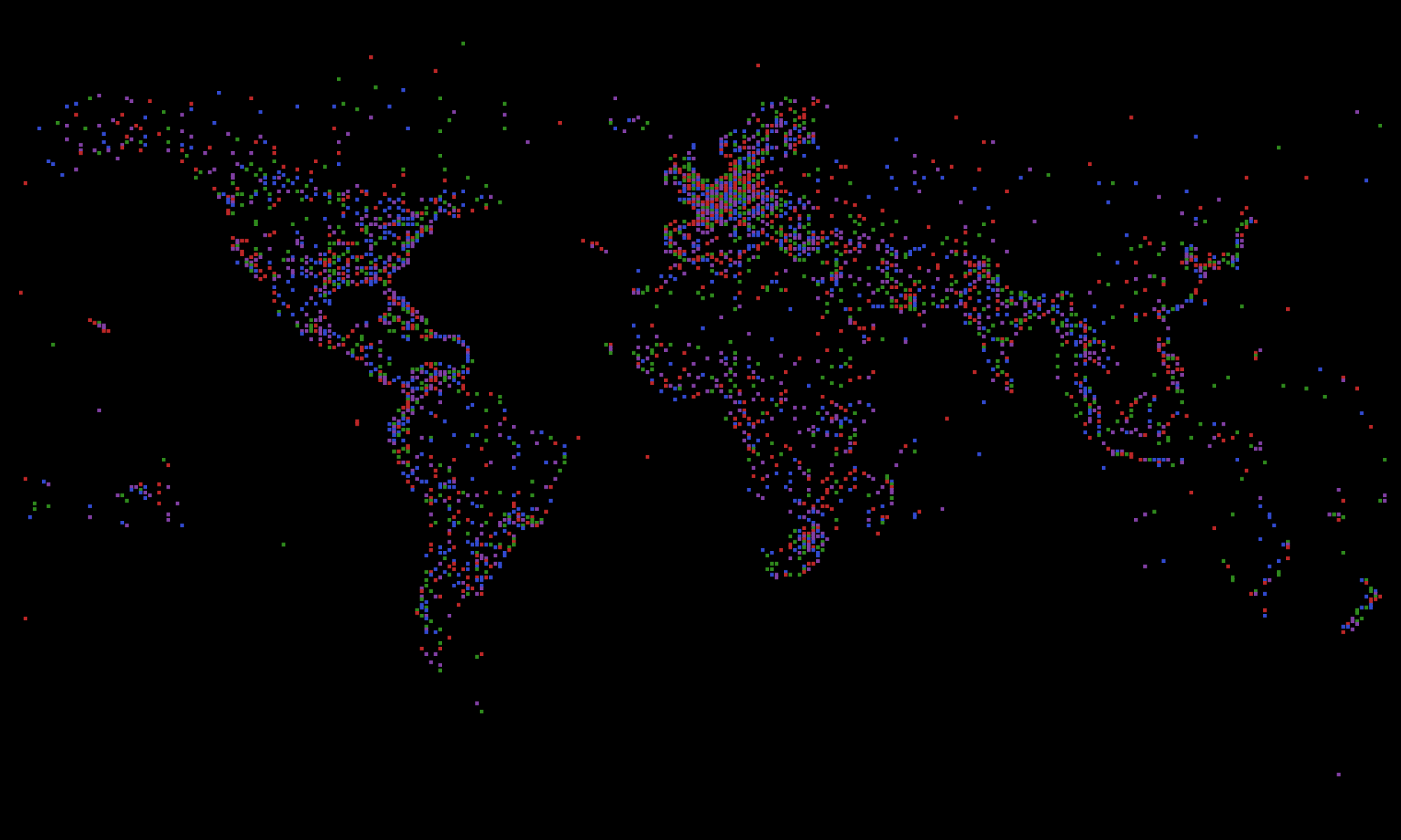
But in the end I didn’t need to do much more to it, other than choose random Julia colors.
...
tiles = Tiler(1200, 800, size(matrix)...)
juliacolors = [Luxor.julia_purple, Luxor.julia_blue, Luxor.julia_red, Luxor.julia_green]
for (pos, n) in tiles
    if matrix[n] == 1
        sethue(juliacolors[rand(1:end)])
        box(pos, 3, 3, :fill)
    end
end
...
Off the map
I got sidetracked researching some of these dots. For example, I wondered what this particular dot was — the airport that gets quickly covered by the incoming JuliaCon2020 logo, halfway between South America and Africa. It’s called Wideawake Airfield, named after a noisy colony of sooty terns nearby. This is Ascension Island, for historical reasons a strategically-placed military base for the UK and USA.
That cluster of dots in the Atlantic are the Azores, part of Portugal, due west of Lisbon... Perhaps we’ll all meet there next year.
Two of the most northerly lights are Alert, Canada (the northernmost permanently inhabited place in the world), and Svalbard (Norway). Svalbard is the location of the GitHub Arctic Code Vault, stored in a decommissioned coal mine. Lots of Julia code is stored there, frozen for posterity.
It was also a useful reminder that data sources are often imperfect. Even if all the locations have valid latitude and longitude values, it would be quite a task to check every entry. For some countries, such as China and Namibia (that empty area on the west coast of Southern Africa), I was puzzled and checked them out — there were fewer squares than I'd expected to see. This is the worst sort of missing data, data that you didn’t realise was missing. There are also some entries that specify airports that I can’t find any references to.
Which leads me to Mountweazels.
Oops
It was only when I saw the first video on the first day of JuliaCon that I realised I’d made a mistake. Technically, this was a deliberate mistake that I’d made a few years ago, but which had now become an accidental mistake, because I’d forgotten to remove it.
I’d been reading about Mountweazels. A Mountweazel is a fictitious or spurious entry in an otherwise trusty reference. A non-existent word in a dictionary, a fictitious place on a map. They’re not really “Easter eggs”, because I don’t think they’re supposed to be found. They might be inserted by someone with a sense of mischief, but, more usually, they’re put in deliberately by the creators as a way of preventing or proving unauthorized copying.
I had added a fictitious airport to the CSV file, “just for testing purposes”, and I’d forgotten to remove it.
If you want to find it: start at the right hand side of the swirly JuliaCon2020 logo, and travel due East, for about the width of the letter “n” in “juliacon”. That square isn’t Agatti Island or Diego Garcia Island. It’s the famous - or infamous - island that made its first appearance in 1977. I’ll leave the pleasure of (re-)discovering it to you!
[2020-08-13]
