This page first appeared as a website to accompany the first release of JuliaMono, and it’s now been incorporated here as a blog post. But it's no longer up to date; see this site
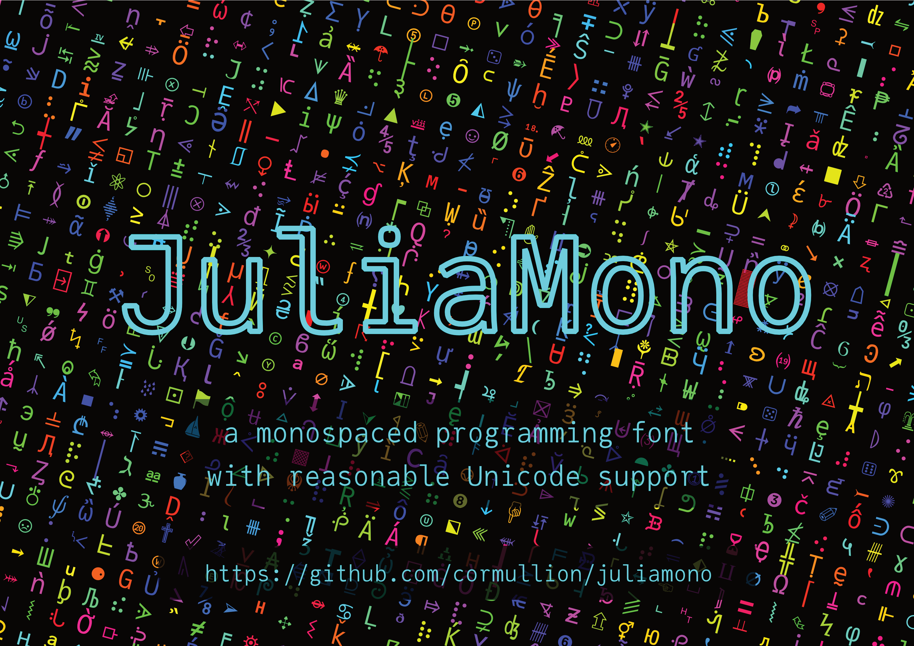
JuliaMono - a monospaced font for scientific and technical computing
JuliaMono is a monospaced typeface designed for use in text editing environments that require a wide range of specialist and technical Unicode characters. It was intended as a fun experiment to be presented at the 2020 JuliaCon conference in Lisbon, Portugal (which of course didn’t physically happen in Lisbon, but online).
JuliaMono is:
free
distributed with a liberal licence [1]
suitable for scientific and technical programming as well as for general purpose hacking
full of Unicode goodness
easy to use, simple, unquirky, friendly, and approachable
available for MacOS, Unix, and Windows [2]
To download and install JuliaMono, see the instructions here.
The original temporary website used JuliaMono everywhere, so let's try to make the rest of this page do the same.
- JuliaMono - a monospaced font for scientific and technical computing
- Contents
- Screenshots
- Examples
- Languages
- Unicode coverage
- Contextual and stylistic alternates (and ‘ligatures’)
- Private Use Areas (PUAs)
- Accessing PUA characters in the Julia REPL
- Download and install
- Frequently asked questions
- ‘Why⁉’
- ‘Is it just for Julia coding? How does it “work well with” Julia?’
- ‘Where can I see it in action?’
- ‘I don’t like it as much as $(myfavouritefont)’
- ‘How can I use the web fonts for my blog?’
- ‘How do I control features in CSS, in Atom/Juno, or VS Code?’
- Atom/Juno
- ‘Can I use this font in a notebook? And how do I do it?’
- ‘How do I use the font for plotting, such as in Plots.jl?’
- ‘Can I use it in a \( \LaTeX \) document?’
- ‘There are problems with rendering and alignment’
- ‘Aren’t these font files too big?’
- ‘How is this different from any other Unicode font?’
- ‘Is it a package? Was it written in Julia? How will this contribute to the ecosystem of Julia language?’
- ‘Is it finished?’
- ‘Why don’t these accents/marks work properly?’
- ‘Does it work on macOS?’
- ‘Does it work on Linux?’
- ‘Does it work on Windows?’
- ‘Any love for nerdfonts?’
- ‘But I prefer the glyphs in this other font?’
- ‘What about italics? How about JuliaSans?’
- ‘Is this page finished yet?’
- Footnotes
- Thanks!
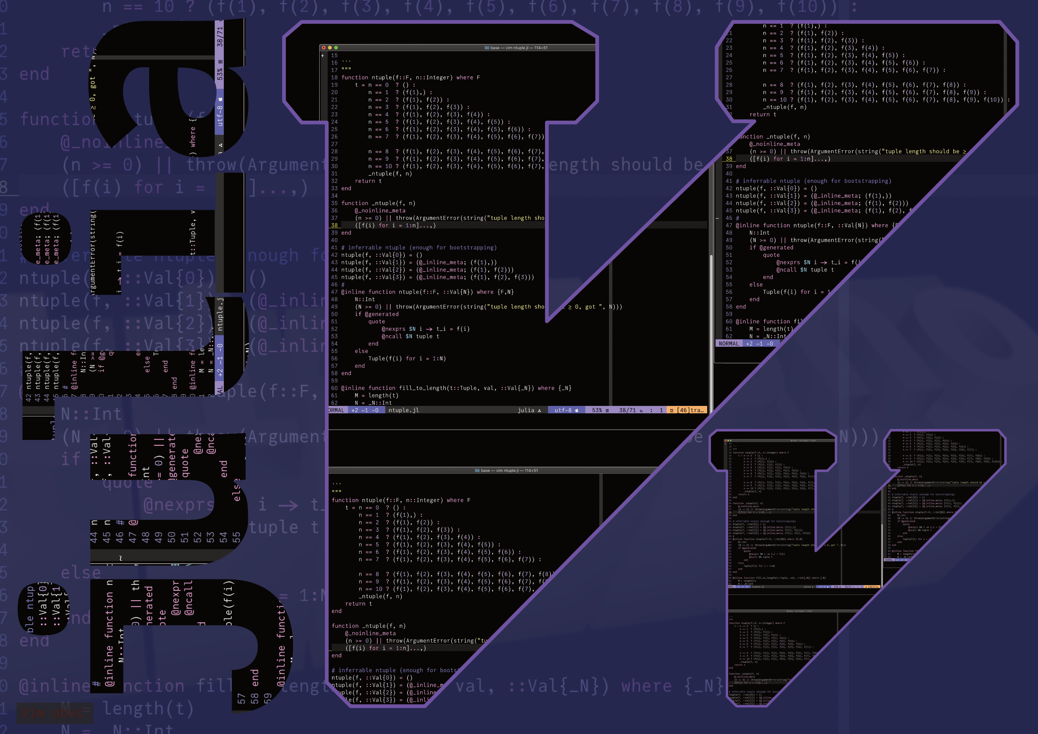
Editing code in Juno.
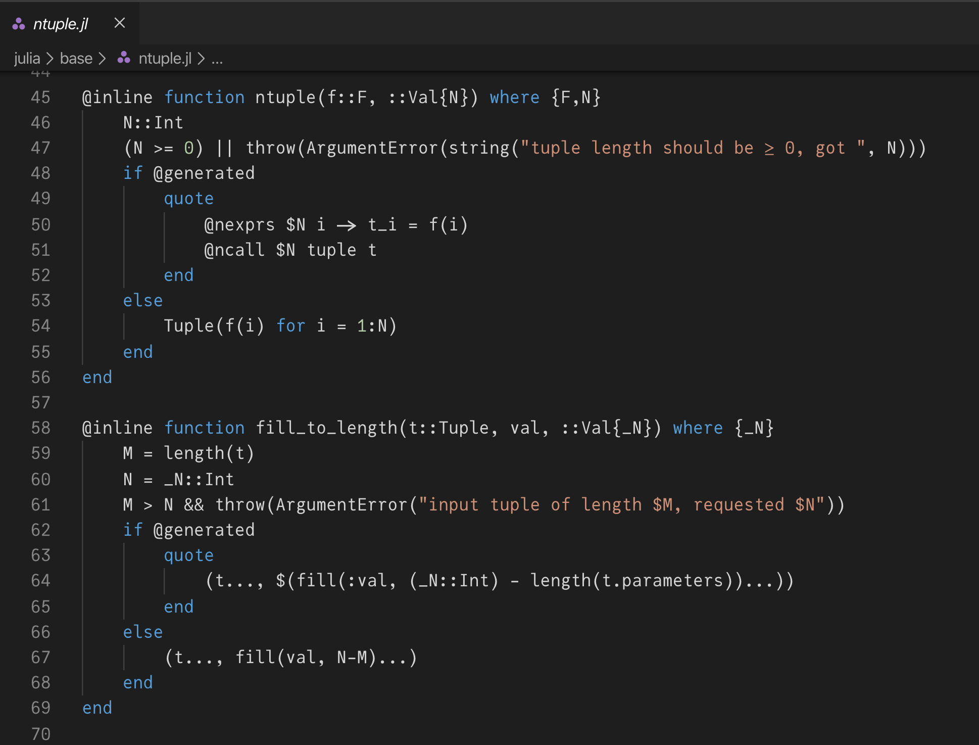
And in VS Code.
And in Vim:
And in Emacs:
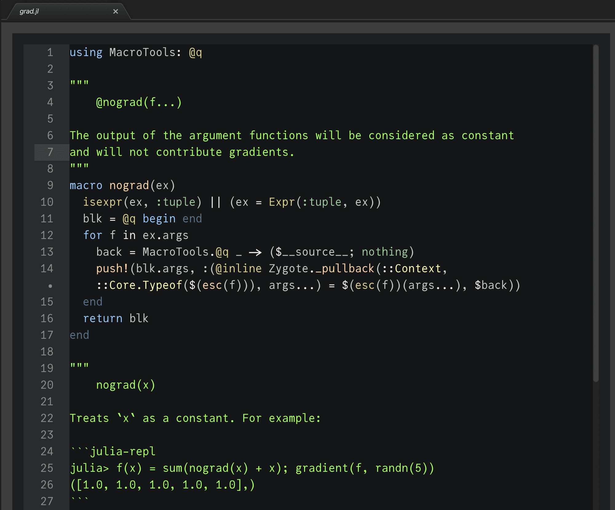
using Zygote: @adjoint
function ignore(f)
try return f()
catch e; return 0; end
end
@adjoint function ignore(f)
try Zygote._pullback(__context__, f)
catch e
0, ȳ -> nothing
end
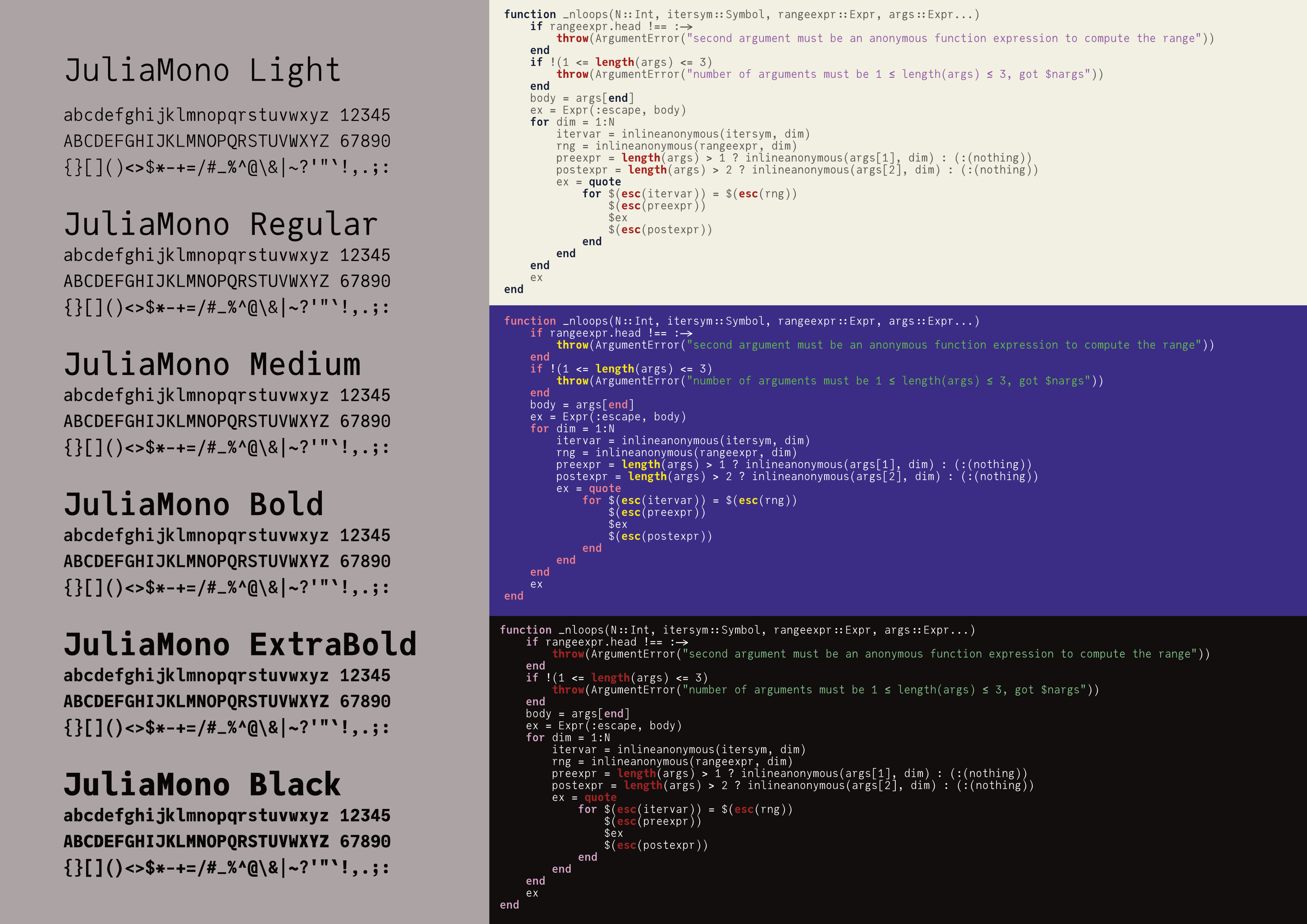
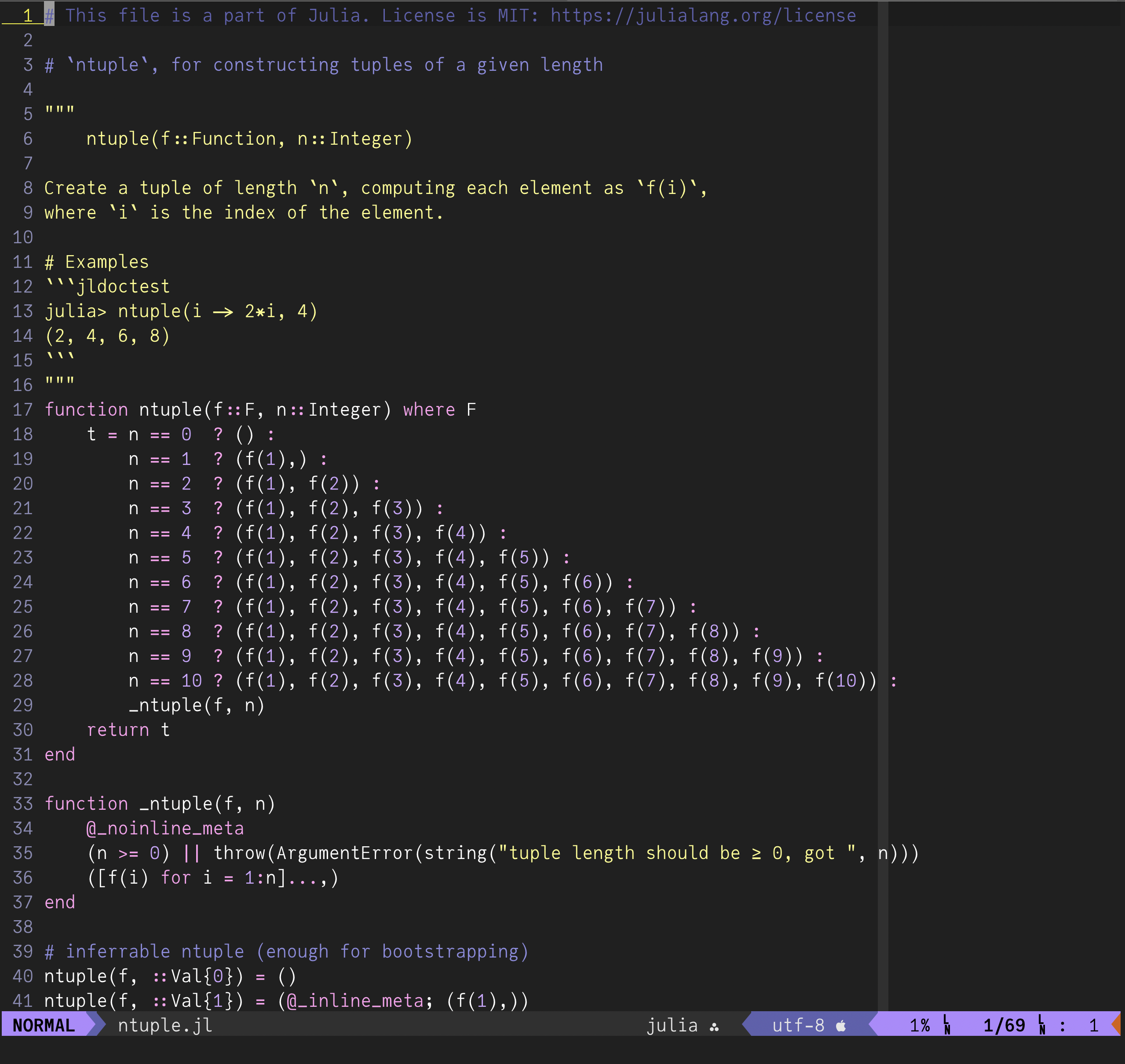
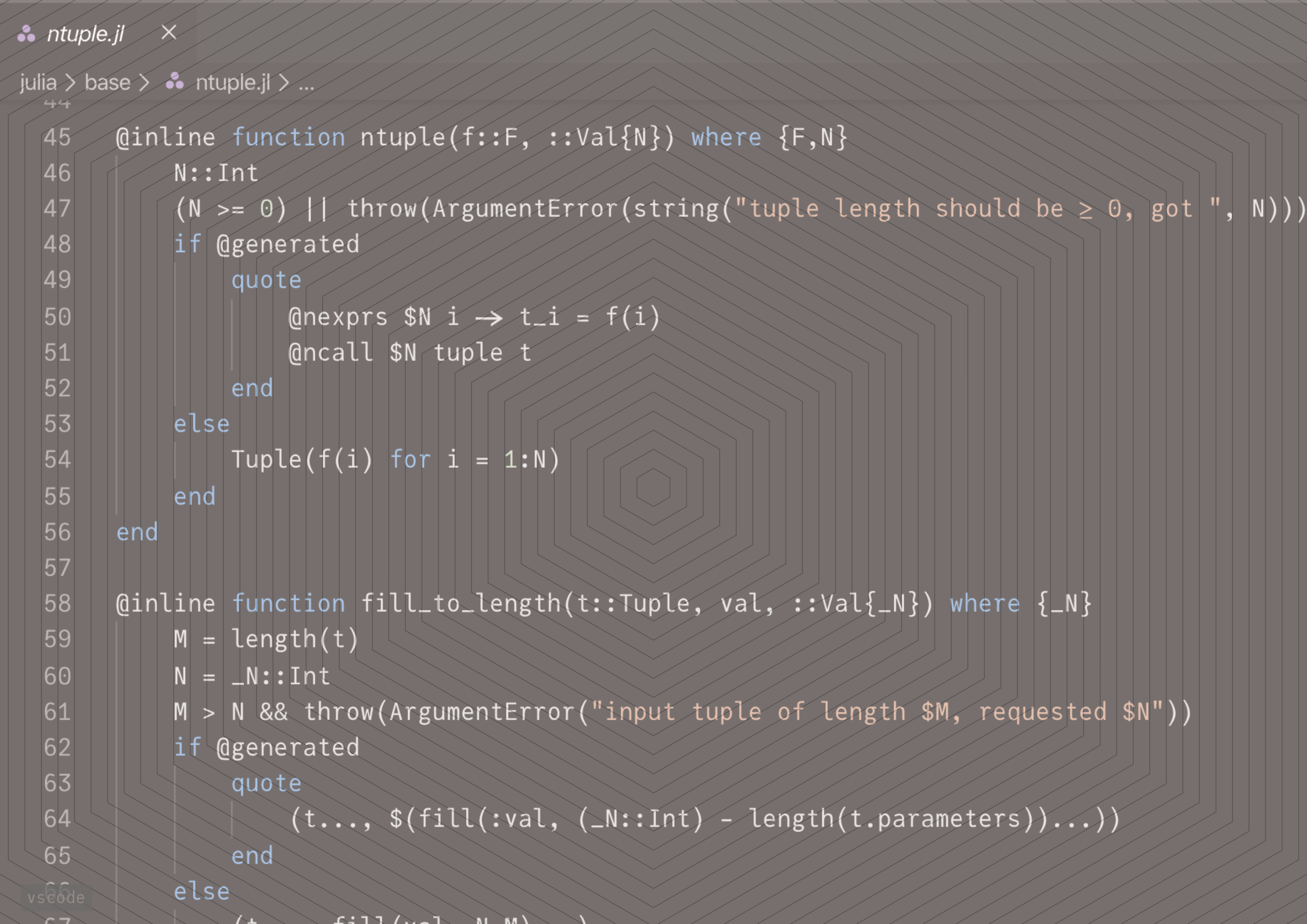
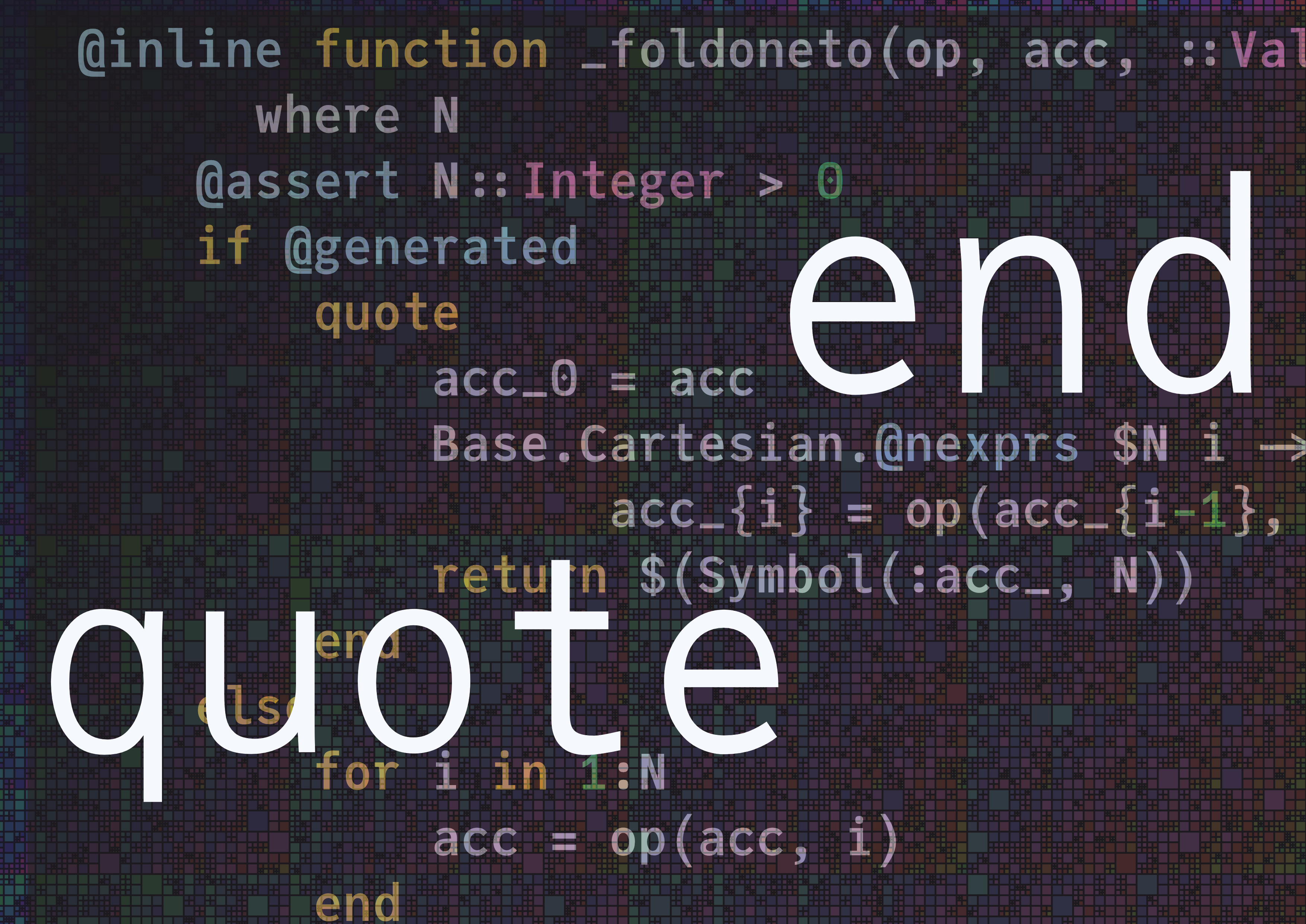
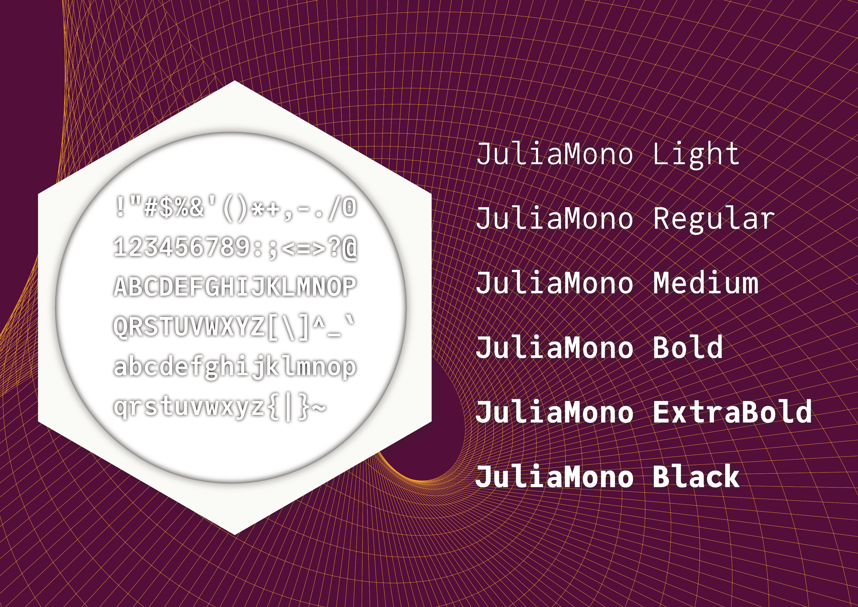
endThere are different weights of JuliaMono, so you can control the amount of contrast you have in your highlighted code, including: JuliaMono-Light, JuliaMono-Regular, JuliaMono-Medium, JuliaMono-Bold, JuliaMono-ExtraBold, and JuliaMono-Black. [3]
(There are also versions of two of the fonts with “Latin” in the name: these are stripped down versions supporting just the basic MacRoman/Windows1252 “Latin” character sets, intended for use as place-holders, which are of interest only if you want to have more control over font loading times in web browser-based applications.)
In the hands of a virtuoso (such as Dr Zygmunt Szpak, the author of the following Julia code fragment[4]), the range of available Unicode characters can be quite expressive:
function T(𝛉::AbstractArray,
           𝒞::Tuple{AbstractArray,
           Vararg{AbstractArray}},
           𝒟::Tuple{AbstractArray, Vararg{AbstractArray}})
    ⊗ = kron
    l = length(𝛉)
    𝐈ₗ = SMatrix{l,l}(1.0I)
    𝐈ₘ = SMatrix{1,1}(1.0I)
    𝐓 = @SMatrix zeros(l,l)
    N = length(𝒟[1])
    ℳ, ℳʹ = 𝒟
    Λ₁, Λ₂ = 𝒞
    𝚲ₙ = @MMatrix zeros(4,4)
    𝐞₁ = @SMatrix [1.0; 0.0; 0.0]
    𝐞₂ = @SMatrix [0.0; 1.0; 0.0]
    for n = 1:N
        index = SVector(1,2)
        𝚲ₙ[1:2,1:2] .=  Λ₁[n][index,index]
        𝚲ₙ[3:4,3:4] .=  Λ₂[n][index,index]
        𝐦    = hom(ℳ[n])
        𝐦ʹ   = hom(ℳʹ[n])
        𝐔ₙ   = (𝐦 ⊗ 𝐦ʹ)
        ∂ₓ𝐮ₙ = [(𝐞₁ ⊗ 𝐦ʹ) (𝐞₂ ⊗ 𝐦ʹ) (𝐦 ⊗ 𝐞₁) (𝐦 ⊗ 𝐞₂)]
        𝐁ₙ   = ∂ₓ𝐮ₙ * 𝚲ₙ * ∂ₓ𝐮ₙ'
        𝚺ₙ   = 𝛉' * 𝐁ₙ * 𝛉
        𝚺ₙ⁻¹ = inv(𝚺ₙ)
        𝐓₁   = @SMatrix zeros(Float64,l,l)
        for k = 1:l
            𝐞ₖ = 𝐈ₗ[:,k]
            ∂𝐞ₖ𝚺ₙ = (𝐈ₘ ⊗ 𝐞ₖ') * 𝐁ₙ * (𝐈ₘ ⊗ 𝛉) + (𝐈ₘ ⊗ 𝛉') * 𝐁ₙ * (𝐈ₘ ⊗ 𝐞ₖ)
            # Accumulating the result in 𝐓₁ allocates memory,
            # even though the two terms in the
            # summation are both SArrays.
            𝐓₁ = 𝐓₁ + 𝐔ₙ * 𝚺ₙ⁻¹ * (∂𝐞ₖ𝚺ₙ) * 𝚺ₙ⁻¹ * 𝐔ₙ' * 𝛉 * 𝐞ₖ'
        end
        𝐓 = 𝐓 + 𝐓₁
    end
    𝐓
endHere are some samples of various languages[5] :
| Ancient Greek | Ἄδμηθ’, ὁρᾷς γὰρ τἀμὰ πράγμαθ’ ὡς ἔχει, λέξαι θέλω σοι πρὶν θανεῖν ἃ βούλομαι. |
| Bulgarian | Я, пазачът Вальо уж бди, а скришом хапва кюфтенца зад щайгите. |
| Catalan | «Dóna amor que seràs feliç!». Això, il·lús company geniüt, ja és un lluït rètol blavís d’onze kWh. |
| Czech | Zvlášť zákeřný učeň s ďolíčky běží podél zóny úlů |
| Danish | Quizdeltagerne spiste jordbær med fløde, mens cirkusklovnen Walther spillede på xylofon. |
| English | Sphinx of black quartz, judge my vow. |
| Estonian | Põdur Zagrebi tšellomängija-följetonist Ciqo külmetas kehvas garaažis |
| Finnish | Charles Darwin jammaili Åken hevixylofonilla Qatarin yöpub Zeligissä. |
| French | Voix ambiguë d’un cœur qui au zéphyr préfère les jattes de kiwi. |
| Georgian | სწრაფი ყავისფერი მელა ახტება ზარმაც ძაღლს. |
| German | Victor jagt zwölf Boxkämpfer quer über den großen Sylter Deich. |
| Greek | Ταχίστη αλώπηξ βαφής ψημένη γη, δρασκελίζει υπέρ νωθρού κυνός. |
| Guarani | Hĩlandiagua kuñanguéra oho peteĩ saʼyju ypaʼũme Gavõme omboʼe hag̃ua ingyleñeʼẽ mitãnguérare neʼẽndyʼỹ. |
| Hungarian | Jó foxim és don Quijote húszwattos lámpánál ülve egy pár bűvös cipőt készít. |
| IPA | [ɢʷɯʔ.nas.doːŋ.kʰlja] [ŋan.ȵʑi̯wo.ɕi̯uĕn.ɣwa] |
| Icelandic | Kæmi ný öxi hér, ykist þjófum nú bæði víl og ádrepa. |
| Irish | Ċuaiġ bé ṁórṡáċ le dlúṫspád fíorḟinn trí hata mo ḋea-ṗorcáin ḃig. |
| Latvian | Muļķa hipiji mēģina brīvi nogaršot celofāna žņaudzējčūsku. |
| Lithuanian | Įlinkdama fechtuotojo špaga sublykčiojusi pragręžė apvalų arbūzą. |
| Macedonian | Ѕидарски пејзаж: шугав билмез со чудење џвака ќофте и кељ на туѓ цех. |
| Norwegian | Jeg begynte å fortære en sandwich mens jeg kjørte taxi på vei til quiz |
| Polish | Pchnąć w tę łódź jeża lub ośm skrzyń fig. |
| Portuguese | Luís argüia à Júlia que «brações, fé, chá, óxido, pôr, zângão» eram palavras do português. |
| Romanian | Înjurând pițigăiat, zoofobul comandă vexat whisky și tequila. |
| Russian | Широкая электрификация южных губерний даст мощный толчок подъёму сельского хозяйства. |
| Scottish | Mus d’fhàg Cèit-Ùna ròp Ì le ob. |
| Serbian | Ајшо, лепото и чежњо, за љубав срца мога дођи у Хаџиће на кафу. |
| Spanish | Benjamín pidió una bebida de kiwi y fresa; Noé, sin vergüenza, la más champaña del menú. |
| Swedish | Flygande bäckasiner söka hwila på mjuka tuvor. |
| Turkish | Pijamalı hasta yağız şoföre çabucak güvendi. |
| Ukrainian | Чуєш їх, доцю, га? Кумедна ж ти, прощайся без ґольфів! |
One of the goals of JuliaMono is to include most of the characters that a typical programmer or monospaced-font user would reasonably expect to find. (Except for all those emojis - they are best handled by the operating system.)
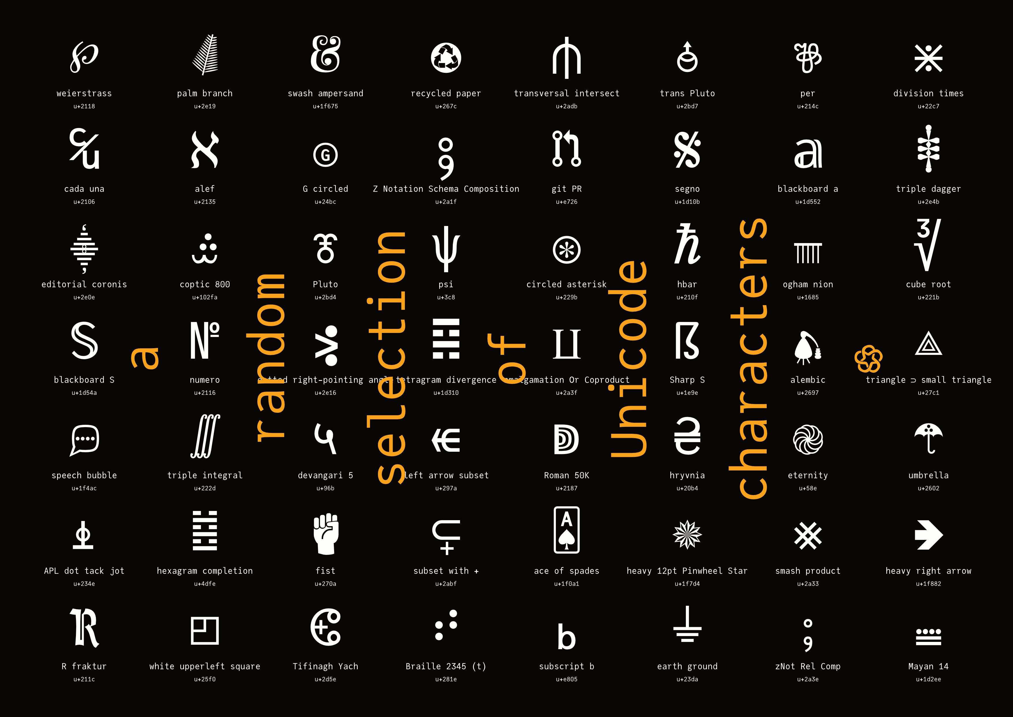
Here’s a thousand or so chosen at random:

In JuliaMono, every character is the same width, because this is a monospaced typeface. Usually, typefaces with a lot of Unicode mathematical symbols are not monospaced, because they’re intended for use in prose and \( \LaTeX \) applications, rather than in programming code.
From a design perspective, forcing every character into the same size box is a problem. It’s like fitting every human being of whatever shape or size into identical airplane seats - some characters are bound to look uncomfortable. There’s never quite enough room for a nice-looking “m” or “w”.
UnicodePlots.jl uses various Unicode characters to plot figures directly in a terminal window. [6]
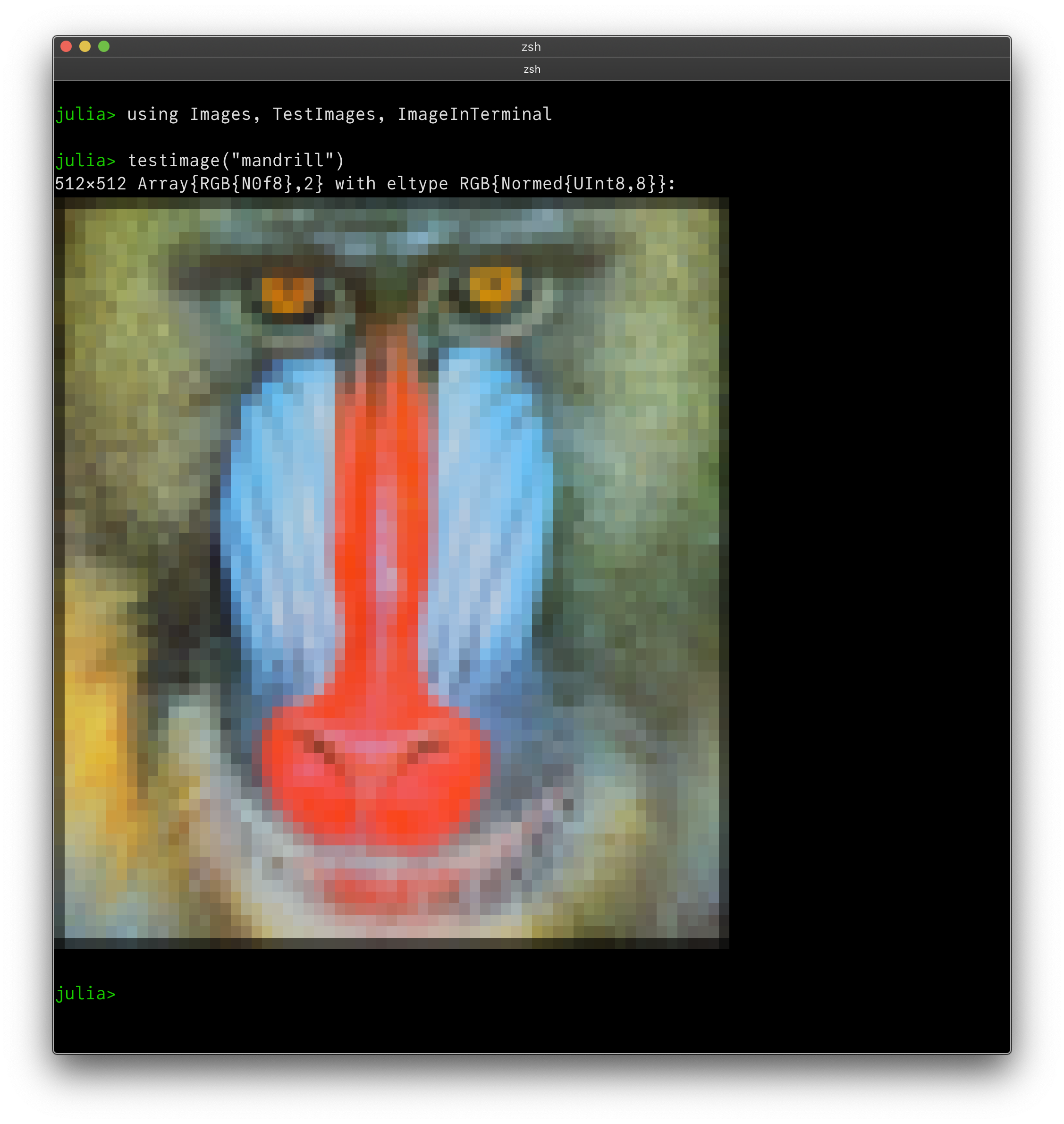
ImageInTerminal.jl is similarly awesome, conjuring images from Unicode characters:
It’s also a good idea to support box-drawing characters and DataFrames.jl output (terminal permitting):
julia> df = DataFrame(A=samples, B=glyphs)
df = 10×2 DataFrame
│ Row │ A              │ B                   │
│     │ String         │ String              │
├─────┼────────────────┼─────────────────────┤
│ 1   │ sample 1       │ ▁▂▁▁▂▄▅▁▄▁▁▅▆▂▇▅▂▇  │
│ 2   │ sample 2       │ ▁▂▄▁▁▃▁▆▂▆▃▁▂▃▂▇▄   │
│ 3   │ sample 3       │ ▁▆▇▁▃▇▇▆▅▅▄▇▇▅▅▇▄▂  │
│ 4   │ sample 4       │ ▅▁▄▁▆▃▁▃▇▂▂▇▅▇▃▆▃▁  │
│ 5   │ sample 5       │ ▆▂▁▂▇▆▃▅▅▄▆▇▄▇▆▁▇   │
│ 6   │ sample 6       │ ▁▁▇▂▂▇▃▅▂▂▆▂▄▄▁▄▂▇▆ │
│ 7   │ sample 7       │ ▂▃▂▁▁▇▁▂▆▂▁▇▁▄▃▂▁▄  │
│ 8   │ sample 8       │ ▄▄▁▂▄▁▅▁▅▁▂▂▇▂▁▃▄▄  │
│ 9   │ sample 9       │ ▁▁▁▂▁▆▃▄▄▁▂▂▃▂▁▅▁▆▃ │
│ 10  │ sample 10      │ ▁▇▄▂▅▃▇▁▇▇▆▄▇▅▄▂▄▅▄ │
(Can you spot the little used and sadly mathematically-unsupported “times” (×) character?)
For a comparison of JuliaMono with other math-capable monospaced fonts, visit mono-math.netlify.app, which shows how Unicode math symbols look.
JuliaMono is quite greedy[7], and contains quite a few Unicode glyphs.

(Of course, size isn’t everything - quality can beat quantity, and other fonts will offer different experiences[8]).
If you want to know whether you can use a Unicode character as an identifier in your Julia code, use the undocumented function Base.isidentifier(). So, for example, if you have the urge to use a dingbat (one of the classic Herman Zapf dingbat designs) as a variable name, you could look for something suitable in the output of this:
julia> for n in 0x2700:0x27bf
			Base.isidentifier(string(Char(n))) && print(Char(n))
	   end
✀✁✂✃✄✅✆✇✈✉✊✋✌✍✎✏✐✑✒✓✔✕✖✗✘✙✚✛✜✝✞✟✠✡✢✣✤✥✦✧✨✩✪✫✬✭✮✯✰✱✲✳✴✵✶✷✸✹✺
✻✼✽✾✿❀❁❂❃❄❅❆❇❈❉❊❋❌❍❎❏❐❑❒❓❔❕❖❗❘❙❚❛❜❝❞❟❠❡❢❣❤❥❦❧➔➕➖➗➘➙➚➛➜➝➞➟➠➡
➢➣➤➥➦➧➨➩➪➫➬➭➮➯➰➱➲➳➴➵➶➷➸➹➺➻➼➽➾➿

julia> ❤(s) = println("I ❤ $(s)")
❤ (generic function with 1 method)

julia> ❤("Julia")
I ❤ Julia
An easy way to include Unicode characters at the Julia REPL is to use the clipboard:
julia> clipboard(Char(0x2764))

# then paste

julia> ❤("Unicode")
I ❤ Unicode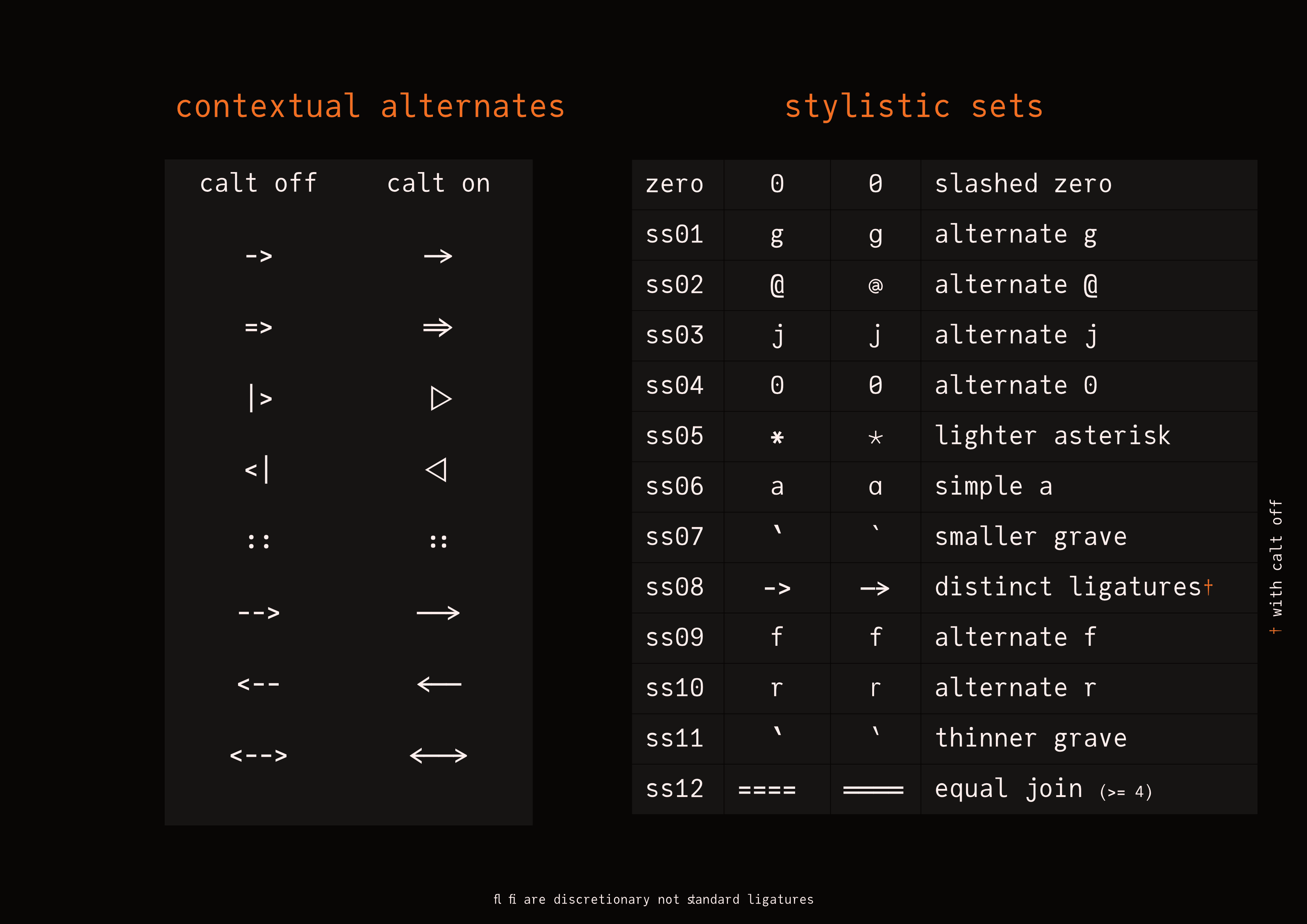
JuliaMono is an OpenType typeface. OpenType technology provides powerful text positioning, pattern matching, and glyph substitution features, which are essential for languages such as Arabic and Urdu. In English, OpenType features are often seen when letter pairs such as fi in certain fonts are replaced by a single glyph such as fi. These ligatures have been used ever since printing with moveable type was invented, replacing the occasional awkward character combination with a better-looking alternative.
To be honest, I’m not a big fan of their use in coding fonts (and I’m not the only one[9]). I like to see exactly what I’ve typed, rather than what the font has decided to replace it with. But, there are a few places in Julia where suitable Unicode alternatives are not accepted by the language, and where I feel that the ASCII-art confections currently used can be gently enhanced by the judicious use of alternate glyphs. There are also a few places where some subtle tweaks can enhance the readability of the language without introducing ambiguity.
In JuliaMono, the following substitutions are applied when the contextual alternates feature is active:
typed |
displayed |
|---|---|
| -> | -> |
| => | => |
| |> | |> |
| <| | <| |
| :: | :: |
| <-- | <-- |
| --> | --> |
| <--> | <--> |
You can see these in action in the following code fragment:[10]
julialang = true # (!= 0)
(x, y) -> (x + y)
f(p::Int) = p * p
@inbounds if f in (Base.:+, Base.:-)
    if any(x -> x <: AbstractArray{<:Number})
         nouns = Dict(
            Base.:+ => "addition",
            Base.:- => "subtraction",
        )
    end
end
df2 = df |>
    @groupby(_.a) |>
    @map({a = key(_), b = mean(_.b)}) |>
    DataFrame # <|
OpenType fonts also offer you the ability to choose different designs for certain characters. These are stored as a ‘stylistic set’.
All the options are stored in the font, and are often referred to by their internal four letter code (not the best user-oriented design, really). For example, the contextual alternates listed above are collectively stored in the calt feature.
Sometimes, an application will show the options more visually in a Typography panel[11], usually tucked away somewhere on a Font chooser dialog.
Here’s a list of the stylistic sets currently available in JuliaMono.
feature code |
off |
on |
description |
|---|---|---|---|
| zero | 0 | 0 | slashed zero |
| ss01 | g | g | alternate g |
| ss02 | @ | @ | alternate @ |
| ss03 | j | j | alternate j |
| ss04 | 0 | 0 | alternate 0 |
| ss05 | * | * | lighter asterisk |
| ss06 | a | a | simple a |
| ss07 | ` | ` | smaller grave |
| ss08 | -> | -> | distinct ligatures |
| ss09 | f | f | alternate f |
| ss10 | r | r | alternate r |
| ss11 | ` | ` | thinner grave |
| ss12 | ==== | ==== | joining equals |
All this fancy technology is under the control of the application and the operating system you’re using. Ideally, they will provide an easy way for you to switch the various OpenType features on and off.
Browser-based editors such as Juno and VS Code support many OpenType features in their editor windows, but not in the terminal/console windows. They provide a settings area where you can type CSS or JSON selectors to control the appearance of features, and you’ll have to know the feature codes. Some features are opt in, others are opt out; this too can vary from application to application.
Terminal/console applications also vary a lot; on MacOS the Terminal and iTerm applications try to offer controls for OpenType features, with varying degrees of success. On Linux, some terminal applications such as Konsole and Kitty offer quite good support, but others such as Alacritty offer little or none, as yet. [12]
If the application allows, you should be able to switch the calt contextual ligatures off, particularly since quite a few people won’t like any of them in their code. For the following listing, I switch the calt set off using CSS (see here), and then enable some of the alternative stylistic sets: compare characters such as the 0, g, a, j, and @ with the previous listing:
julialang = true # (!= 0)
(x, y) -> (x + y)
f(p::Int) = p * p
@inbounds if f in (Base.:+, Base.:-)
    if any(x -> x <: AbstractArray{<:Number})
         nouns = Dict(
            Base.:+ => "addition",
            Base.:- => "subtraction",
        )
    end
end
df2 = df |>
    @groupby(_.a) |>
    @map({a = key(_), b = mean(_.b)}) |>
    DataFrame # <|
(I originally liked the idea of a more circular @ sign, but in practice it doesn’t work at small point sizes, as the details disappear. But I’ve kept it anyway.)
It's possible that you don't like even the few ligatures and alternate characters provided in JuliaMono. If switching them off isn't possible, or not drastic enough, you can strip them out of the font with the following terminal magic (courtesy of @fredrikekre):
$ cat Dockerfile
FROM python
RUN pip install fonttools
COPY run.sh /scripts/
ENTRYPOINT ["/scripts/run.sh"]

$ cat run.sh
#!/bin/bash
set -euo pipefail

VERSION="${1-}"

mkdir -p /juliamono-source
mkdir -p /juliamono-output
mkdir -p /juliamono

# Download release version
curl -L "https://github.com/cormullion/juliamono/releases/download/v${VERSION}/JuliaMono.tar.gz" | tar -xzvC /juliamono-source

# Strip glyphs
for f in /juliamono-source/*.ttf
do
    pyftsubset "$f" '*' --output-file=/juliamono-output/$(basename "$f")  --layout-features-=calt,liga
done

# Pack it up
tar -C /juliamono-output -czvf /juliamono/JuliaMono-${VERSION}.tar.gz $(ls /juliamono-output)

$ cat Makefile
.PHONY: image strip
VERSION := 0.021
image:
        docker build -t juliamono-strip:latest .

strip:
        docker run --rm -v ${PWD}:/juliamono juliamono-strip:latest "${VERSION}"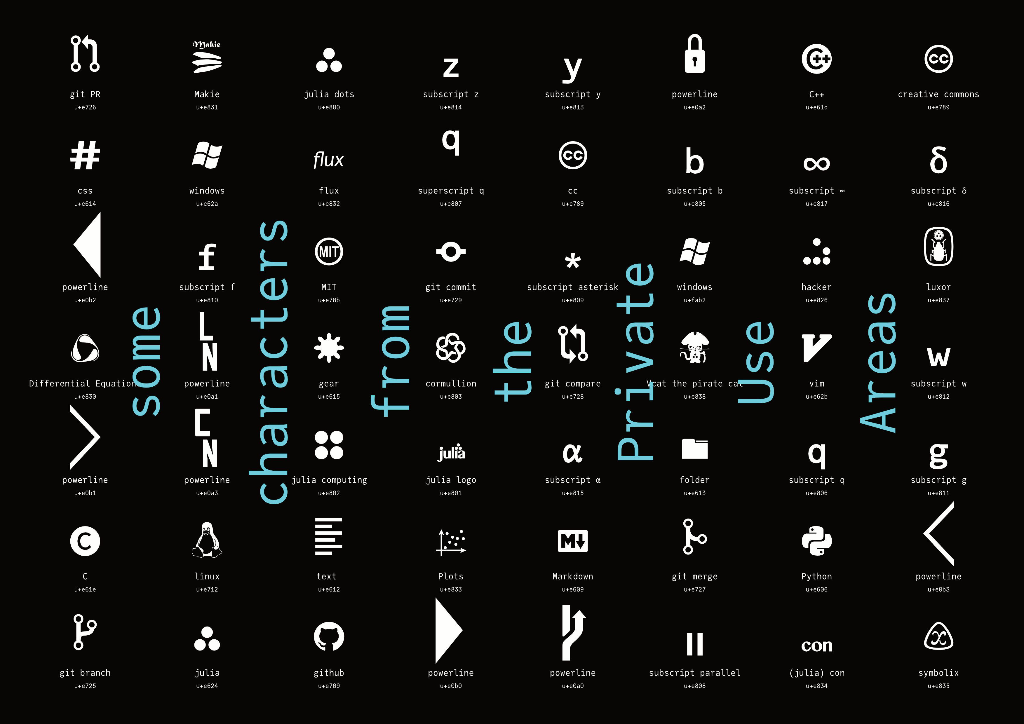
There are a few areas of the Unicode system that have been officially kept empty and are thus available to store characters that are not part of the standard. These are called the Private Use Areas, and there are three: \ue000 to \uf8ff, \UF0000 to \UFFFFD, and U100000 to U+10FFFD.
Each typeface can do its own thing in these areas. In JuliaMono, for example, if you look around \ue800 you’ll find a few familiar shapes:
julia> foreach(println, '\ue800':'\ue802')
The obvious drawback to using characters in a Private Use Area is that you have to have installed the font wherever you want to see them rendered correctly, unless they’ve been converted to outlines or bitmaps. If the font isn’t installed (eg on github), you have no idea what glyph - if any - will be displayed.
You can define these to be available at the Julia REPL. For example, say you want the Julia circles to be available in the terminal when you type \julialogo in a Julia session with the JuliaMono font active. Run this:
using REPL
REPL.REPLCompletions.latex_symbols["\\julialogo"] = "\ue800"
Now you can insert the logo in strings by typing \julialogo:
julia> println("Welcome to ")
Welcome to It’s usually possible to type Unicode values directly into text. This is a useful skill to have when you’re not using the Julia REPL... On MacOS you hold the Option (⌥) key down while typing the four hex digits (make sure you’re using the Unicode Hex Input keyboard). On Windows I think you type the four hex digits followed by ALT then X. On Linux it might be ctrl-shift-u followed by the hex digits.
You can find the font files at https://github.com/cormullion/juliamono.
Mac
To install and activate a font, launch Font Book from your Applications folder, and drag the font files into the middle pane labelled Font. If you're using a different font manager, you already know what to do. :)
Homebrew
On the latest version of Homebrew, you can install the fonts with:
$ brew tap homebrew/cask-fonts
$ brew install --cask font-juliamono
Windows
You can install a font for a single user or for all users. (Some applications (such as Java) don't see fonts unless they have been installed for all users.)
To install and activate a font on Windows, go to Computer |> Local Disk (C:) |> Windows |> Fonts. Locate the expanded .zip file folder, and drag the font files from there into the Fonts folder.
To install for all users, just right-click the font file(s) and choose Install for All Users. Administrator privileges are required.
Linux - using Font Manager
Install Font Manager:
sudo apt install font-managerThen double-click on the font files and click Install on each one.
Linux - on the command line
For Arch Linux, there is a package in the AUR.
Locate your font folder. Might be one of:
~/.fonts
/usr/share/fonts/truetype/newfonts/
~/.local/fonts/
~/.local/share/fonts/
and copy the files there. You might want to (or have to) regenerate the font cache:
$ fc-cache -f -vAnd verify installation:
$ fc-list | grep "JuliaMono"The typeface was introduced at the 2020 Julia Programming Language conference, JuliaCon, in Lisbon, Portugal, and it was (going to be) my contribution to the festivities. It was an experiment to see whether a font could be designed with a specific programming language in mind.
it has all the glyphs used in the Unicode Input chapter of the Julia documentation (except for the emojis)
a few of the glyphs and ligatures were designed with the Julia programming language in mind
the font contains special features such as contextual alternates, stylistic sets, and “ligatures” that complement Julia syntax
But in general it can be used for any purpose.
You can visit this mirror of the Julia blog. It hasn’t been updated for a while (it was useful during the development of Franklin.jl), but all the code examples use JuliaMono.
You can browse through this local copy of an old Julia manual. The default Roboto-Mono font has been replaced with JuliaMono-Regular.
As an example of using JuliaMono with Documenter.jl-generated documents, see the documentation for Luxor.jl.
Feel free to compare it with other fonts at dev fonts www.programmingfonts.org.
That’s not a question! But I know what you mean. Choice of work environment (editor, font, colour scheme, background music, preferred beverage, etc.) is very much a personal thing, and over the hours, days, and weeks that you work with your particular setup, you’ll grow accustomed to it, and unfamiliar work environments will look unappealing or even ugly. You’d probably need to try any alternatives for a while before you get more accustomed to them. Fortunately, you don’t have to try Comic Code, the Kakoune editor, the music of Autechre, Durian tea, or anything else that’s new and unfamiliar; just stick to your current favourites!
Find the relevant CSS file, and add a link to the WOFF2 stored on the server.
Option 1 (using the jsdelivr content delivery network):
@font-face {
	font-family: JuliaMono-Regular;
	src: url("https://cdn.jsdelivr.net/gh/cormullion/juliamono/webfonts/JuliaMono-Regular.woff2");
}
Option 2 (using the cdnjs content delivery network):
@font-face {
	font-family: JuliaMono-Regular;
	src: url("https://cdnjs.cloudflare.com/ajax/libs/juliamono/0.037/JuliaMono-Regular.woff2");
}
Then, in the area of the CSS where you control the appearance of monospaced text:
pre {
	font-family: JuliaMono-Regular;
}
code {
	font-family: JuliaMono-Regular;
	}
Notice that the CDNJS version points to a specific version (e.g. v0.037 here), whereas the JSDELIVR version always retrieves the current master version.
You may prefer to serve the WOFF/2 fonts from your own server. One problem you might encounter is related to Cross-origin resource sharing, which on some browsers prevents one web page from downloading fonts from another.
There are some other options for the @font-face directive, which determine things like the behaviour of web pages while the fonts are still downloading, the range of characters you want to download, and so on.
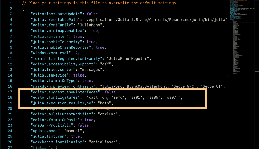
VS-Code
In VS-Code you’ll find the font settings somewhere in the labyrinthine (but thankfully searchable) Settings department.
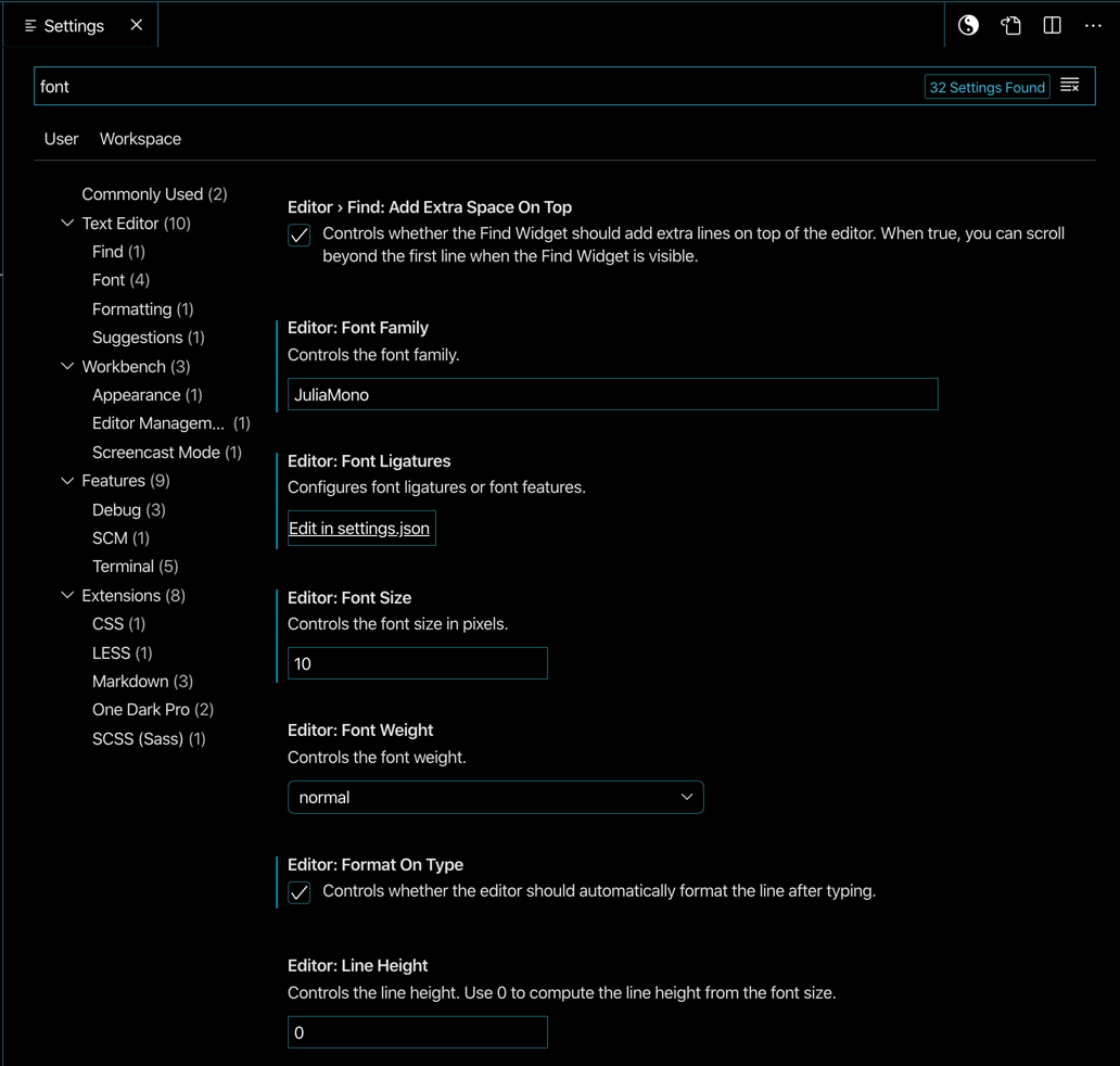
To control the display of contextual and stylistic alternates, click on the Edit Settings in JSON, and look for editor.fontLigatures:
This uses the feature codes (listed here). These should all be switched on or off in a single line.
For example, if you want all the currently available stylistic sets, use:
"editor.fontLigatures": "'zero', 'ss01', 'ss02', 'ss03', 'ss04',
    'ss05', 'ss06',  'ss07', 'ss08', 'ss09', 'ss10', 'ss11', 'ss12'",
Or if you just don’t like the contextual alternates, but quite like the slashed zero, simpler g, and lighter asterisk, use this:
"editor.fontLigatures": "'calt' off, 'zero', 'ss01', 'ss05'",Atom/Juno
In the Atom/Juno stylesheet, you can specify the font with the required CSS selectors:
font-family: "JuliaMono";which defaults to the Regular weight, or
font-family: "JuliaMono-Medium";You can switch off the contextual alternates (such as -> and =>) with:
font-variant-ligatures: no-contextual;Or on (if it’s not enabled by default) with:
font-variant-ligatures: contextual;Select any stylistic sets in a single line. For example:
font-feature-settings: "zero", "ss02";In Atom/Juno, you’d put these in the stylesheet, perhaps like this:
atom-text-editor {
    font-variant-ligatures: no-contextual;
	font-feature-settings: "ss01", "ss02", "ss03",
	    "ss04", "ss05", "ss06";
}It’s a good question. Some browsers these days are reluctant to give even you access to things on your own local disk, “for security reasons”. But a local copy of the font may be available and accessible on your particular set-up.
If not, you could try using web fonts, as above. For example, if there’s a Jupyter CSS file here:
~/.jupyter/custom/custom.cssyou could add definitions like this:
@font-face {
	font-family: JuliaMono-Regular;
	src: url("https://cdn.jsdelivr.net/gh/cormullion/juliamono/webfonts/JuliaMono-Regular.woff2");
}

.rendered_html table{
    font-size: 16px !important;
}

div.input_area {
    background: #def !important;
    font-size: 16px !important;
}

.CodeMirror {
    font-size: 16px !important;
    font-family: "JuliaMono-Regular" !important;
    font-feature-settings: "zero", "ss01";
    font-variant-ligatures: contextual;
}
which downloads the font once and is then available to applications.
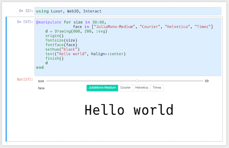
Another great question. Are you sure you want a monospaced font on your plot? If you do, it should be easy enough to ask for the font when you plot. But it’s never as simple as you want it to be, as is usual in the world of fonts.
I know very little about plotting in Julia, but some investigations suggest that:
pyplot()works well, mostlysome backends do their own thing with fonts. For example, I couldn’t persuade the GR backend to use JuliaMono at all.
Here’s some code that uses JuliaMono for a plot. The plot shows the frequency of occurrence of every Unicode character used in the Julia git repository, and uses the characters as plot markers. I went through every text file and totalled all the characters - there are 956044 letter “e”s, and so on. I’m using pyplot(); the freqs DataFrame holds the characters and the counts. I’ve created a few font objects using Plots.font(), which makes it easier to use different text styles in the plot() function. I haven’t yet worked out how to use the different weights of a font family.
using Plots, Plots.PlotMeasures
pyplot()
theme(:dark)
juliamonofont8 = Plots.font(family="JuliaMono", 8,
halign=:center, colorant"white")
juliamonofont12 = Plots.font(family="JuliaMono", 12,
halign=:center, colorant"white")
juliamonofont80 = Plots.font(family="JuliaMono", 80,
halign=:center, colorant"grey30")
annotation = "counting character frequencies\nin Julia source files "
p = plot(1:100,
freqs[1:100, 2],
fontfamily = "JuliaMono",
margin = 20mm,
yaxis = :log10,
annotation = [
(50, 1000, Plots.text(annotation, juliamonofont12)),
(80, 1_000_000, Plots.text("", juliamonofont80))
],
linewidth = 0.25,
series_annotations = Plots.text.(freqs[1:100, 1], Ref(juliamonofont8)),
xlabel = "← more frequent | less frequent → ",
ylabel = "occurrences (log scale) ",
labelfontsize = 6,
titlefontsize = 14,
formatter = :plain,
size = (800, 500),
title = "Top 100 characters\nin the Julia github repo ",
legend = false,
)
display(p)
The top 9 characters - “etanirsol” - are a good match for the typical English frequency count e.g. “etarionsh”. It’s to be expected that parentheses make a very good showing, here.
Although over 3600 unique characters occur in the Julia documentation, about 3000 of them appear just once. All of them, except the emojis which aren’t in JuliaMono, could be plotted, but the long tail isn’t very interesting visually.
For plotting emoji characters, you’ll have to dive into the internals of the plots system...
Notice that the y-axis labels are in DejaVu Sans, provided with matplotlib. That’s because the :log10 scaling code does its own \( \LaTeX \)-y business, ignoring the current font. However, at least I was able to insert the Julia logo successfully, since it’s part of the JuliaMono font.
In a \( \LaTeX \) document, you should be able to define and use local fonts.
Robert Moss put together an excellent package to help negotiate the various font issues that you might encounter when using Unicode and \( \LaTeX \):
An earlier approach that worked for me is as follows:
In your \( \LaTeX \) source file, define the font, using the local pathname:
\newfontfamily \JuliaMono {JuliaMono-Regular.otf}[
    Path      = /Users/me/Library/Fonts/,
    Extension = .otf
    ]
\newfontface \JuliaMonoMedium{JuliaMono-Regular}
\setmonofont{JuliaMonoMedium}[
	Contextuals=Alternate
]
Then you can use something like minted to format the code.
(I used the lualatex engine.)
It’s well-known that there are basically two different styles of font rendering - the Apple way, and the Microsoft way. Apple and Microsoft have always disagreed in how to display fonts on screens. The argument has been going on for over a decade, now. For example, see this blog post.
In brief: Windows stretches and distorts the glyph shapes to better hit the pixel boundaries, but at the expense of distorting the forms. Apple renders the glyph shapes precisely, but uses antialiasing to smooth the outlines, making the type a bit fuzzy on lower-resolution displays.
It depends if you mean the web fonts or the ‘desktop’ fonts. Web fonts come in two flavours, .WOFF and .WOFF2, where the 2 indicates a more recent and slightly more compact format. JuliaMono-Regular.woff is 674KB, JuliaMono-Regular.woff2 is 619KB - the size of a PNG image, perhaps.
The .TTF versions are getting on for 1.8MB each.
For comparison, the Themes folder of .CSS files for the Julia manual (and for every manual built with Documenter.jl since v0.21) is about 700KB. So in that light the WOFF2 fonts aren’t that bad. Of course, the two Google fonts downloaded by every Julia document (Lato and Roboto) are tiny, at 14KB and 11KB, with 221 glyphs in each.
So, if you’re building a website, or designing for mobile applications, the size of the WOFF2 file(s) will be an important factor to weigh against the advantages of having predictable character sets. Note that you can specify font subsets in the CSS using the unicode-range feature, which defines a restricted set of characters which you know are going to be used, so that users don’t download any that they won’t need.
You could consider using the ‘-Latin’ variants to obviate the initial loading time.
You’re right, of course, there are many coding fonts, all perfectly adequate for the task of programming in Julia and most other languages. Comparing two different fonts is a matter of how important small similarities and differences are. Perhaps with one font you’ll see the occasional empty box or odd replacement rather than the character you were hoping for. Or perhaps sometimes you won’t like a particular glyph.
More likely, though, the overall ‘feel’ of a new and unfamiliar font - too narrow, too wide, too dense, too light, too quirky, too dull, too consistent, too variable - is a matter of personal taste, immune to objective measurement. The design goals of JuliaMono - readable, easy to use, unquirky, simple - mean that the shapes aren’t compressed or condensed. It’s not fashionably thin. It might feel quite “airy” because of the generously-spaced shapes. The punctuation is quite solid, which might not be to your taste; it’s much more important in code than in ordinary prose, and my eyesight is probably poorer than yours!
Most people probably can’t tell the difference between Helvetica and Arial, and certainly aren’t going to be bothered about minor differences between JuliaMono and other coding fonts. But that’s fine. Just stick to your current favourites!
In the world of typographical software, one programming language is currently ubiquitous (hint: one of the leading programmers in the typography realm is Just van Rossum, one of the van Rossum brothers) and it’s not Julia.
The typeface isn’t a Julia package. It might be, soon! But although Julia wasn’t used to build the typeface, I did use Julia quite a lot while designing it; sometimes to generate glyphs, there being plenty of symmetrical designs that lend themselves to programmatic construction with a simple graphics program (e.g. Luxor.jl). And also for producing glyph lists, charts, test output, and build scripts. And the various graphics you see here and in the specimen PDF were also made with Julia. So in that sense at least the font is a bit Julian.
And how will JuliaMono contribute? It’s often in the nature of an experiment that the outcome is uncertain until it’s been carried out.
The first β release, version 0.001, was released on July 27, 2020. The most recent β release, version 0.037, was released in April 2021. Always download the latest version if you want the typeface to perform at its best.
Unicode (and Julia) allows you to combine characters. In the Julia REPL, you can type a character and then modify it by adding a mark or diacritic. For example:
e\vecdisplays as
e⃗and the arrow mark is displayed above the character. These combining marks are listed in the Unicode Input section of the Julia documentation. It’s sometimes possible to add more than one:
e\vec\dotwhich JuliaMono renders like this:
e⃗̇However, this doesn’t work in all text environments, such as the terminals in Atom/Juno, VS Code, or Jupyter:
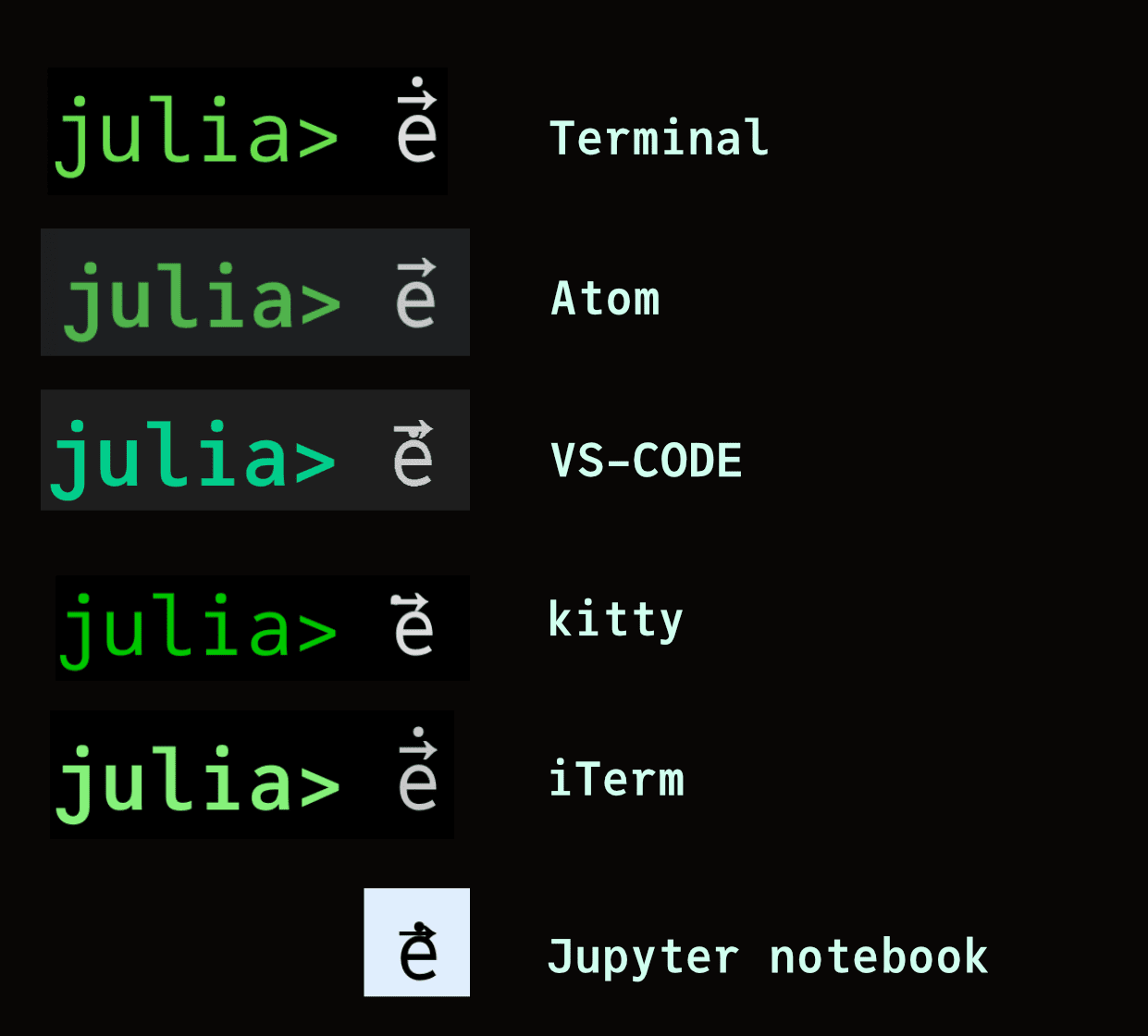
For Atom/Juno and VSCode, it’s because they're using a JavaScript terminal emulator (xterm.js) rather than a full terminal. But there may be improvements in the future. Other terminal applications choose not to implement all OpenType features, for performance reasons, perhaps.
If it does work for you, this is fun:
jul\iota\ddot\dotagiving:
julϊ̇aYes. JuliaMono works well, with most modern MacOS text editors, such as Atom/Juno, Visual Studio Code, Sublime Text, the excellent free CotEditor, Panic's new Nova editor, and TextEdit, among others. If these editors support OpenType features such as stylistic alternatives and ligatures (not all do), these features of JuliaMono should work well.
With older applications, such as the old-school BBEdit text editor, you may experience a few glitches when using fonts such as FiraCode, IBMPlex Mono, JetBrains Mono, JuliaMono, Operator Mono, and Source Code Pro (to name just the ones I checked). BBEdit doesn't support OpenType ligatures either. But apart from that, you can still use it.
Yes.
Font management in Linux may require you to become familiar with the fontconfig program. And it may be necessary to provide an additional configuration file (in /etc/fonts/local.conf for example), that contains instructions like the following:
<alias>
    <family>monospace</family>
    <prefer>
		    <family>JuliaMono</family>
		</prefer>
</alias>
With some older terminal software, the ligatures and alternate characters may cause problems, or not work at all. Not all terminals choose to display ligatures, others are just confused by fonts that have them.
The font works well on a good quality display, but will struggle to maintain quality when displayed on low-resolution displays.
On Windows, the shapes of letters are distorted in order to place the important features of letters on pixels, rather than ‘between’ pixels (which could make features disappear). On high-resolution displays, as found on Apple devices, it isn't necesary to distort letter shapes in this way. The distortion is controlled by a process called ‘hinting’. On Windows displays, you may find that there is unevenness and variations in thickness and alignments, particularly at smaller sizes. This is due to the hinting generating distorted shapes to target pixels.
JuliaMono is an OTF/TTF-flavoured font that contains hinting instructions. Hinted fonts are larger than OTF/CFF (PostScript-flavour) as a consequence.
nerdfonts can add about four thousand extra glyphs to a font. It does this by creating a new font that combines an existing font’s glyphs with a bunch of new ones, using a FontForge Python script. This is quite cool, in a way.
JuliaMono concentrates on the Unicode standard glyphs, as used for Julia code, whereas Nerdfonts adds many non-standard glyphs such as product and brand logos, trade names, icons for dozens of file extensions, programming languages, commercial applications, and a fair number of not-so-relevant characters. It’s aimed at a much wider audience. Nerdfonts doesn’t overlap much with JuliaMono.
The nerdfonts project is a bit of a hack - glyphs are pushed into areas that are outside the Private Use Area, and there’s some unnecessary duplication of icons and other Unicode characters. And, if you do build a nerdfont version of JuliaMono, it will be quite large.
Perhaps the companies could contribute money to the Julia project in exchange for having their logos stored in the font...
Good to know!
One day perhaps.
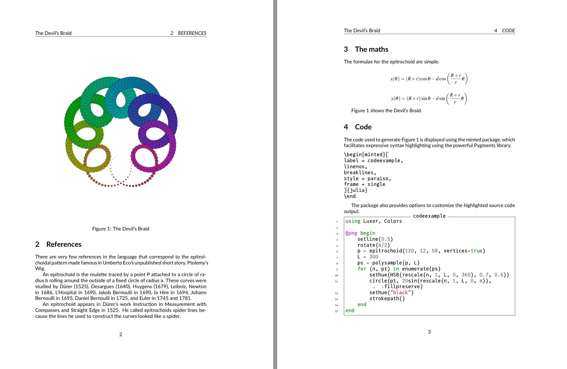
Well, here are a few images to show JuliaMono in some less practical situations:
| [1] | “licence” Although not MIT-licensed like Julia, JuliaMono is licensed using the SIL Open Font licence, which allows the fonts to be used, studied, modified, freely redistributed, and even sold, without affecting anything they’re bundled with. |
| [2] | “Windows” For more information about if and how it works on Windows, read this, but I currently don't know enough about Windows font technology and how it differs from MacOS and Unix. Early reports said that the font didn't look good on Windows. This was because the format was CFF/PostScript OTF, which isn't hinted on Windows. A switch to TTF/TrueType OTF, which is hinted, was considered an improvement. |
| [3] | “masters” In fact there are four masters (Light, Regular, Bold, and Black), and the other instances are interpolated between them. |
| [4] | “maths in code” spotted here |
| [5] | “languages” Apologies for errors - I don’t speak most of these languages. |
| [6] | “terminals and line spacing” Terminal applications usually provide the option to vary the line spacing. For perfectly smooth Unicode plots, you can adjust this until the shaded glyphs are in tune. But for coding purposes you might want the line spacing increased (or decreased) from the default, depending on the trade-off between reading speed, font size, and how many lines of code you can cram in. |
| [7] | “greedy” referencing this classic Julia blog post |
| [8] | “better fonts...” Operator Mono and Fira are excellent typefaces... Try them! Also try IBM Plex Mono, Iosevka, Recursive, and Victor Mono, to name a few of my favourites. Like programming languages, every typeface has its strengths and weaknesses. Perhaps keep JuliaMono for font fallback purposes... ;) |
| [9] | “not the only one” Matthew Butterick says “hell no” to them. He also uses the phrase “well-intentioned amateur ligaturists” which isn’t a label I want to have. But more seriously, he says: “my main concern is typography that faces other human beings. So if you’re preparing your code for others to read — whether on screen or on paper — skip the ligatures.” |
| [10] | “alternate glyphs” Note that the substitute glyphs occupy the same width as the source glyphs they're replacing. While you could in theory use one of the thousands of Unicode arrows, such as →, as a replacement for the ‘stabby lambda’ (->), these are the width of a single character, and so you'd be changing the width of your string/line whenever you made the substitution. |
| [11] | “Typography panel” These vary widely in their abilities and functions: the MacOS Terminal app’s Typography panel is comprehensive but I’m not convinced that all the buttons are wired up yet... |
| [12] | “terminals again” Writers of terminal apps usually have their own ideas about how fonts and type should be managed and displayed. I haven’t yet found one that did everything that I wanted it to and nothing I didn’t expect it to. In the world of fonts, nothing is 100% correct, which can be frustrating. You can track some of the issues and discussions on github and elsewhere: here’s a VS Code issue; here are the Alacritty terminal developers working on it; here is the iTerm documentation talking about performance. |
Thanks!
Thanks to: Thibaut Lienart for his Franklin.jl website builder; to Jérémie Knüsel who provided invaluable suggestions and advice; to Dr Zygmunt Szpak for his cool maths code; to Simeon Schaub for the issues and PRs, and everyone else who's taken an interest and commented.