If I ever get round to presenting something at a future Julia Conference (not JuliaCon 2018, but perhaps JuliaCon 2019, who knows?), it will probably be something like this. Lots of graphics, and a little bit of Julia code.
String logo
So, Scott asked me on Twitter: why don't I suggest some ideas for a logo for the JuliaString organization on Github?

Yes, that’s the infamous Scott P. ("Mr. String") Jones! Scott also mused on what he’d like to see in a logo: multiple concentric rings of text from all corners of the Unicode table, including Hindi, some Chinese, DNA strings, an annoying slogan, and a scattering of emojis for seasoning:


But flattery is still very acceptable currency in my neck of the woods, so I thought I’d have a go. I know little about logo design, but I've made a few. I think I know what I like. And I've got some graphics code which always needs testing.
Fun fact: The word logomark is sometimes used to distinguish a purely graphical symbol (think of the Apple logo) from a logotype, which is more commonly known as a wordmark, which uses letters or words (think of the IBM logo).
I know that a logo should be a simple, distinctive, graphical construction recognisable at large and small scales, from the side of buildings to small computer icons 64 or 128 pixels across, and that it should preferably communicate well in both black and white and colour. It should also be witty, ingenious, and convey the essence of the thing it represents without being over-specific or over-restrictive. And it should also be—in a world with millions of existing logos—unique and unlike any other.
That’s a tall order, and even the pros don't manage it all the time.
How long is a piece of string?
Unfortunately, when I start thinking about the word "string", it conveys to me just one thing: a long thin strand of fibrous material most likely overlapping itself, and possibly subject to random entanglements that both mathematicians and non-mathematicians call knots. A piece of string. So, my first thought was that a logo representing string has to look like, er, string.
This should be straightforward enough: I’ll photograph some string, enhance the image, put it inside a box. Job done!
Oh, perhaps I should add the traditional Julian colours of purple, red, and green:
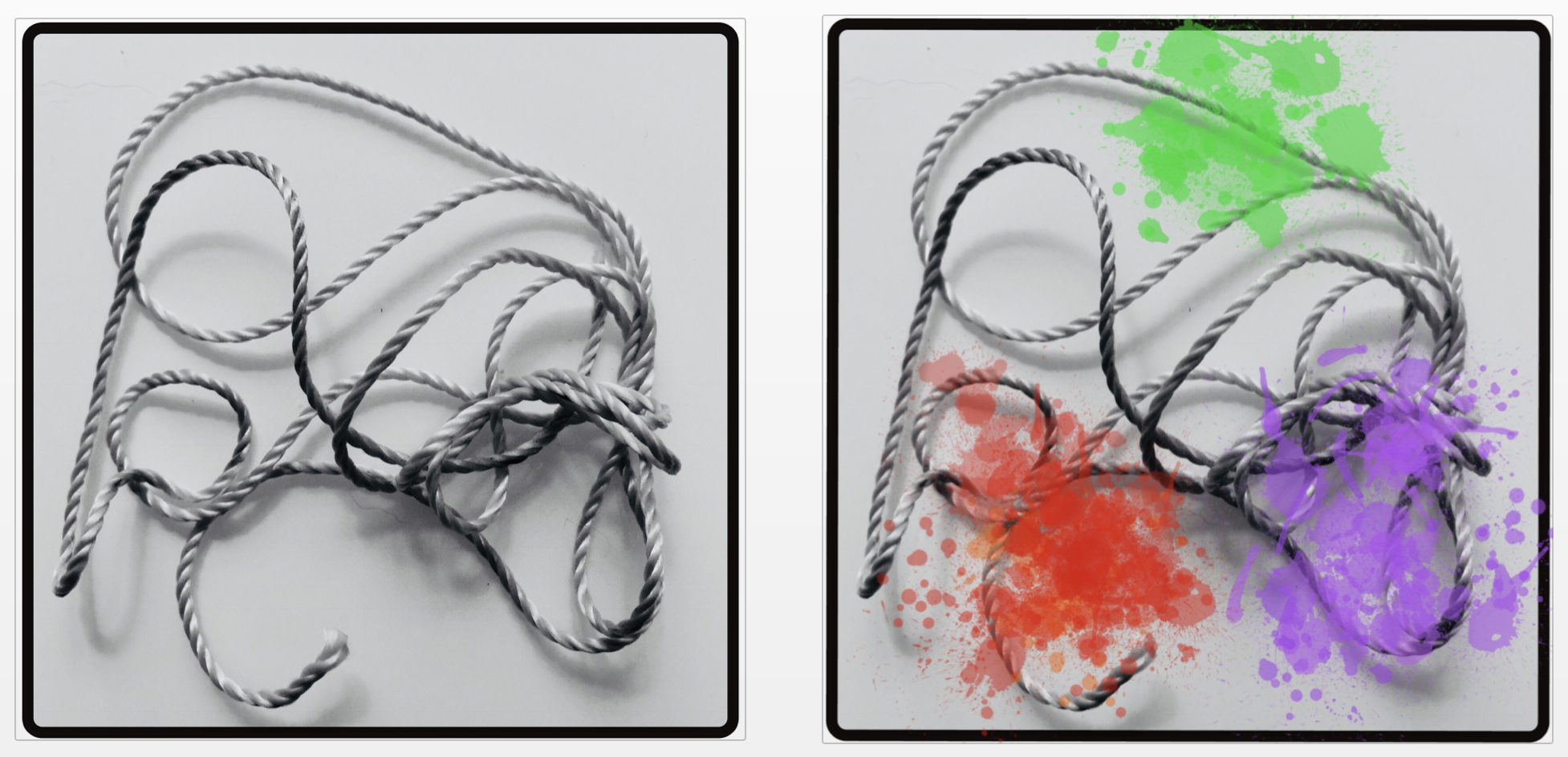
That didn’t take long!
But seriously...
Seriously, though, I should really show a bit of geometric enthusiasm for the task. Besides, I have to abide by the Code for tasks like this, which means producing it entirely in Julia, basically just an excuse for testing the usability and reliability of the packages I develop, and for playing with some pretty pictures.
Let’s start again, with a fresh cup of coffee to hand.
My initial idea of geometrical string led me to the parametric equations for a small piece of string joined at the ends in a loop, overlapping three times, known as a trefoil knot.
\[\begin{array}{rcl} \begin{cases} x &= \sin(t)+2\sin(2t) \\ y &= \cos(t)-2\cos(2t) \end{cases} \end{array}\]As the mathematicians say, this is the simplest non-trivial knot.
These can be plotted with a long-ish one-liner. I've used Luxor's prettypoly() function rather than poly() here, to see the individual points. (It applies a function at every vertex, using the circle() function by default.)
using Luxor
@svg begin
    prettypoly([Point(130sin(t) + 90sin(2t),
                      130cos(t) - 90cos(2t))
        for t in 0:0.05:2pi], :stroke, close=true)
end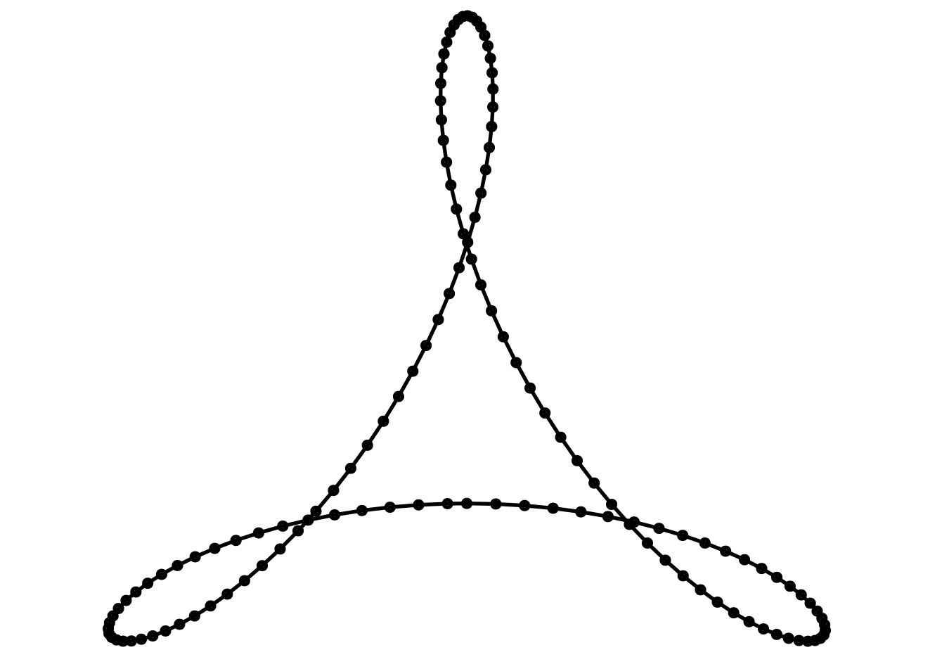
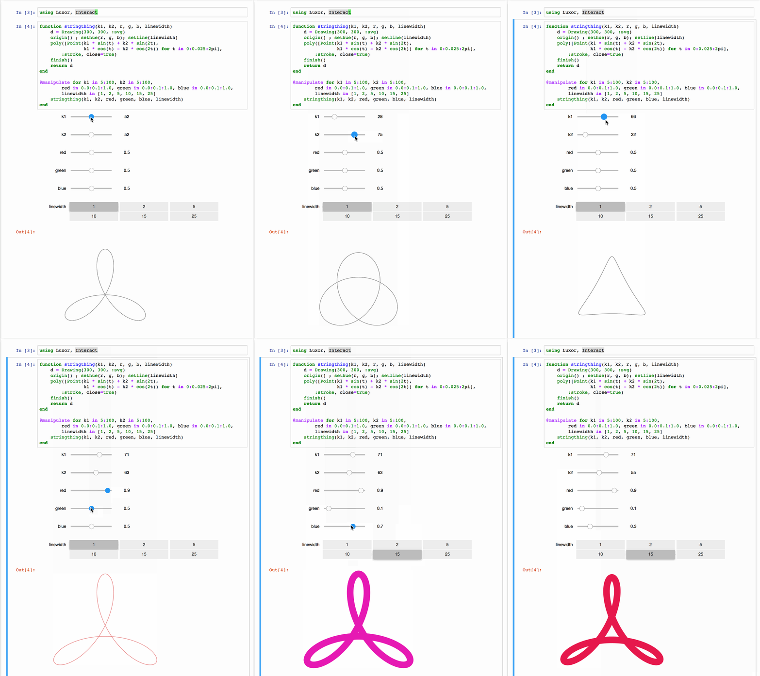
The same comprehension can be inserted into an interactive Jupyter notebook cell. This allows me to explore some of the basic geometrical possibilities.
Over and under
The results are pleasant, but a wee bit dull. Also, the places where the string goes over and under itself—the overlaps and underlaps—these are part of the unique string-y quality of string that I should be trying to show, and you can't see them.
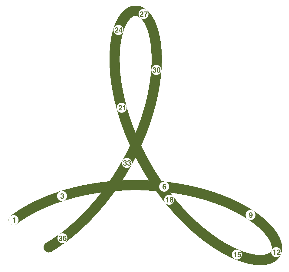
Usually when you’re drawing a path in some graphics program, you can overlap your earlier traces again and again, but it’s not possible to go underneath earlier bits on the same path once you’ve already started drawing it. In the next example, perhaps after Point 18 we'd want to show the path dipping below Point 6, which was drawn earlier. Wherever you start from, you go "under→over→under", or "over→under→over".
Also, typically, a single stroked path can be only a single colour, and a single opacity level.
You can get only so far by drawing circles:
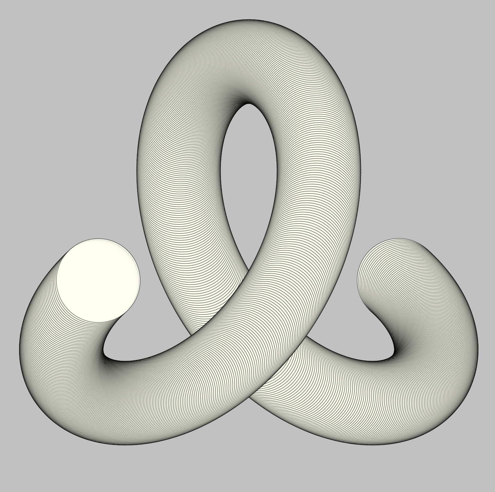
That right-hand end should be heading above the loop, the left-hand end below...
using Luxor
@svg begin
    background("silver")
    translate(0, 25)
    pts = [Point(100sin(t) + 150sin(2t),
             100cos(t) - 150cos(2t))
             for t in pi/6:0.0075:2pi - pi/6]
    setline(0.75)
    setopacity(0.8)
    for t in pts
        sethue("black")
        circle(t, 50, :stroke)
        sethue("ivory")
        circle(t, 50, :fill)
    end
end
I tried to devise some algorithms to draw overlapping and underlapping paths automatically. For example, as you start to draw a path, remember the location of each line segment, then, when you have to go underneath an earlier segment, make a note of it, then later go back and erase it and redraw it.... Well, I didn’t manage to complete any of these thought algorithms, but I'd love to know if anyone else has.
Go deeper
The problem was literally asking for a more in-depth approach. I added Z-coordinates to the X and Y. The parametric equations are now:
\[\begin{array}{rcl} \begin{cases} x &= \sin(t)+2\sin(2t) \\ y &= \cos(t)-2\cos(2t) \\ z &= -\sin(3t) \end{cases} \end{array}\]A quick modification uses the X and Y coordinates as before, and the Z coordinate determines the radius of the dots:
@svg begin
    pts = [(130sin(t) + 90sin(2t),
            130cos(t) - 90cos(2t),
            -90sin(2t))
           for t in 0:0.025:2pi]

    for t in pts
        circle(Point(t[1], t[2]), abs(t[3]/25), :fill)
    end
end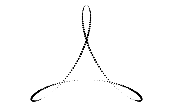
This should be familiar to most of us, it's more or less the Adobe PDF logo:

Fun fact: The software known as Adobe Acrobat was code-named Carousel during its development. I wonder if this logo had its origins with the idea of roundabouts...
We're only enhancing the illusion of depth, though, by changing the size of the disks in response to the Z-coordinate.
Ciao, Cairo?
Cairo.jl doesn't do 3D graphics (and neither does Luxor.jl, which depends on it), but I thought there was a bit more mileage left in this idea before I moved on. Once you start down a rabbit hole, you want to see what's round the next bend; you probably know that “I’ll just give this ten more minutes...” feeling?
Fun fact: The name of the graphics system Cairo derives from its original name Xr (the X-Windows Renderer)) when the Greek letters for
Xandr(chiandrho) are pronounced.
I made a Point3D type to store the XYZ coordinates of curves:
mutable struct Point3D
   x::Float64
   y::Float64
   z::Float64
end
I want to be able to look at the curve from a defined angle, probably above, so I’ll have a Projection type to store things that define a 3d projection, like eye position and view center, and a way of choosing how much perspective foreshortening should be applied:
mutable struct Projection
   U::Point3D
   V::Point3D
   W::Point3D
   ue::Float64
   ve::Float64
   we::Float64
   perspective::Float64
end
And I needed a function to convert a Point3D to a Point via a Projection, using some arithmetic:
function project(P::Point3D, proj::Projection)
   r = proj.W.x * P.x + proj.W.y * P.y + proj.W.z * P.z - proj.we
   if r < eps()
       result = nothing # behind you!
   else
       if proj.perspective == 1.0
           depth = 1 # parallel projection
       else
           depth = proj.perspective * (1/r)
       end
       uq = depth * (proj.U.x * P.x + proj.U.y * P.y +
         proj.U.z * P.z - proj.ue)
       vq = depth * (proj.V.x * P.x + proj.V.y * P.y +
         proj.V.z * P.z - proj.ve)
       result = Point(uq, -vq) # Y is down
   end
   return result
end
(And yes, this needs re-working to be more type stable. @code_warntype gives me a right telling off, with lots of red result::Union{Luxor.Point, Void}s!)
Get to the Point3D
I wrote a few more utilities, drank a few more cups of coffee, and eventually there’s a spinning shape on the screen:
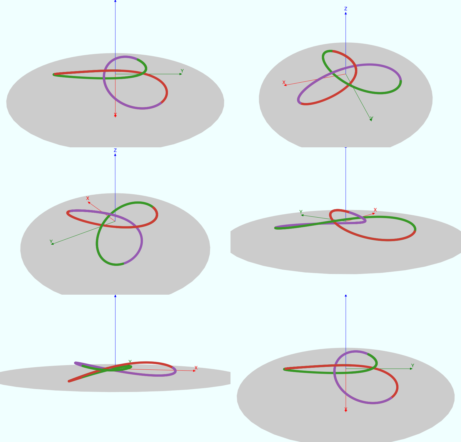
The gray carpet is just a polygon of 3D points with zeros for Z values, each one pushed onto the Luxor drawing using this project() function. The animation is the usual animate() to GIF which sends a bunch of stills to ffmpeg.
At least I can see where the overlaps and underlaps occur, and I can start working out how to drop back to 2 dimensions while preserving the over/underlapping information from the 3D world.
Try colour
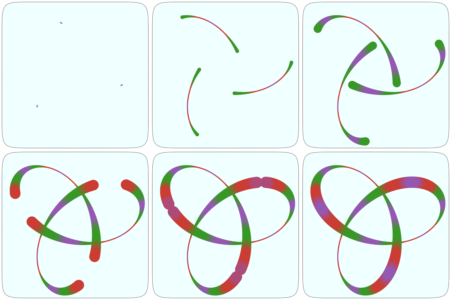
If the curve was split into three pieces, they could all be drawn “at the same time”, but in different colours. So for each point I collect the three z-coordinates and sort them into order with sortperm(), so the point with the lowest Z could be drawn first, at the bottom of the stack, and points with higher Zs drawn on top.
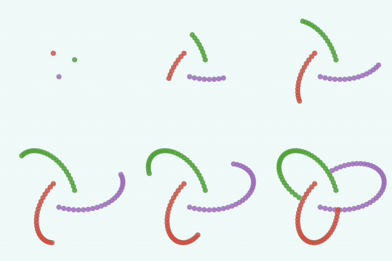
Fortuitously, most Julia logos also keep to the theme of three colours: purple, red, and green.
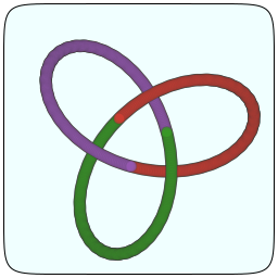
I realise that 99% of the time it’s not worth checking the Z values—it's only for those few occasions when the XY values are the same does the Z value matter. Perhaps I could predict mathematically where those points are? Well, let's worry about performance later.
There's a hint of translucency in this one:
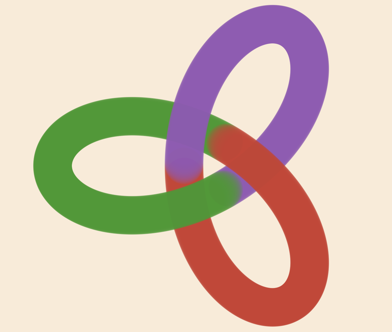
Sorted
Better still, let's generate all the points first, in one fell swoop, then sort them by Z coordinate.
...
points = Point3D[]
for t in 0:0.005:2pi
    push!(points, pointonstring(t, 110, 180, 5, xy=2, z = 3))
end
sort!(points, by = (a) -> a.z)
...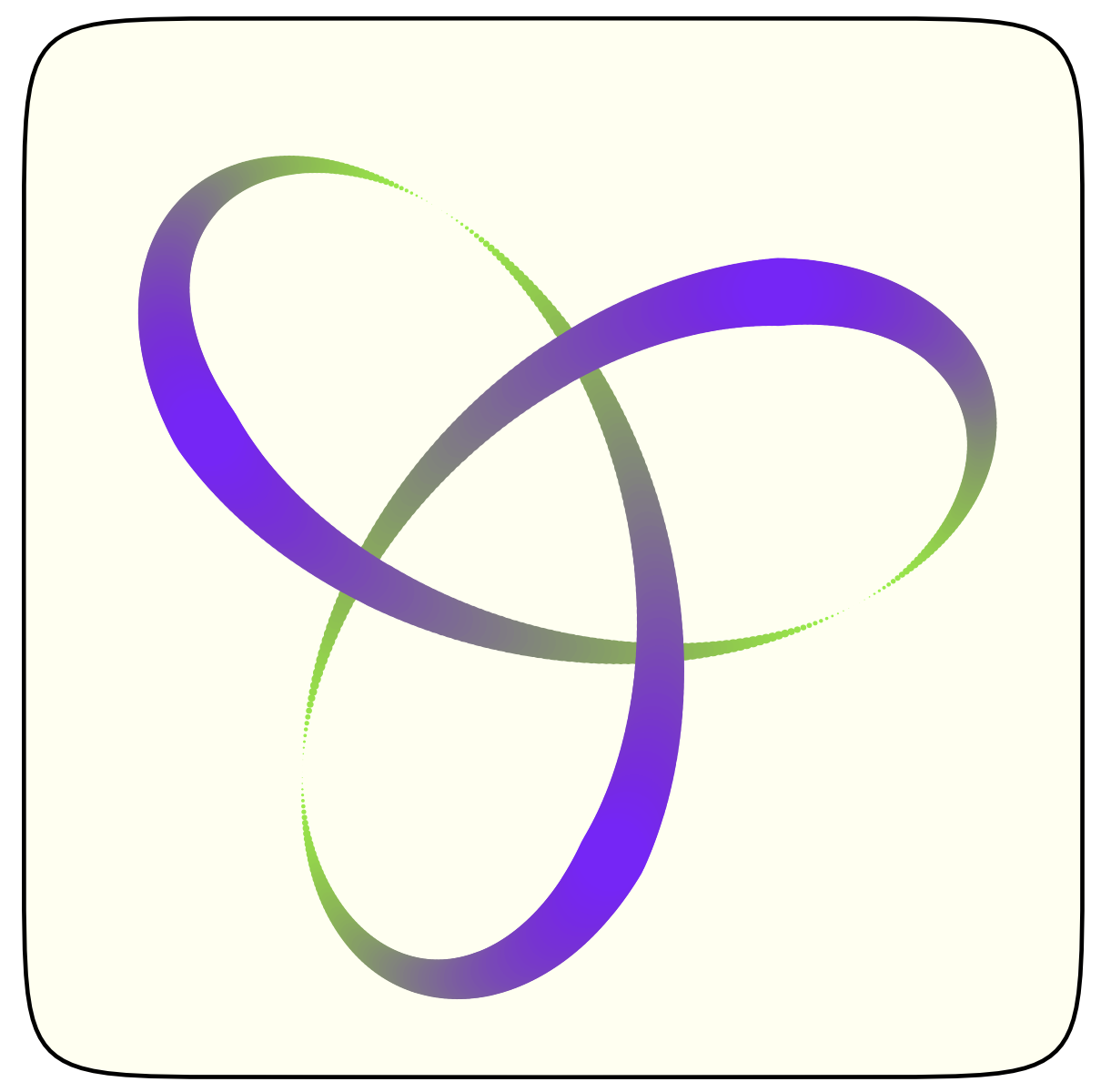
An animation shows how the points furthest from the eye are drawn first, then the nearer ones hide them in turn:

Coloured blends
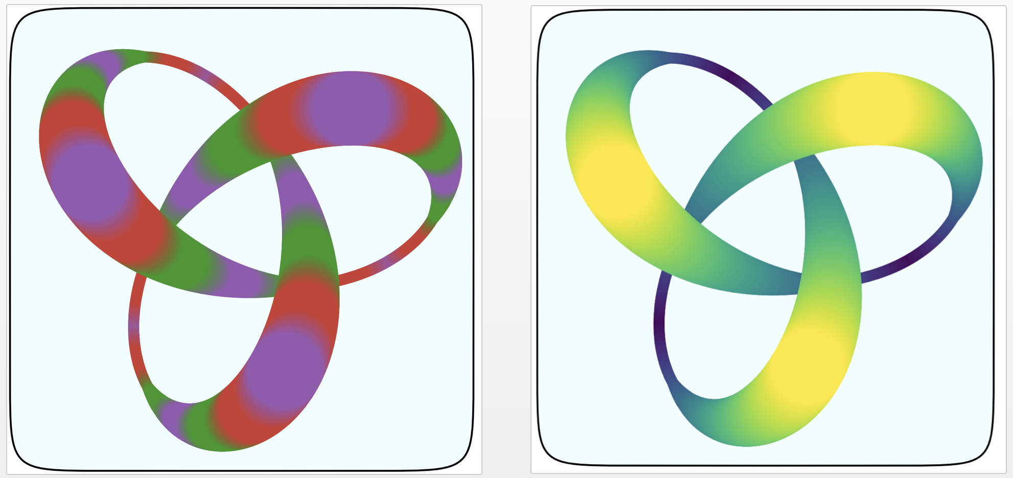
After trying to draw the three Julia-coloured strands separately, I tried changing the colour continuously along the length of the string. This is possible with the get() function from ColorSchemes.jl, which lets you sample a set of colours at any point, not just where the colour stops occur. I created a Julia colour scheme, which goes from purple, to red, to green.
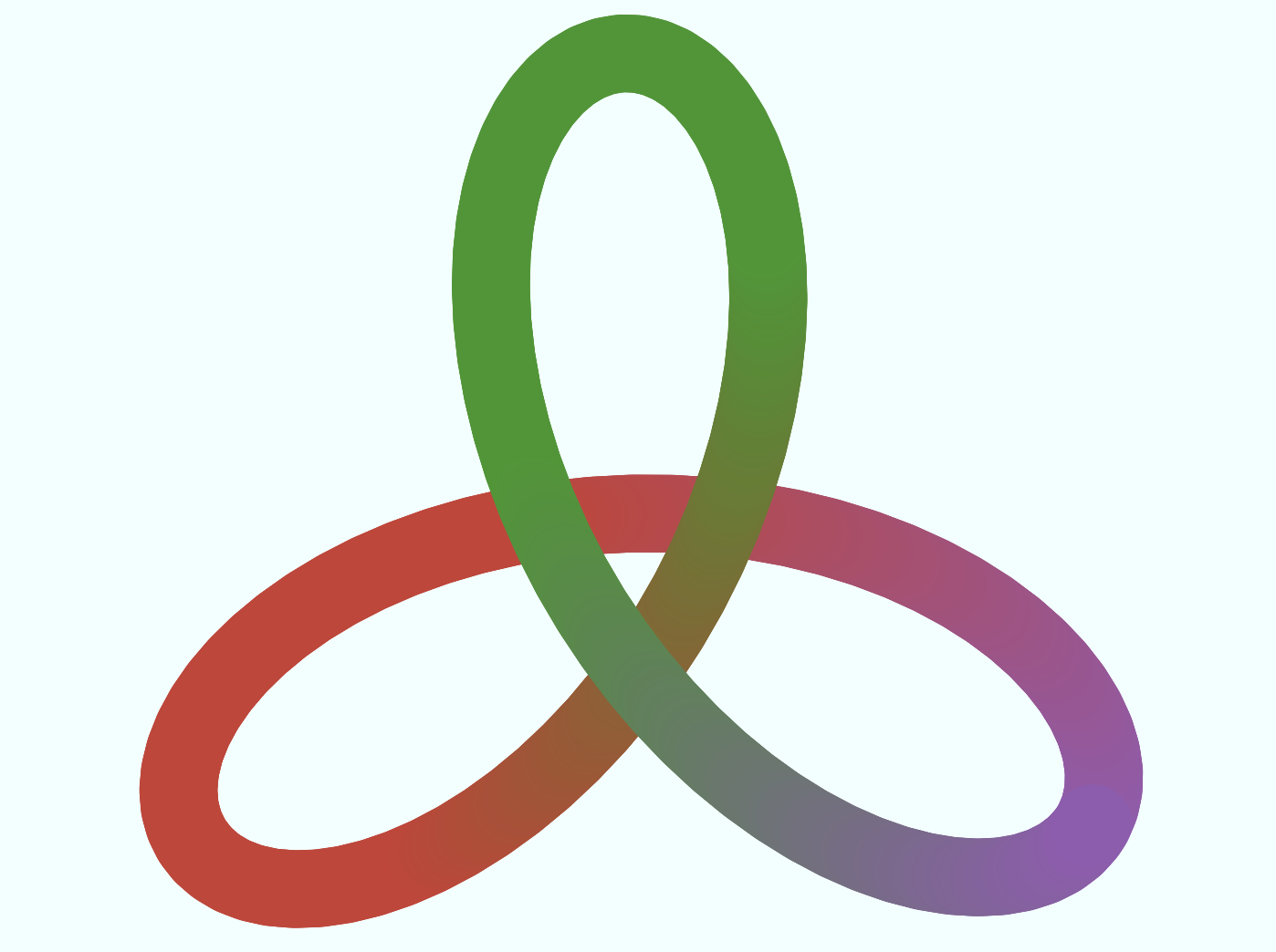
However, the exact geometry of the knot is lost when you try to do this. (Did you notice? I didn't for a while). Still, it looks OK.
Get some Zs
It's hard to resist playing with the various parameters and colour schemes.

Changing the way the Z coordinates were generated led to some interesting permutations:
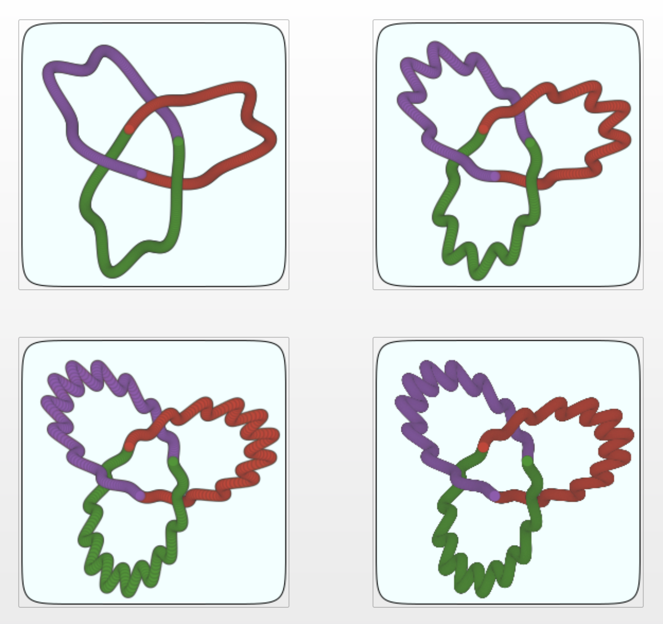
I think there's some stringiness here. This next one looks like a hank of woollen thread:
The graphics look great in SVG (says I, inserting a big PNG at this point...):
Fiddling with the formula
Using Julia for playing around with designs means that the solution space defined by a few basic graphic ideas can be explored, once you have parameterized all the things. Letting these cycle through at random is one possible strategy, or you could just step through some pre-arranged sequence of numbers. For a language as powerful as Julia this isn't very demanding stuff, computationally speaking, and the results are usually generated more or less instantly. (It takes a few seconds to make the animations, because this involves creating and joining 100s of individual frames.)
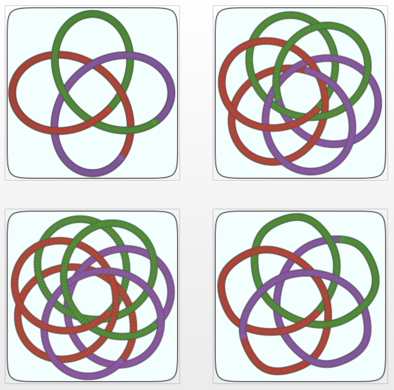
Some of these are taxing my brain's ability to parse 3D shapes... Are these valid?
Space craft
When you use trig functions to generate curves, you’re often stepping through the angles by a fixed amount. The intermediate points on resulting curves have different spacings—wider apart one minute, closer the next. This is usually OK, because the tighter corners at inflection points use more points — it can even add some useful visual cues. But sometimes you want equidistant intermediate points on curves, no matter where the curve is going.
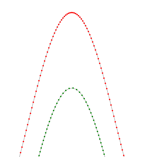
The green version of the red curve above is made with the Luxor function polyportion(), which lets you find any position along a polygon’s length: so for any polygon, a range of 0.0:0.1:1.0 produces 11 equally spaced points along the polygon’s length. With Julia’s speed it doesn’t take long to scan a curve and return a new set of equidistant points. (For example it takes about 0.2 seconds to reinterpret a 12,000 point polygon as 4000 equidistant points.)
This technique lets us represent curves in a more decorative or controlled way.
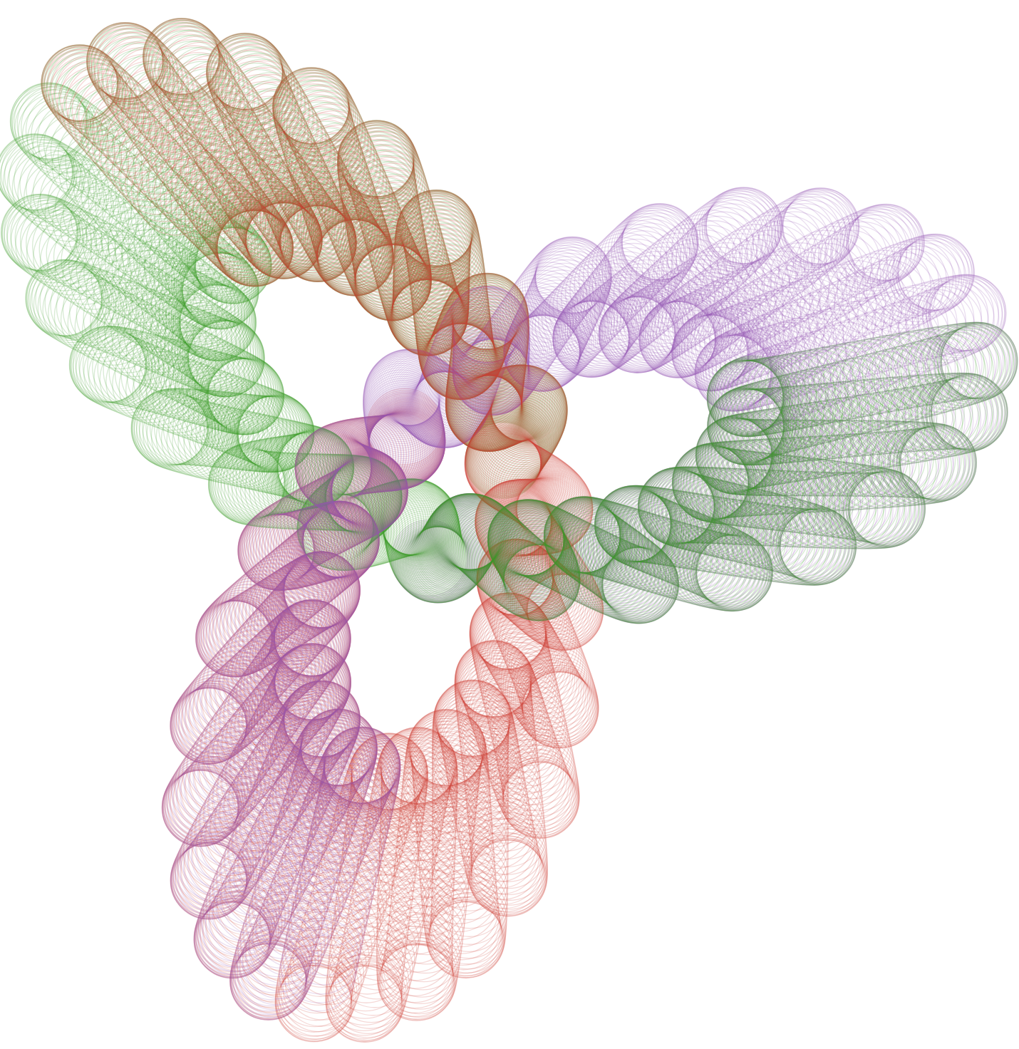
Placing white circles at intervals adds a neat and fairly convincing perspective effect, even though there isn't any 3D geometry going on here:
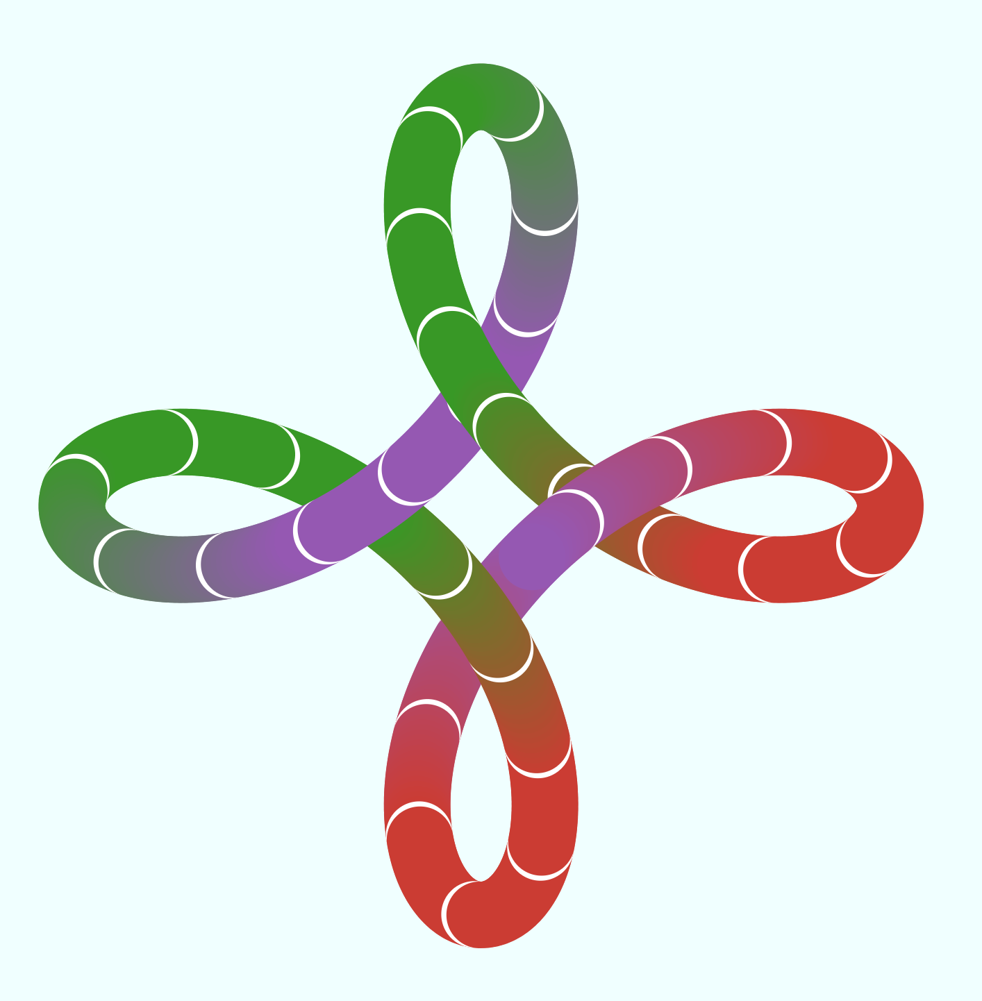
The colour schemes have slipped a bit here...
In the next images, the string is starting to look like a necklace:
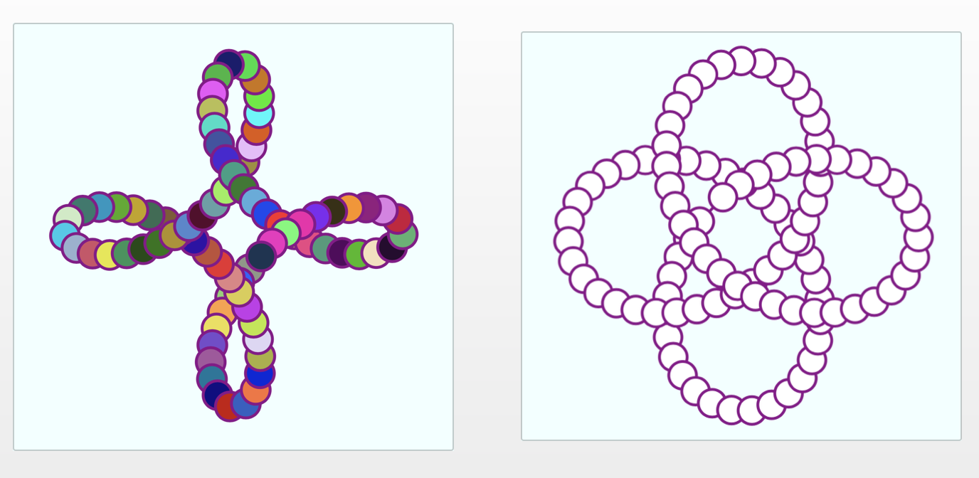
It's not bad; the ‘beads’ could even carry a suggestion of elements in an ordered sequence, such as characters in strings...

Unfortunately, I think this goes too far. It just doesn't look very good, and of course it doesn't work at all at small sizes:
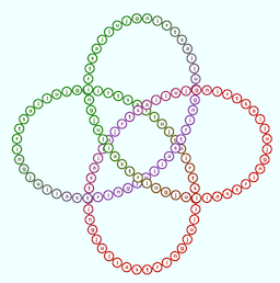
Worryingly, I think Scott might like this one...
An improvement would be to work out in advance where the curves overlap so as to align the circles (because they look horrible here). This might take some mathematical know-how. Perhaps I should hire a math wiz like Chris Rackauckas as Technical Consultant...
Asymmetry
I think there's always a desire for symmetry and graphical simplicity. The problem is that, by now, these simple geometric ideas are well-travelled paths. We haven't yet hit Peak Logo, but there are already millions of the things, with more being generated every second, and many of the simple and elegant designs have already been taken. This problem is seen elsewhere, such as product names, top-level internet domains, start-up company names, and perhaps even names for programming languages.
Exploring asymmetry and randomness can be a useful technique because it immediately relaxes a constraint that, up to now, has been limiting the possibilities. If nothing else, you can get some ideas for further investigation.
These are quite jaunty, if a bit formulaic:
cs = juliacolorscheme
pts = Point3D[]
for t in 0:0.005:2pi
    push!(pts, pointonstring(t, 50, 90, 2.5, xy=2, z = 3))
end
sort!(pts, by = (a) -> a.z)
zmin, zmax = extrema(getfield.(pts, :z))
for (n, pt) in enumerate(pts)
    sethue(get(cs, rescale(n, 0, length(pts), 0, 1)))
    d = rescale(pt.z, zmin, zmax, 0, 20)
    circle(project(pt, projection), max(3.0, d), :fill)
end
Here it is when depth sorted and animated:
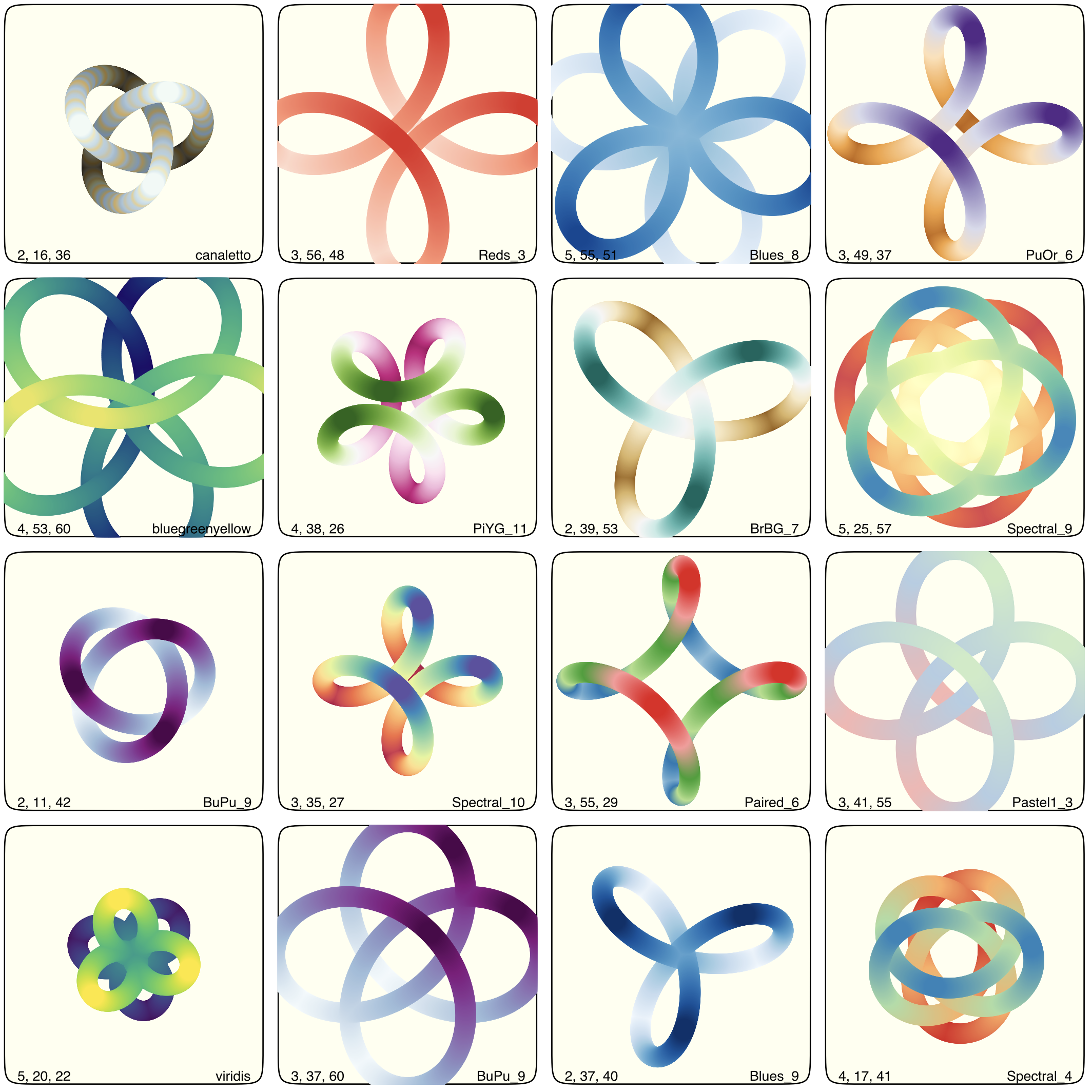
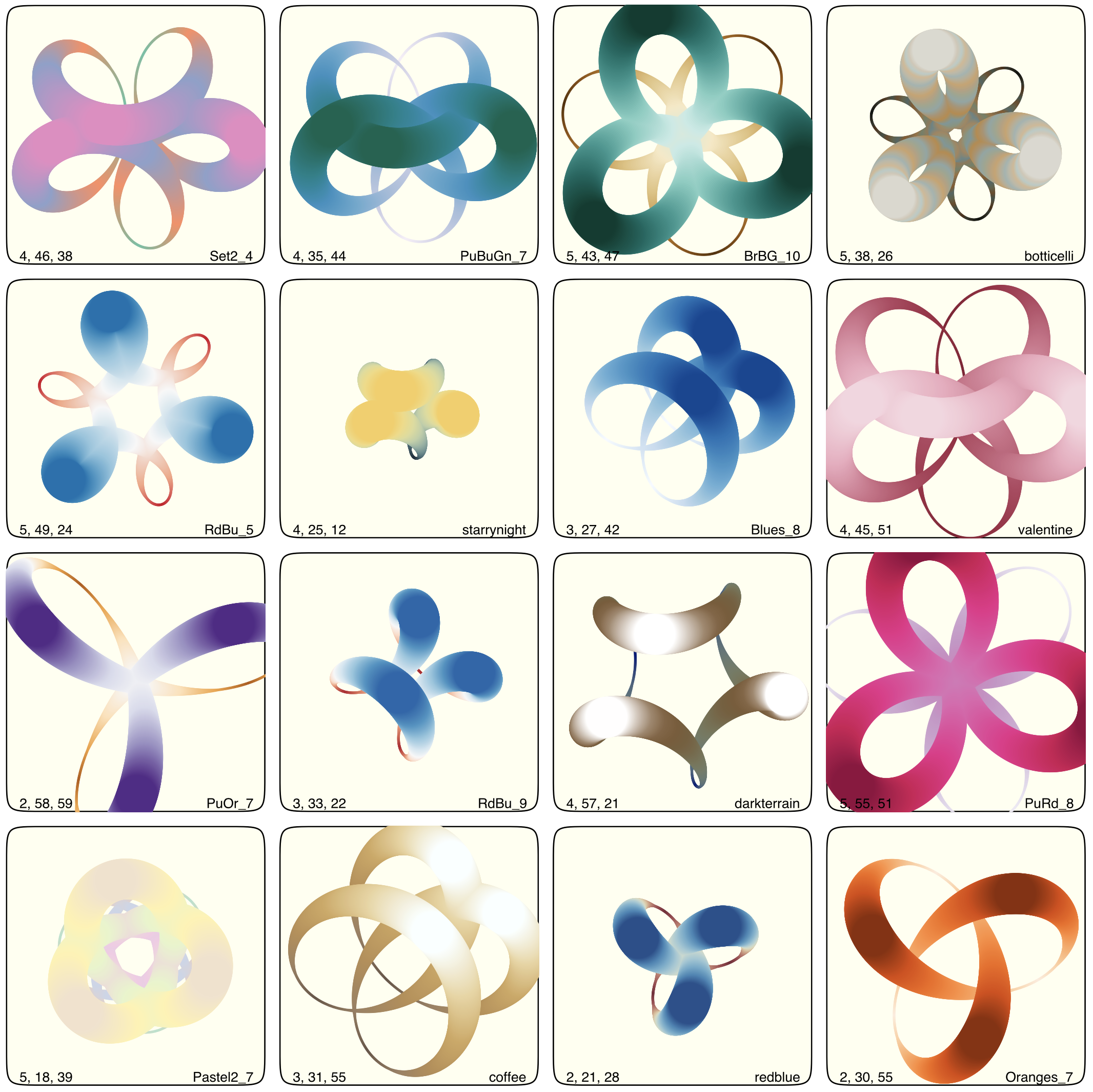
I'll let the computer play with this for a while, with some of the parameters randomized (and remember to store the chosen settings somewhere, in case you find anything really cool!). Some will be useless, perhaps others will show potential:
End of the line
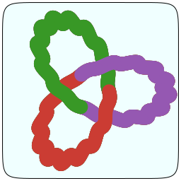
Eventually, I find something that I quite like:
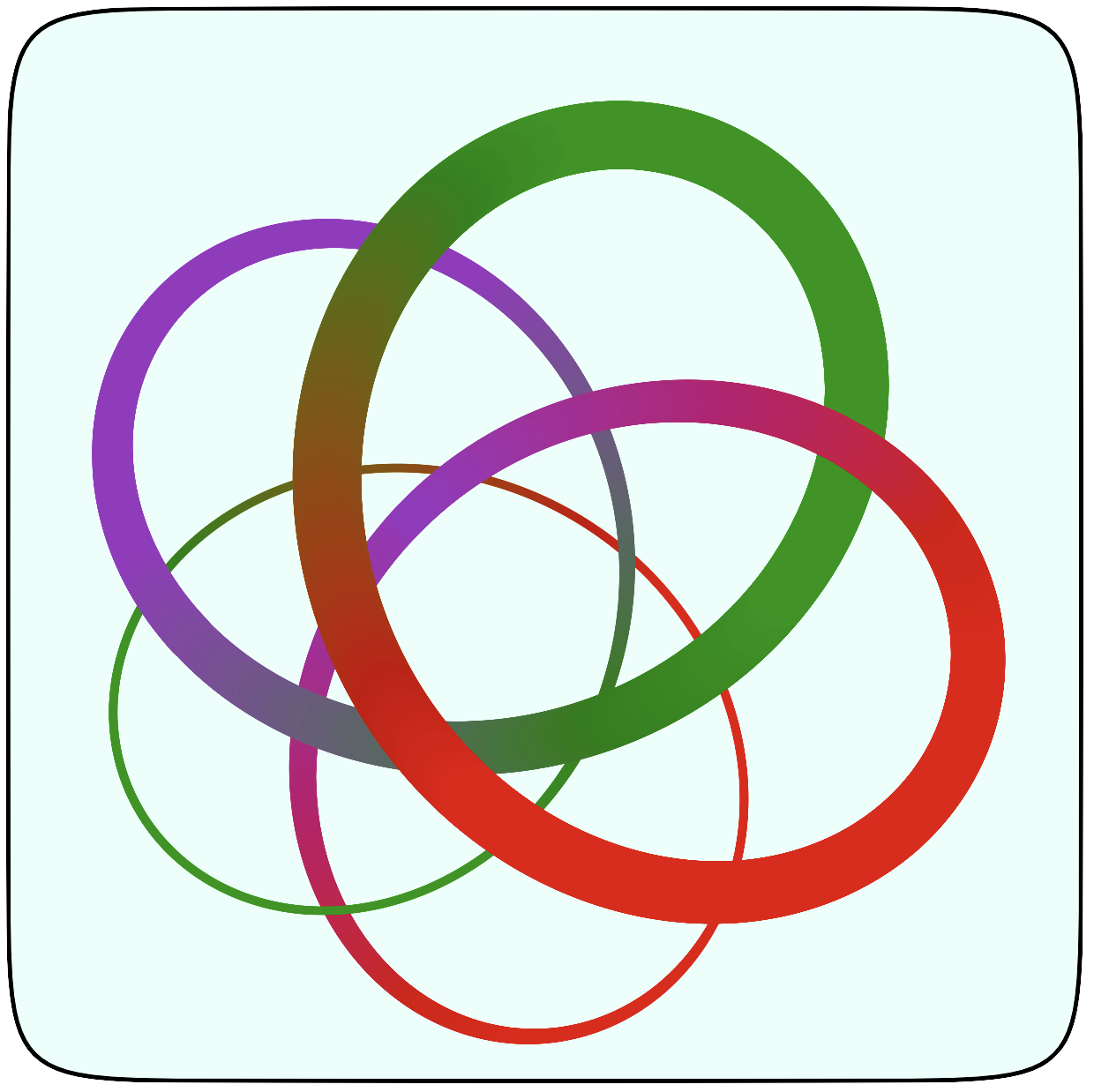
It looks good—in SVG, at least. (PNGs may take up less room, but the level of detail sometimes disappoints, compared with the vector-y precision of SVG.) Either that, or I’ve just reached saturation point and my fatigued brain can no longer choose anything.
Gradients and colour blends aren't always ideal solutions; they're either coming into or going out of fashion. The quality can depend on the final output method, of course, such as when printed or when reproduced. But for a simple logo on a GitHub web page, the gradients probably aren't going to be a problem.
This version doesn't have the depth-sorting, mainly because it didn't make much difference to the finished image. The top-level code that made it looks like this (there are some other utility functions being called here, such as project() and newprojection()):
@svg begin
    squircle(O, 125, 125, :clip, rt=0.15)
    sethue("azure")
    squircle(O, 125, 125, :fillpreserve, rt=0.15)
    sethue("black")
    strokepath()
    eyepoint    = Point3D(5, 5, 1000)
    centerpoint = Point3D(0, 0, 0)
    uppoint     = Point3D(0, 0, 1)
    projection  = newprojection(eyepoint, centerpoint, uppoint, 750)
    translate(-10, 15)
    cs = vcat(juliacolorscheme, reverse(juliacolorscheme))
    for t in 0:0.001:2pi
        pt1 = pointonstring(t, 50, 90, .5, xy=4, z = 1)
        sethue(get(cs, rescale(t, 0, 2pi, 0, 1)))
        d = rescale(pt1.z, -100, 150, 0, 10)
        circle(project(pt1, projection), max(1.0, d), :fill)
    end
end 256 256
Everyone's a critic
After all the graphics have faded from view, with just one left standing as the final offering, the fun really starts, because we all have opinions about things like logos, and there's no easy way to measure their quality or effectiveness. There are some famous examples of good and bad logos getting all kinds of mixed reception, with praise and derision that they might not wholly deserve.
Michael Bierut wrote an excellent piece (Graphic Design Criticism as a Spectator Sport: Design Observer) about how we all notice and talk about logos and designs these days:
Earlier last year, [2012], University of California quietly unveiled a new logo. Much has changed since 2009, including the notion that you can quietly unveil a logo. The logo was, eventually, inevitably noticed. After Tropicana, after the "epic fail" Gap debacle, after the seizure-inducing London 2012 affair, no one should have been surprised by what happened next. In fact, you almost had a sense that we all knew our roles in the drama to come: New logo? Game on!
As he says, graphic design criticism is now a spectator sport, and anyone can play!
Fun fact. Michael Bierut designed the MIT Media Lab logo. And one of the developers of the Julia language, Jeff Bezanson, was a PhD student at MIT; and Julia source code is licensed using the MIT license.
Well, Scott said the last iteration was pretty. So that's nice! Here it is in use (without GitHub's ugly black header bar, fortunately):

[2018-05-07]
