This post was originally intended to be a light-hearted addendum to the serious math stuff that usually gets posted on the official Julia blog on Pi day, but in the end there were no other contributions, so Simon asked if I wanted to go ahead anyway. So this had more prominence than I expected. This is the final draft; there were some improvements made by the community after I'd submitted it.
Some π-ography
Although we've known about "Archimedes' constant" for a few millennia, we've been referring to it as the Greek letter π only since the 1700s. Patricia Rothman suggested that the following page could contain one of the earliest uses of the Greek character to indicate the concept. It's from a mathematics text book written by William Jones and published in 1706:
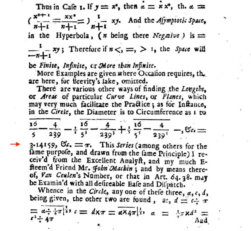
Jones used the Greek letter in various places both to indicate the number and, like some of his predecessors, to refer to the periphery or perimeter (Greek περιφέρεια) of a circle, and to label points in diagrams, as we would use P and Q today. Jones also refers to it as Van Ceulen's Number, after the Dutch mathematician Ludolph van Ceulen, who spent a major part of his life calculating the value. (He managed 35 decimal places, and asked for it to be engraved on his tombstone.)
Jones, like all mathematicians, used a lot of symbols. His Synopsis Palmariorum Matheseos, or A New Introduction to the Mathematics has been digitized and can be viewed here. It's an impressive achievement, not least by his typesetter, and it might make you appreciate your next LATEX session more than usual.
But although Jones was one of the first, he wasn't influential enough to inspire many followers, and it was the more famous Leonhard Euler and his use of the π symbol later in the century that did more to establish the Greek letter's primary mathematical meaning for posterity:
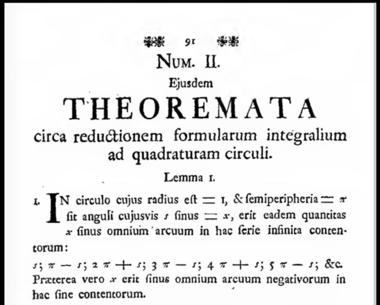
(Original online here.)
Julia embraces the Unicode standard enthusiastically, so it's very easy to use the appropriate Greek (and other Unicode) letters in your code. In the REPL, for example, type \pi TAB to insert the Unicode character U+03C0:
julia> π
π = 3.1415926535897...
and you can use it freely in expressions:
@test kepler_solver.([π/4, π/6, 8π/3], 0) ≈ [π/4, π/6, 2π/3](although pi will still work, if you'd prefer). In Julia, π and other mathematical constants such as Euler's ℯ (2.7182818284590) currently live in the Base.MathConstants module.
As always in Julia, you can usually see how the magic is performed:
julia> Base.REPLCompletions.latex_symbols["\\pi"]
"π"
More π
We usually use the U+03C0 π from the Unicode block for Greek and Coptic text glyphs (Coptic was the Greek-based language adopted by the Egyptians to replace hieroglyphs), but there are other π symbols intended mainly for mathematical use. The following snippet of Julia code tries to show all the lower-case Unicode π symbols:
morepi = [
(0x3c0,    "\\pi",           "GREEK SMALL LETTER PI")
(0x213c,   "\\bbpi",         "DOUBLE-STRUCK SMALL PI") # v0.7
(0x1d6d1,  "\\mbfpi",        "MATHEMATICAL BOLD SMALL PI")
(0x1D70B,  "\\mitpi",        "MATHEMATICAL ITALIC SMALL PI")
(0x1d745,  "\\mbfitpi",      "MATHEMATICAL BOLD ITALIC SMALL PI")
(0x1d77f,  "\\bsanspi",      "MATHEMATICAL SANS-SERIF BOLD SMALL PI") # v0.7
(0x1d7b9,   "\\mbfitsanspi", "MATHEMATICAL SANS-SERIF BOLD ITALIC SMALL PI")];

foreach(p ->
    println(" $(Char(p[1])) U+$(lpad(hex(p[1]), 5, "0")) $(rpad(p[2], 15)) $(p[3])"),
    morepi)
The two tab completions commented as v0.7 have been added for Julia version 0.7.
The output you see will depend a lot on your computer, operating system, and various other settings. This is a good introduction to the adventure game that is the Wonderful World of Fonts. Here, for example, is what I see if I evaluate this snippet in my Julia REPL today (version 0.6.2), using the Terminal app on macOS:

As you can see, not all the π symbols were rendered. The OS looks in the current font (I'm trying out Fira Code) for the Unicode characters U+3c0, U+213c, U+1d6d1, U+1d70b, U+1d745, U+1d77f, and U+1d7b9. For each one it fails to find, it searches through other activated fonts looking for one that has a symbol at that code point. The OS doesn't check to see whether the symbol it finds is suitable.
In the example above, the Greek π at U+3c0 was already available in Fira Code. \mitpi (the maths italic π at U+1d70b) was eventually found in Microsoft's Segoe UI Symbol, so that font was used for that one character. For \bbpi, the double-struck or blackboard π, the font Code2000 yielded a symbol at U+213c which was duly used, although to me it looks more like a backwards single-struck epsilon than any sort of π. The others weren't found in any active font, so they've been displayed using a question mark in a box.
Now, if I activate a font such as Asana-Math, Everson Mono, or STIX, or some other mathematically-endowed font, the OS will immediately start to find matches and update the display, constantly switching between fonts as necessary to satisfy demands for Unicode code points:

With Asana Math installed, all the other πs can be found, and now the double-struck small π looks more like the blackboard-written character it's supposed to resemble, although it's difficult to see at small point sizes. And I think there are better designs:
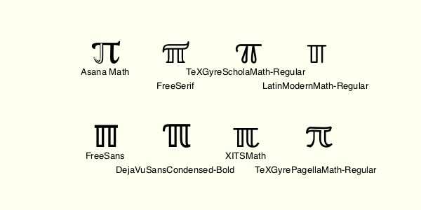
Some tedious experimentation suggests that the search is to some extent alphabetic, because if Asana Math is unavailable, the OS moves on and tries Code2000, then Deja Vu, then Everson, then FreeSans, and so on. This at least is what I think happens on the current macOS with my particular setup. I suspect that it would be different on yours. And similar (but different) things will happen in your browser.
By the way, these alternative symbols for π such as \mitpi don't evaluate as 3.14..., so you can use them—as William Jones did—as general purpose symbols. For example, if you work with prime numbers you could use one of them to indicate the prime-counting function. Or you could just confuse yourself with the following:
julia> 𝜋 = 3
julia> 2𝜋
6
The publisher symbol Ⓟ
Not all fonts contain a suitable Greek π at U+03C0. A few expensive fonts such as Gotham offer the circled P symbol at U+03c0 instead of π. This is the "publisher" symbol, which usually lives at U+2117 (the one at U+24C5 is also used), and it's like the copyright symbol © but for sound recordings. The story behind this is that, particularly before the days of Unicode standardization, font companies sometimes favoured pragmatism over correctness. According to David Berlow:
we at Font Bureau understand how users work, and so we put the p in a circle, a "must-have" glyph that is very difficult for a user to make on the fly, in the slot of a glyph (math pi) that most people really don't need (because even if they do, it's in the Symbol font on every single computer on earth).
Designs on π
Can we use Julia to find all the different designs of π? My first attempt at this challenge uses Fontconfig.jl to produce a list of installed fonts, and Luxor.jl to draw them in a table. It at least gives a glimpse of the variety of designs available, and illustrates some of the issues. Fonts that provide a zero-width glyph are skipped, meaning the table winds up being smaller than originally planned.
using Fontconfig, Luxor

function buildfontlist()
    fonts = []
    for font in Fontconfig.list()
        families = Fontconfig.format(font, "%{family}")
        for family in split(families, ",")
            push!(fonts, family)
        end
    end
    filter!(f -> !ismatch(r".LastResort|Agenda|Topaz|Bodoni Ornaments|System",
        f), fonts)
    return sort(unique(fonts))
end

function tabulatepi()
    fonts = buildfontlist()
    ncols = 25
    nrows = convert(Int, ceil(length(fonts))) ÷ ncols
    @svg begin
        background("ivory")
        setopacity(1)
        t = Table(nrows, ncols, 30, 25)
        sethue("black")
        cellnumber = 1
        for n in 1:length(fonts)
            fontface(fonts[n])
            te = textextents("π")
            if te[3] > 0.0
                fontsize(18)
                text("π", t[cellnumber], halign=:center)
                setfont("Lucida-Sans", 3)
                settext(fonts[n], t[cellnumber] + (0, isodd(cellnumber) ? 6 : 10), halign="center")
                cellnumber += 1
            end
        end
    end 800 1200
end

tabulatepi()
You probably won't have to manually remove oddments like Bodoni Ornaments or Topaz from the font list as I had to...
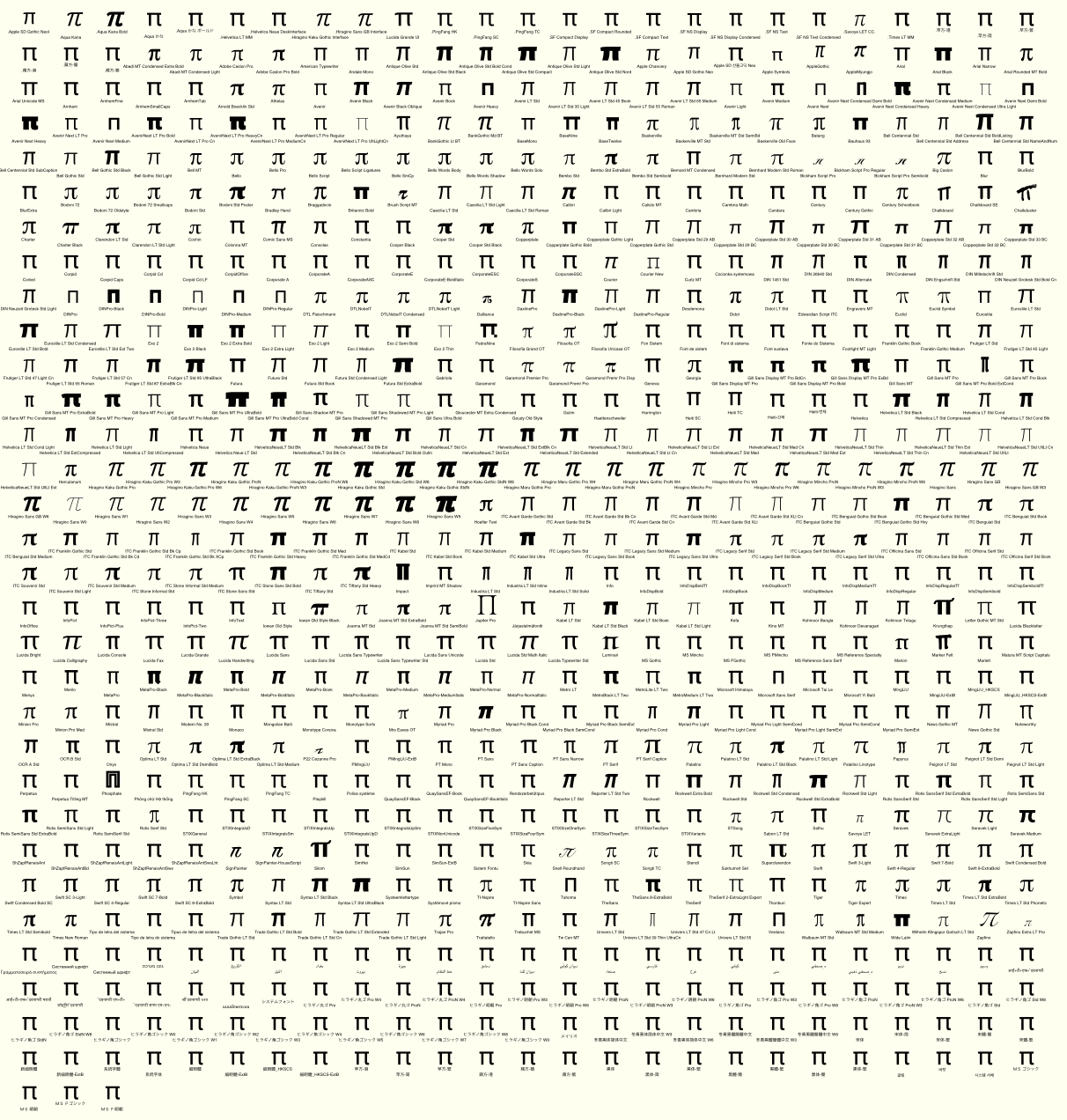
Link to SVG version of this image
It would be better if I manually curated the candidates rather than used this automatically-generated font list: there are way too many "default" designs from various system and language-specific fonts that simply fill the slot with a basic design, rather than interpret the shape according to the font's theme. And the font list produced by fontconfig doesn't look in all the font libraries, so it's an incomplete list.
Here are a few of the more interesting designs: the portly Cooper Black and Tiffany Heavy, the minimalist Verdana and Tahoma (looking almost like "n"s?), the eccentric Gill "Kayo" Sans, and the silly Chalkduster.

I like the small version from Dalliance; it's nicely old-school, where "old-school" here means based on an original from 1799, not long after Euler's death.
The average π
It occurred to me to ask "what is the average of π?", or "what would it look like if all the πs were displayed at the same time?". Using the same font list generation as before, I ran this:
function textstroke(s, pos, action)
    @layer begin
        translate(pos)
        te = textextents(s)
        move(-te[3]/2, te[4]/2)
        textpath(s)
        tp = pathtopoly()
        poly.(tp, action, close=true)
    end
end

function accumulatepi()
    fonts = buildfontlist()
    @png begin
        background("midnightblue")
        sethue("lightgoldenrod2")
        setline(0.2)
        fontsize(560)
        setopacity(0.3)
        for n in 1:length(fonts)
            fontface(fonts[n])
            te = textextents("π")
            if te[3] > 0.0
                textstroke("π", O, :stroke)
            end
        end
    end
end
accumulatepi()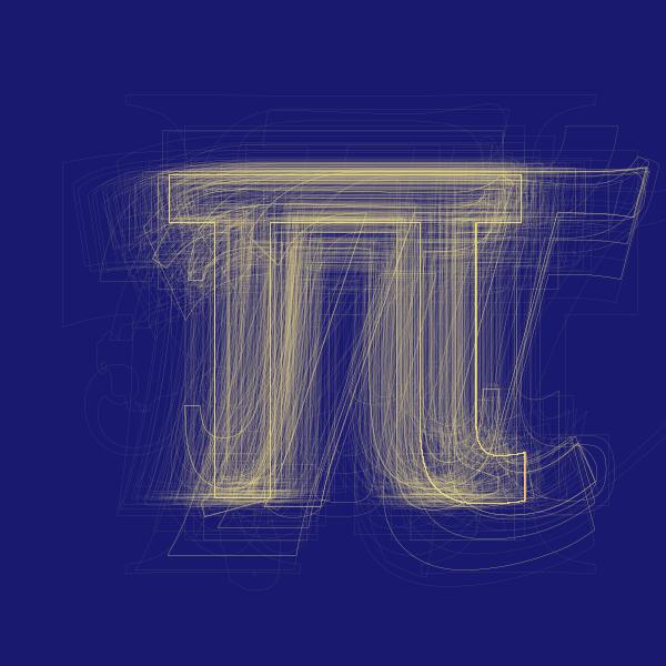
For a complete font based on the average shapes of many other fonts, have a look at Averia.
I haven't yet found a way to list all the fonts that contain the full set of Unicode π symbols. In theory I think I can use Freetype.jl to inspect a font to see whether it contains code points for particular character glyphs. Perhaps I'll report back on 3-14-19 with any progress...
